> ## Documentation Index
> Fetch the complete documentation index at: https://docs.nebuly.com/llms.txt
> Use this file to discover all available pages before exploring further.
# Product changelog
> Product updates and announcements
## Easier interaction and conversation deep links with `/go`
Deep links to interactions and conversations are now easier to share with `/go` URLs. They send authenticated Nebuly users directly to the right interaction or conversation page and resolve the required project and organization context automatically, making them simpler to use from tools such as spreadsheets or internal workflows. See [Deep-link to an interaction or conversation](/guides/share-interaction-and-conversation-link) for setup details.
This is currently available only on the new UI (v2).
## Table charts: metrics limit raised to 10
Table charts previously capped metric columns at 4. You can now add up to **10 metrics** to a single table, both in reports and in Explore mode.
This is currently available only on the new UI (v2).
## ROI
Measure the business impact of AI directly in Nebuly. The new ROI feature translates AI usage into hours and business value automatically. When enabled, Nebuly uses sensible defaults and thanks to a proprietary model we calculate each action time cost. You can customize at any time to make it fit your organization and needs.
ROI reporting is now available in **beta** on both v1 and v2. Enable it from **Settings > Feature Flags > ROI Analysis**.
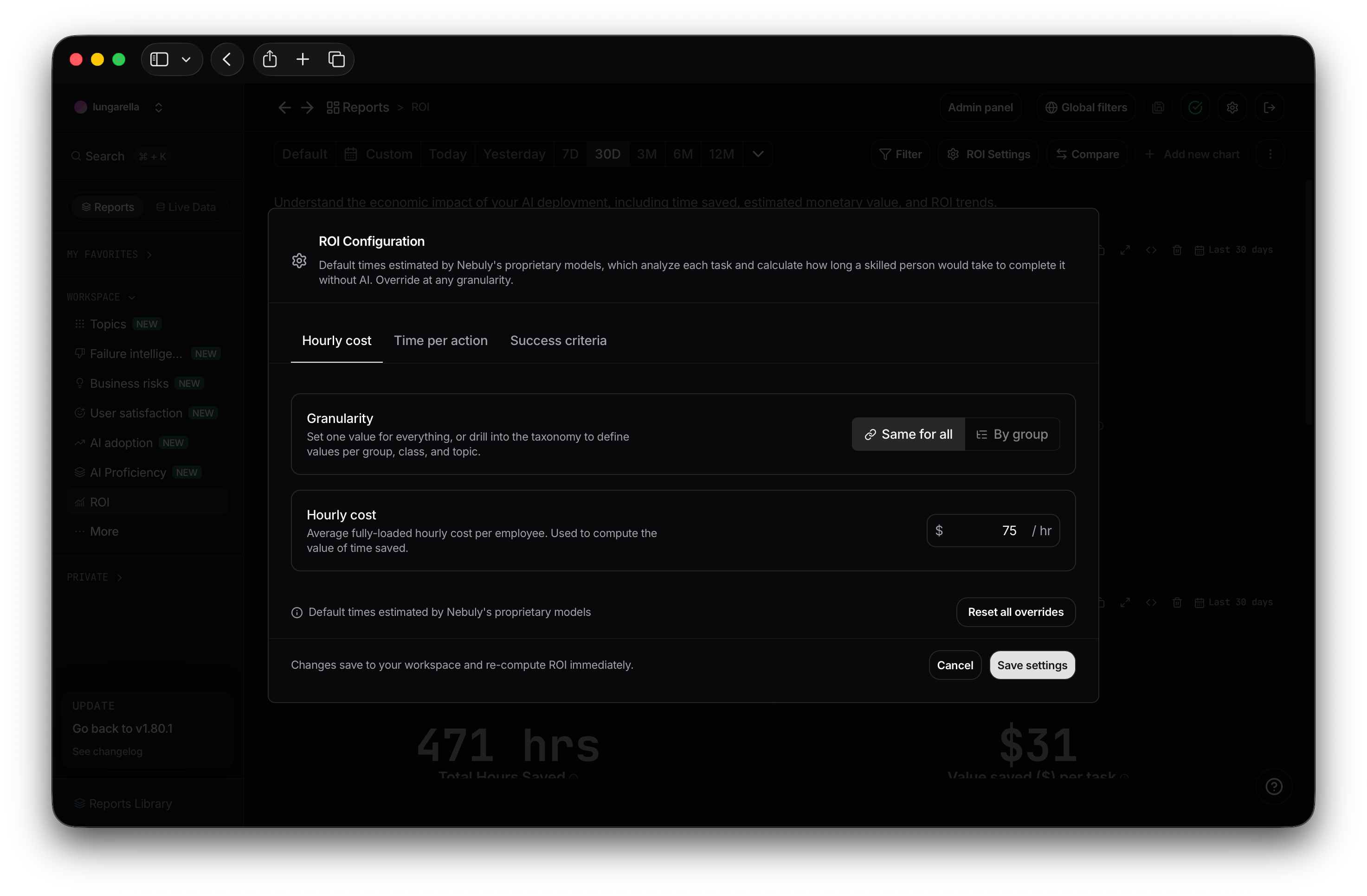
After enabling ROI, Nebuly's model needs some time to compute time-per-action estimates for your
workspace. Until then, the platform uses default values: **15 minutes** per action and
**\$75/hour** employee cost. You can adjust the employee cost at any time from ROI Settings.
### ROI Report
The new ROI report surfaces the metrics that matter most:
* Total hours saved
* Hours saved per user
* Hours saved per task
* Tasks completed
* Task completion rate
* Total value saved
* Value saved per task
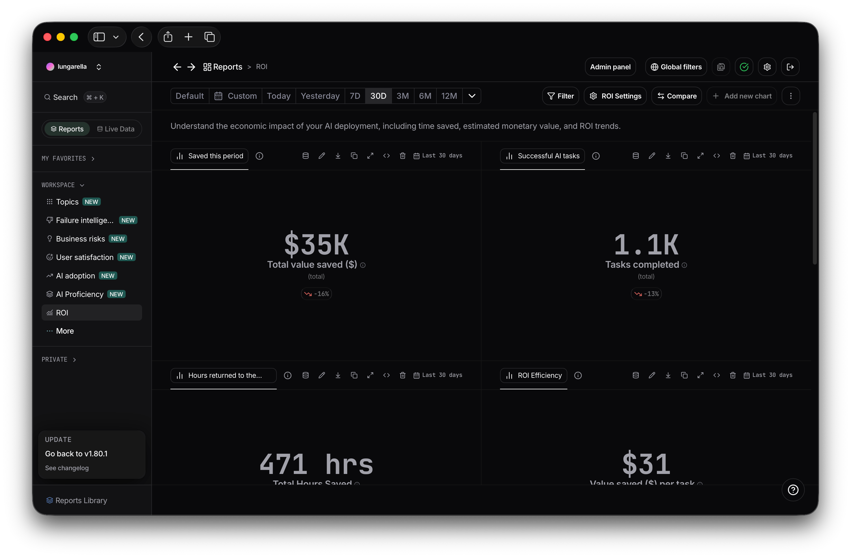
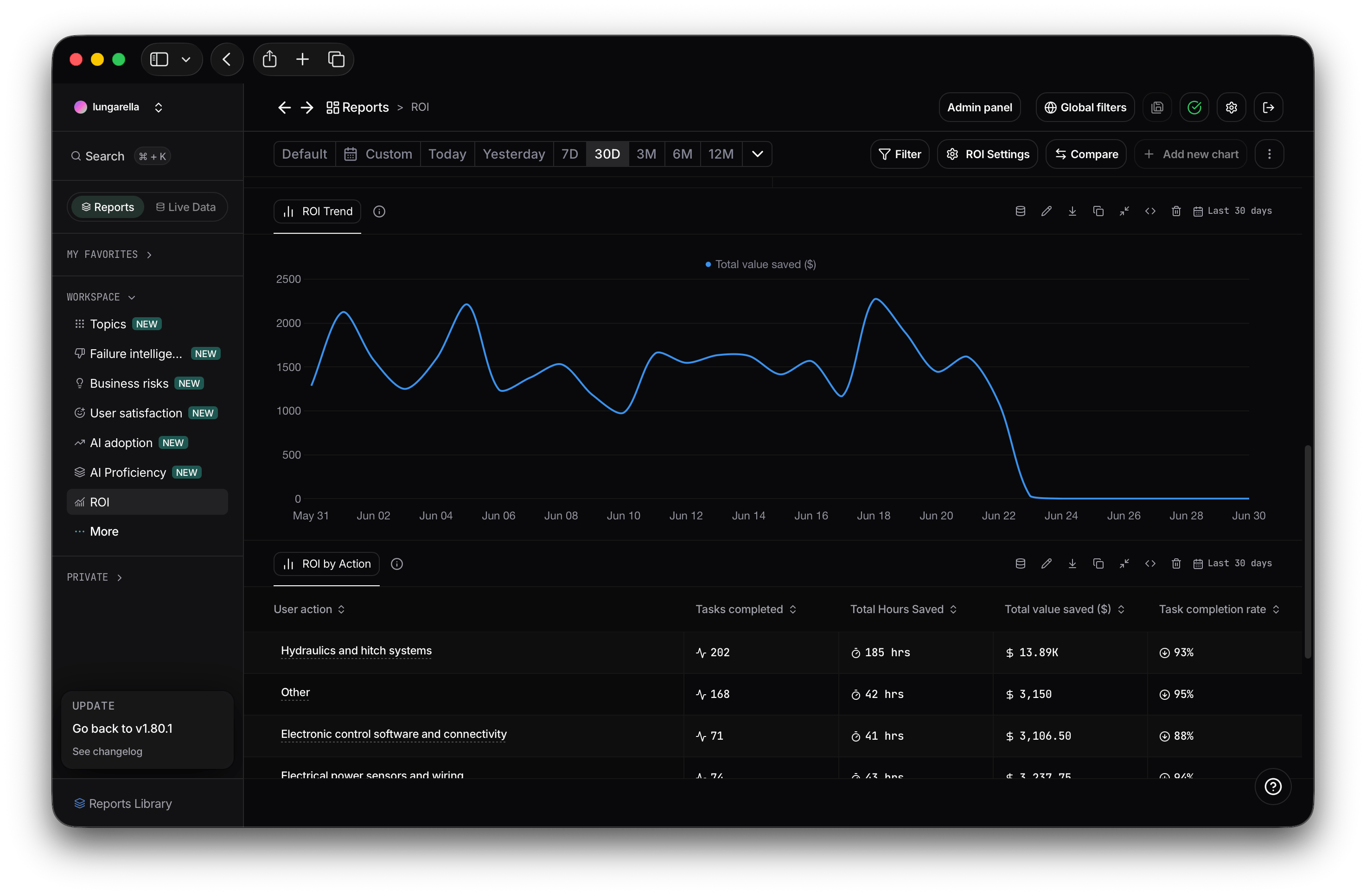 ### ROI Settings
Configure how ROI is calculated for your organization. Set employee hourly cost, adjust time estimates for individual actions, and choose which unsuccessful conversations to exclude. Changes are reflected immediately across all ROI reports.
### ROI Settings
Configure how ROI is calculated for your organization. Set employee hourly cost, adjust time estimates for individual actions, and choose which unsuccessful conversations to exclude. Changes are reflected immediately across all ROI reports.
 ## Nebuly 2.2.8 (Beta)
This release focuses on making reports faster to create, easier to organize, and simpler to explore across teams.
## New All reports workspace
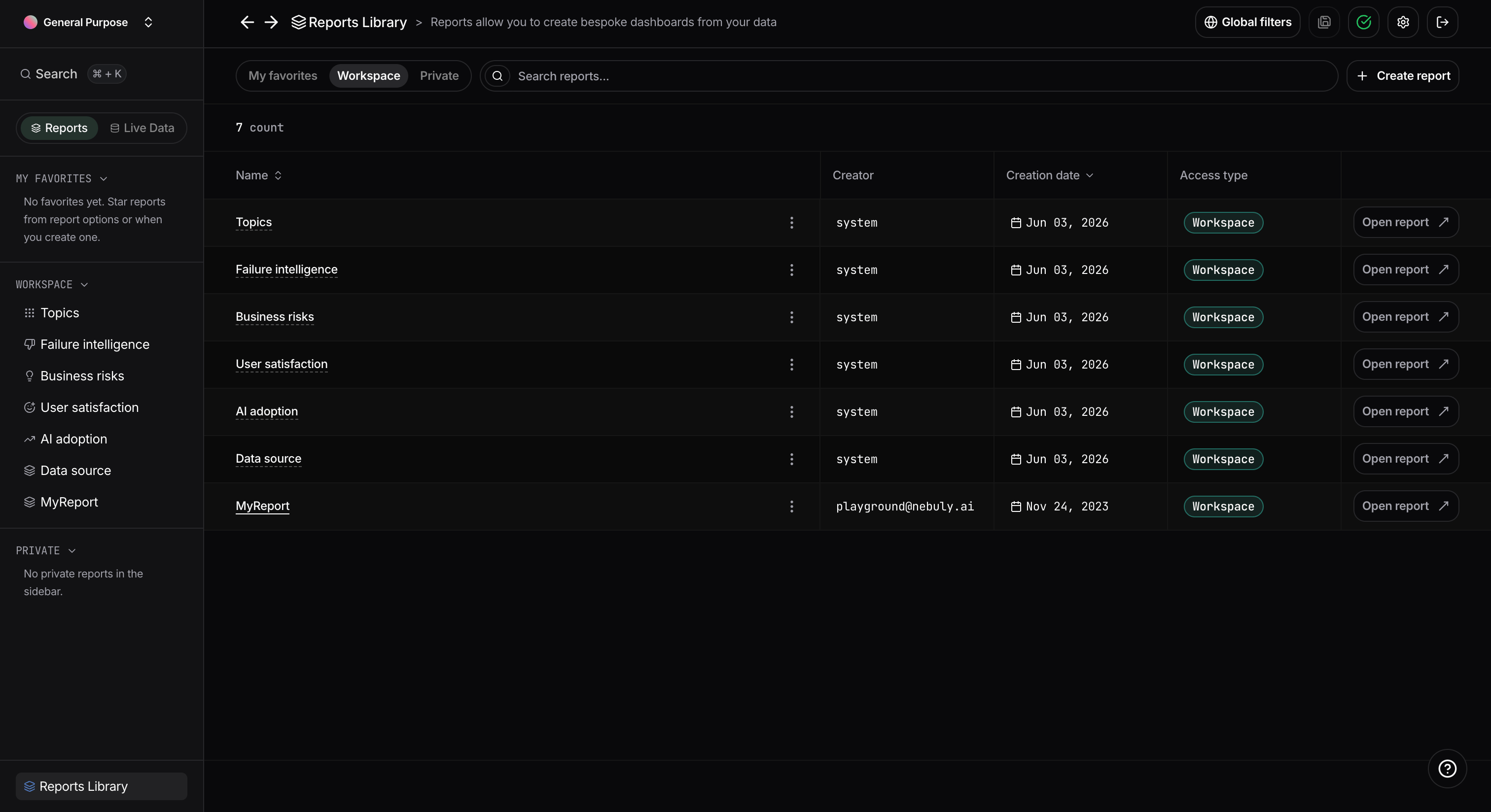
We added a dedicated **All reports** page organized into three views: **My favorites**, **Workspace**, and **Private**.
All reports — workspace and private — are pinned to the sidebar automatically. Star any report to add it to your **Favorites** section for quick access.
## Nebuly 2.2.8 (Beta)
This release focuses on making reports faster to create, easier to organize, and simpler to explore across teams.
## New All reports workspace
We added a dedicated **All reports** page organized into three views: **My favorites**, **Workspace**, and **Private**.
All reports — workspace and private — are pinned to the sidebar automatically. Star any report to add it to your **Favorites** section for quick access.
 ## Sidebar redesigned around reports
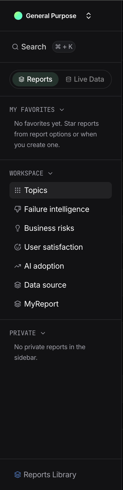
The sidebar is now split into two tabs: **Reports** and **Live Data**.
Under the **Reports** tab, reports are organized into three sections — **Favorites** (your starred shortcuts), **Workspace** (reports shared across the platform), and **Private** (reports only visible to you). The **Reports Library** at the bottom gives you a searchable view of all reports in one place.
Switch to the **Live Data** tab to access Interactions, Conversations, Users, and User groups from one consolidated navigation surface.
## Sidebar redesigned around reports
The sidebar is now split into two tabs: **Reports** and **Live Data**.
Under the **Reports** tab, reports are organized into three sections — **Favorites** (your starred shortcuts), **Workspace** (reports shared across the platform), and **Private** (reports only visible to you). The **Reports Library** at the bottom gives you a searchable view of all reports in one place.
Switch to the **Live Data** tab to access Interactions, Conversations, Users, and User groups from one consolidated navigation surface.
 ## New report creation wizard
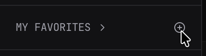
We replaced the previous single-step creation modal with a multi-step wizard. To create a new report, hover onto one of the three sections and click on the add icon
## New report creation wizard
We replaced the previous single-step creation modal with a multi-step wizard. To create a new report, hover onto one of the three sections and click on the add icon
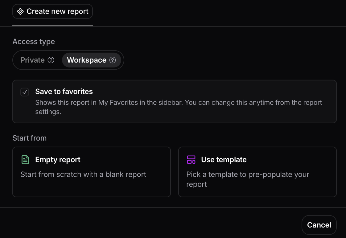
 When creating a report you can:
* Set visibility to **Private** (only you) or **Workspace** (everyone on the platform)
* Check **Save to favorites** to pin the report under your Favorites section immediately
* Start from an empty report or from a template
* Finalize name and description
When creating a report you can:
* Set visibility to **Private** (only you) or **Workspace** (everyone on the platform)
* Check **Save to favorites** to pin the report under your Favorites section immediately
* Start from an empty report or from a template
* Finalize name and description
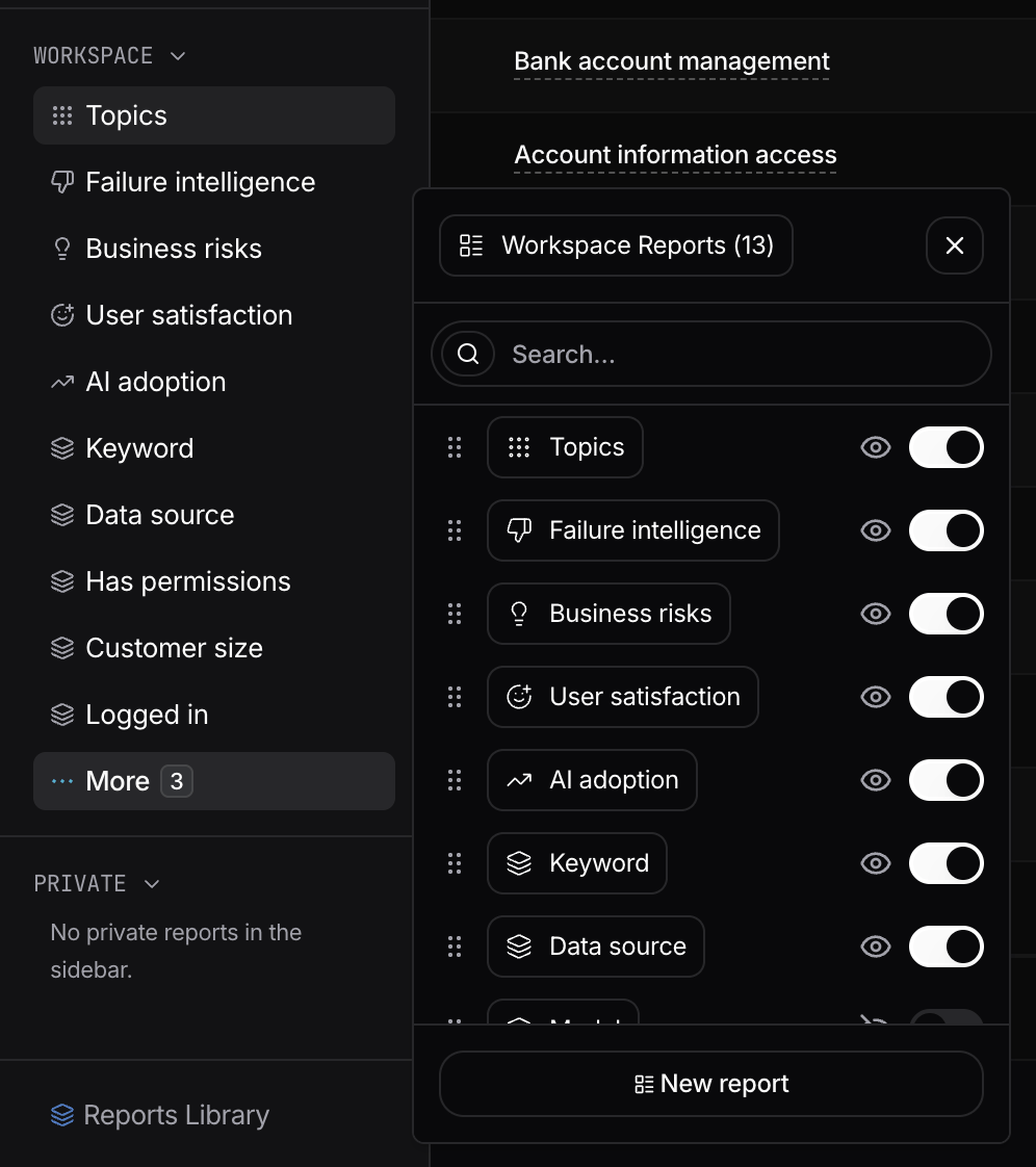
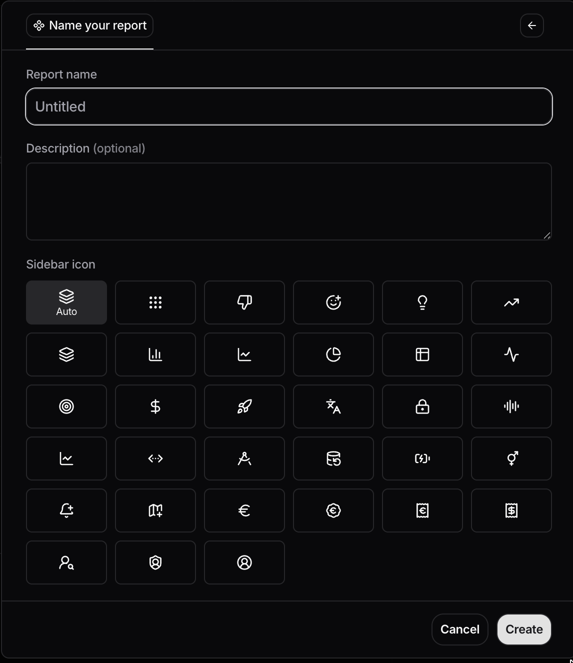 New reports are added to your sidebar automatically. When a section has more than 10 reports, a **More** button appears at the bottom of the list — open it to show or hide reports in the sidebar, or reorder them.
 ## Faster chart-level actions in reports
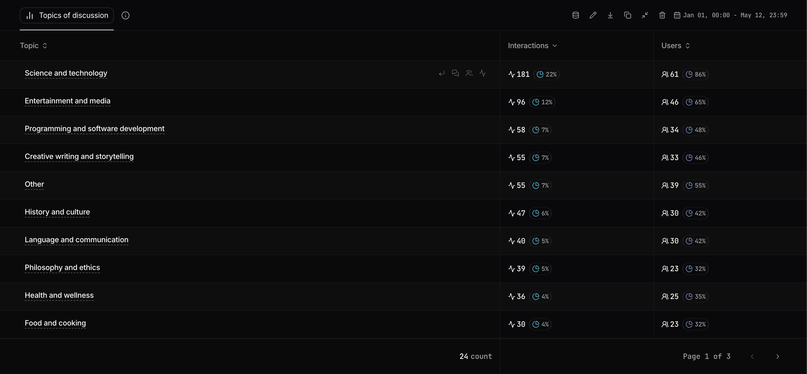
Chart cards now expose hover-based quick actions for edit, data mode, export, duplicate, delete, and expand/compress chart size.
Chart interactions are more direct, with fewer modal and menu hops.
## Faster chart-level actions in reports
Chart cards now expose hover-based quick actions for edit, data mode, export, duplicate, delete, and expand/compress chart size.
Chart interactions are more direct, with fewer modal and menu hops.
 ## Improved table drilldown workflow
Datatable rows now support richer shortcut actions on hover to jump directly to drilldown, conversations, users, and interactions.
This reduces clicks when moving from aggregate insights into underlying activity.
## Improved table drilldown workflow
Datatable rows now support richer shortcut actions on hover to jump directly to drilldown, conversations, users, and interactions.
This reduces clicks when moving from aggregate insights into underlying activity.
 ## Explore Mode
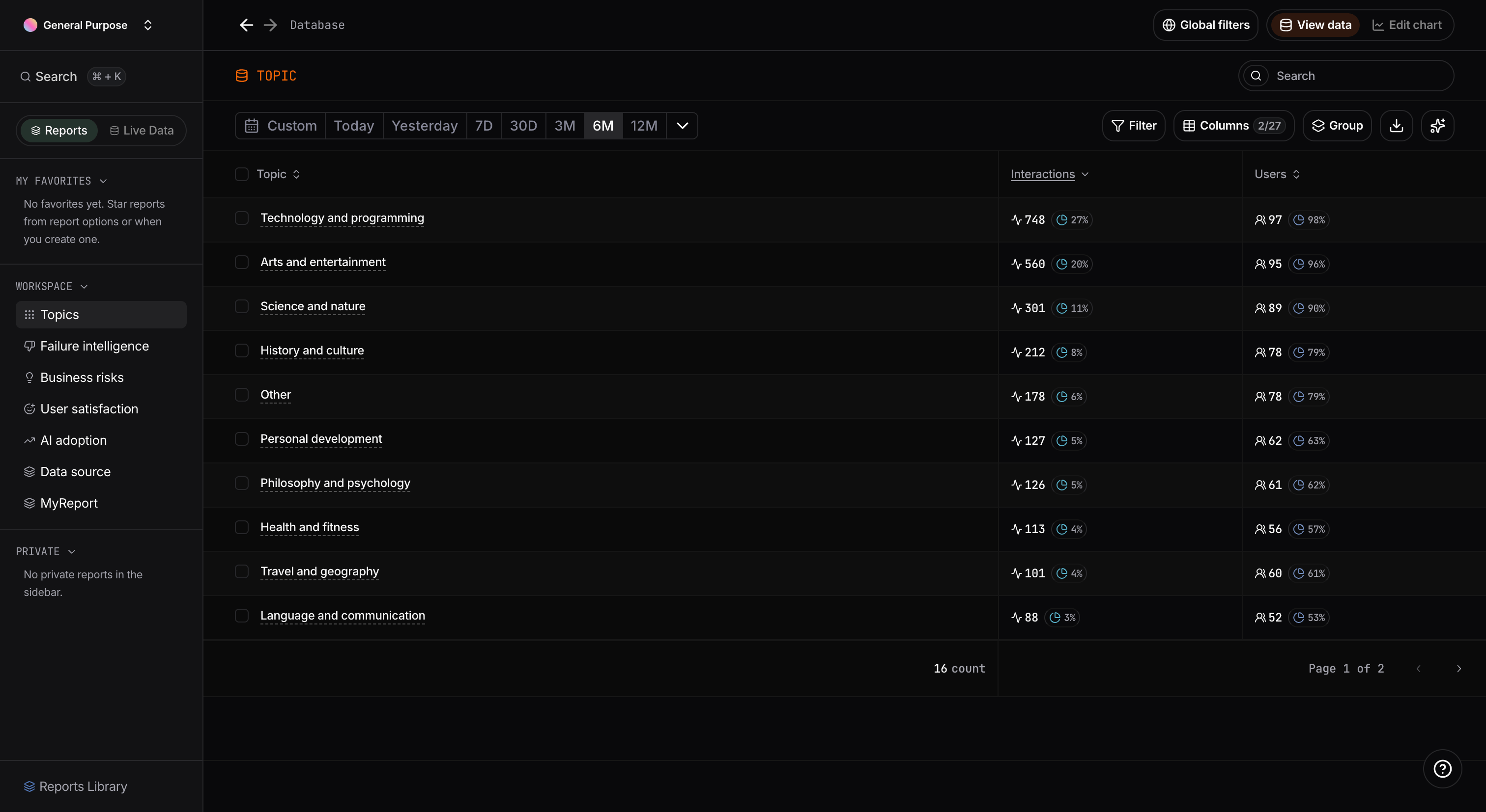
Explore Mode is the fast path from a report chart to the raw evidence behind it.
**What you can do**
* Drill down from aggregated chart values into lower-level breakdowns.
* Move directly from a row to related **users**, **interactions**, and **conversations**.
* Keep slicing data with filters to answer follow-up questions without rebuilding charts.
**How it works**
* Open it from chart quick actions (data/explore icon) or directly from report table rows.
* It preserves report context (selected report/chart and active filters), so analysis continues from where you started.
* As you drill deeper, row shortcuts let you jump immediately to the exact entity list you need to inspect.
**Why it matters**
* It turns reports from static dashboards into interactive investigation workflows.
* It helps teams move from "a metric changed" to "which users or interactions caused it" in fewer steps.
## Explore Mode
Explore Mode is the fast path from a report chart to the raw evidence behind it.
**What you can do**
* Drill down from aggregated chart values into lower-level breakdowns.
* Move directly from a row to related **users**, **interactions**, and **conversations**.
* Keep slicing data with filters to answer follow-up questions without rebuilding charts.
**How it works**
* Open it from chart quick actions (data/explore icon) or directly from report table rows.
* It preserves report context (selected report/chart and active filters), so analysis continues from where you started.
* As you drill deeper, row shortcuts let you jump immediately to the exact entity list you need to inspect.
**Why it matters**
* It turns reports from static dashboards into interactive investigation workflows.
* It helps teams move from "a metric changed" to "which users or interactions caused it" in fewer steps.
 ## Live Data
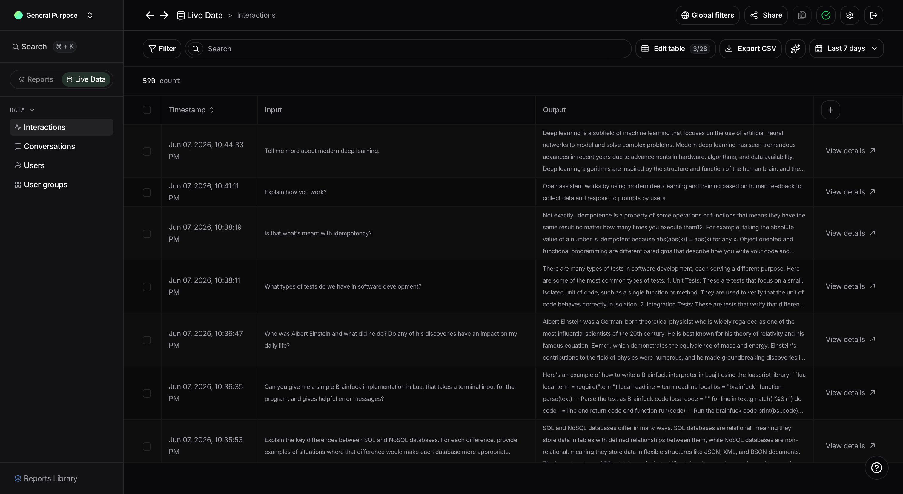
**Live Data** is the operational workspace that unifies previously separate navigation paths.
**Purpose**
* Merge the old **Interactions**, **Conversations**, **Users**, and **User groups** tabs into one coherent entry point.
* Remove context switching between multiple pages when analyzing real activity.
**What this enables**
* A single place to inspect platform activity from interaction, conversation, user, and user group perspectives.
* Faster transitions between aggregate insights in reports and concrete activity records in Live Data.
**Why this is important**
* It reduces navigation friction and duplicated filtering work.
* It gives teams one consistent source-of-truth flow for day-to-day investigation and monitoring.
## Live Data
**Live Data** is the operational workspace that unifies previously separate navigation paths.
**Purpose**
* Merge the old **Interactions**, **Conversations**, **Users**, and **User groups** tabs into one coherent entry point.
* Remove context switching between multiple pages when analyzing real activity.
**What this enables**
* A single place to inspect platform activity from interaction, conversation, user, and user group perspectives.
* Faster transitions between aggregate insights in reports and concrete activity records in Live Data.
**Why this is important**
* It reduces navigation friction and duplicated filtering work.
* It gives teams one consistent source-of-truth flow for day-to-day investigation and monitoring.
 ## Guided adoption
We introduced a new product tour for the reports experience.
The step-by-step walkthrough covers:
* Reports and Live Data sidebar tabs
* Favorites, Workspace, and Private report sections
* Reports Library
* Access control (Private vs Workspace visibility)
* Analytics pages as reports, and report menu options
* More button and panel for managing sidebar report lists
* Drill down and Explore Mode
* Chart quick actions (resize, edit, data mode)
* Report creation wizard and templates
* Live Data navigation
We also added a **Welcome banner** for first-time exposure and a persistent **Help** button to replay the tour at any time.
## Guided adoption
We introduced a new product tour for the reports experience.
The step-by-step walkthrough covers:
* Reports and Live Data sidebar tabs
* Favorites, Workspace, and Private report sections
* Reports Library
* Access control (Private vs Workspace visibility)
* Analytics pages as reports, and report menu options
* More button and panel for managing sidebar report lists
* Drill down and Explore Mode
* Chart quick actions (resize, edit, data mode)
* Report creation wizard and templates
* Live Data navigation
We also added a **Welcome banner** for first-time exposure and a persistent **Help** button to replay the tour at any time.
 ## Control the number of bars in horizontal bar charts
Horizontal bar charts with a **Group by** now include a **Number of bars** field in the chart configuration panel. This lets you cap how many bars are rendered, which is especially useful when the chart is exported — a chart with dozens of bars can become unreadable as a PNG image.
## Control the number of bars in horizontal bar charts
Horizontal bar charts with a **Group by** now include a **Number of bars** field in the chart configuration panel. This lets you cap how many bars are rendered, which is especially useful when the chart is exported — a chart with dozens of bars can become unreadable as a PNG image.
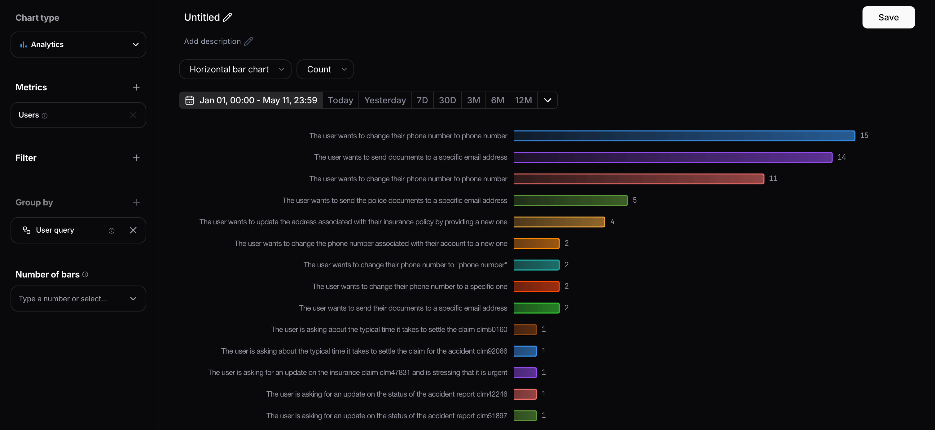 The field appears in the left-hand panel once a **Group by** is selected. You can pick from the presets — **No limit**, **5**, **10**, or **15** — or type any custom number directly.
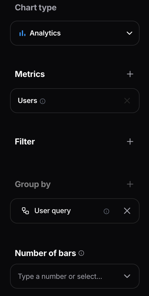 When you export the chart — either as a PNG image or as a CSV file — only the number of bars you configured will be included in the export.
 ## Navigate between interactions in the same conversation
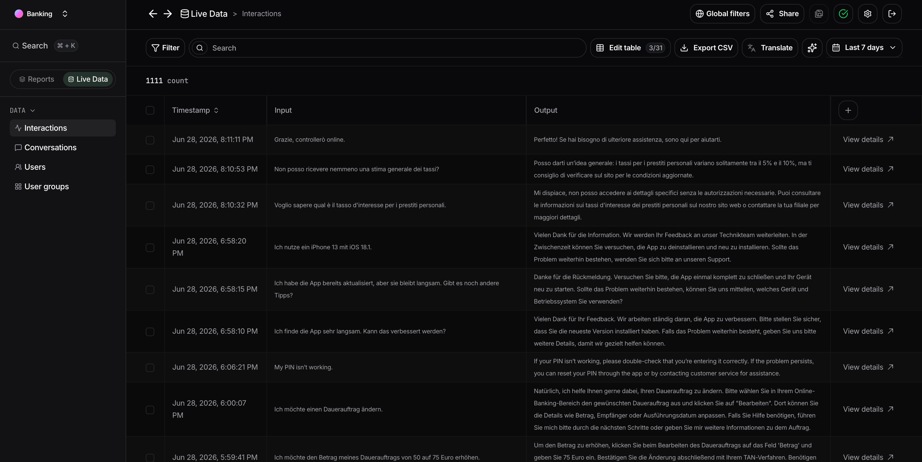
From the **Live Activity** interactions table, you can open the details of an interaction by clicking **View details** in the last column of a row.
## Navigate between interactions in the same conversation
From the **Live Activity** interactions table, you can open the details of an interaction by clicking **View details** in the last column of a row.
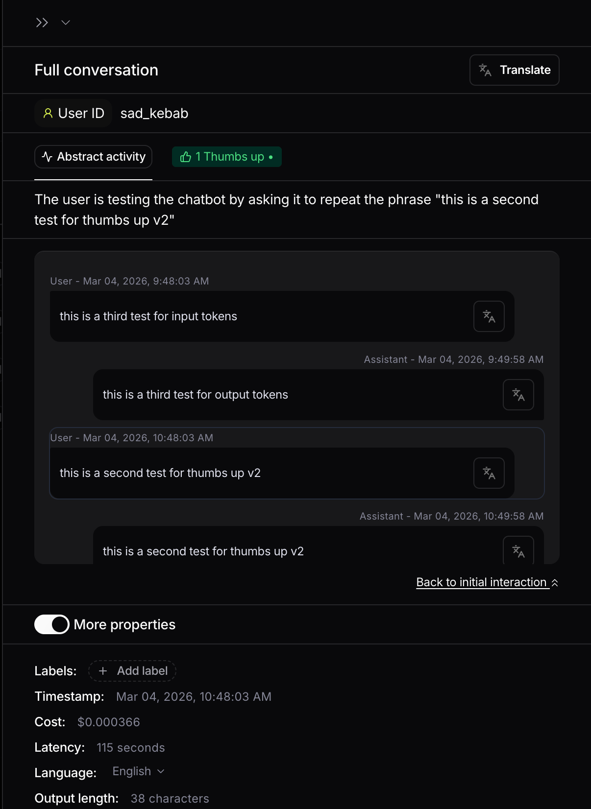
 Once the details sidebar is open, you can click another message in the same conversation and the interaction details will load in place. This makes it easier to move through a conversation.
 ## Frontend V2 filters: restyled UI and new `Contains` operator
We restyled filters in Frontend V2 and introduced a new `Contains` operator for text-based matching.
The V2 filter row is now organized in three pills:
* **Filter kind**
* **Operator**
* **Value**
## Frontend V2 filters: restyled UI and new `Contains` operator
We restyled filters in Frontend V2 and introduced a new `Contains` operator for text-based matching.
The V2 filter row is now organized in three pills:
* **Filter kind**
* **Operator**
* **Value**
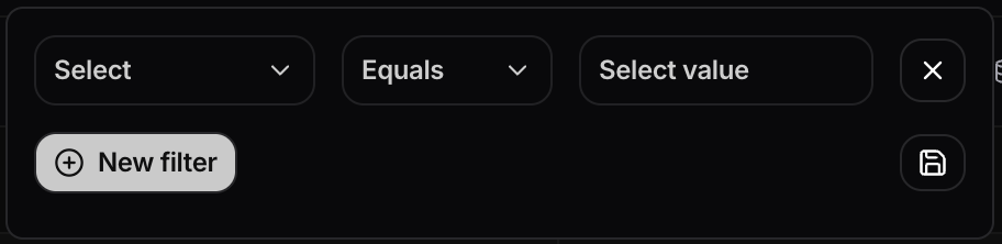 The first pills contains all filters grouped by kind, for example Interactions, Conversations, and Tags.
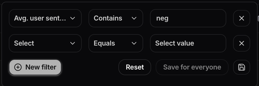
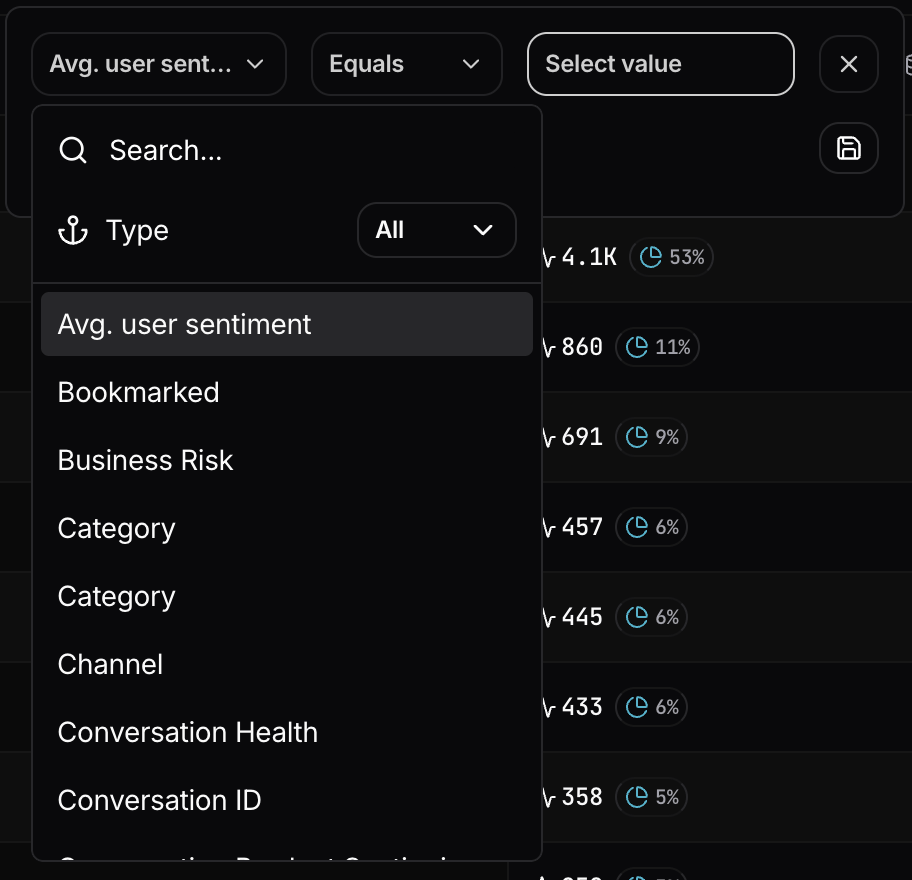 The second pill contains the three operators: `Equals`, `Is not`, and `Contains`
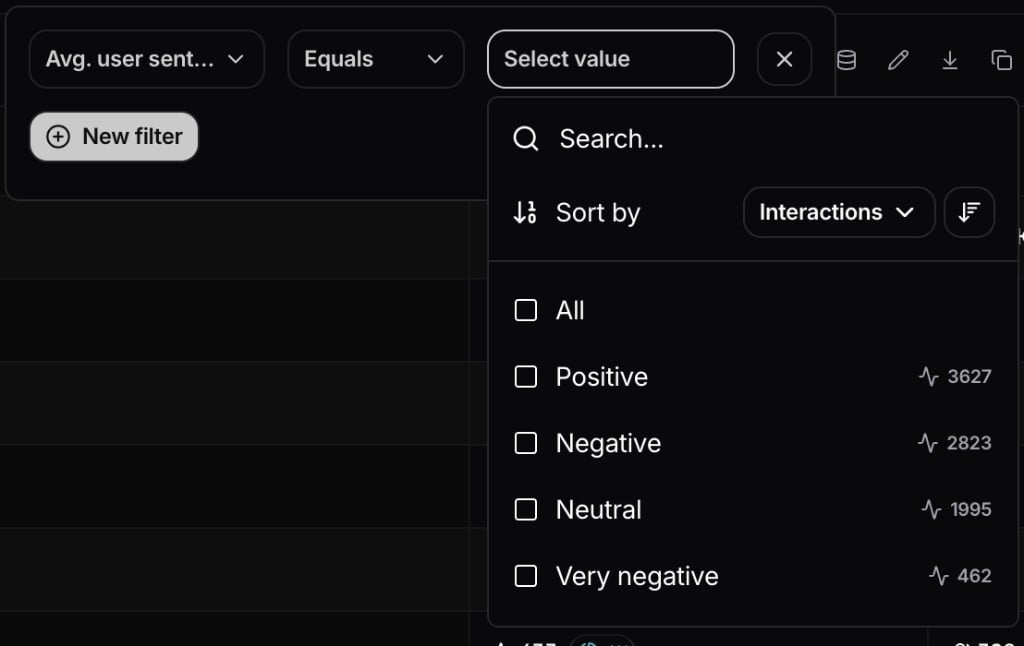
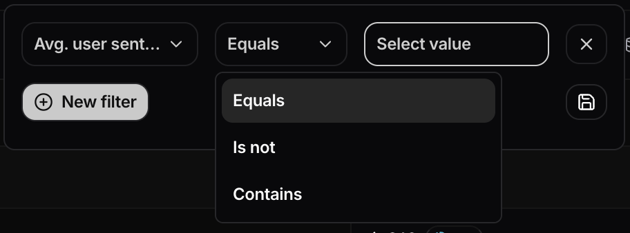 Here's an example of the Avg. user sentiment values after selecting the Equals operator
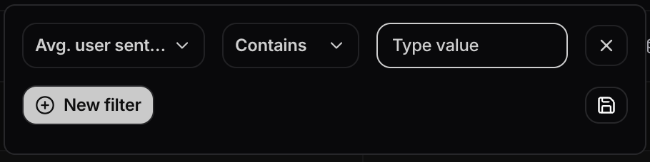
 The new `Contains` operator accepts partial text and matches all values that include it.
 Example: typing `neg` in `Avg. user sentiment` matches both `Negative` and `Very negative`.
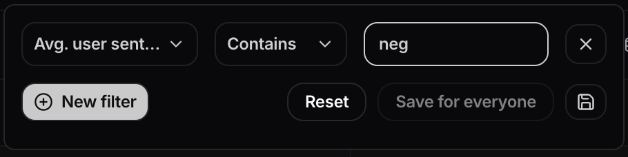 You can still add multiple filters by clicking the **New filter** button.
 ## Gemini Enterprise integration
You can now sync Gemini Enterprise assistant interactions into Nebuly from Google Cloud.
A self-hosted Python script reads end-user activity from Cloud Logging, enriches token counts from Cloud Trace, and ingests each prompt/response interaction into Nebuly. The sync is incremental and safe to re-run, supports an optional BigQuery log source, and offers date-range filtering and a dry-run preview before ingesting data.
See the [Gemini Enterprise integration guide](/integrations/gemini-enterprise/gemini-enterprise) to get started.
## Alerts: new metrics and interaction filters
Alerts have been expanded with new metrics and more granular filtering:
* **Interactions count** and **Users count** are now available as alert metrics
* **Business risk variance** has been removed
* Alerts can now be configured with **interaction filters**, letting you control which interactions are included in alert evaluation
## Gauge chart
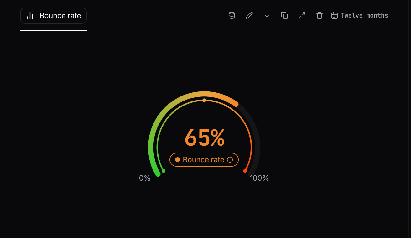
You can now add a **Gauge** chart to analytics reports to display a single KPI on a color-coded semicircular scale, with a configurable visible range and threshold bands.
* Choose **Gauge** from the chart type menu when editing an analytics chart.
* Configure the visible range and colored threshold bands via **Scale** settings next to the chart type.
* Drag thresholds or enter values in absolute or percentage mode; customize colors per band.
* Ideal for metrics with target zones (e.g. error rate, bounce rate, custom percentage KPIs).
## Gemini Enterprise integration
You can now sync Gemini Enterprise assistant interactions into Nebuly from Google Cloud.
A self-hosted Python script reads end-user activity from Cloud Logging, enriches token counts from Cloud Trace, and ingests each prompt/response interaction into Nebuly. The sync is incremental and safe to re-run, supports an optional BigQuery log source, and offers date-range filtering and a dry-run preview before ingesting data.
See the [Gemini Enterprise integration guide](/integrations/gemini-enterprise/gemini-enterprise) to get started.
## Alerts: new metrics and interaction filters
Alerts have been expanded with new metrics and more granular filtering:
* **Interactions count** and **Users count** are now available as alert metrics
* **Business risk variance** has been removed
* Alerts can now be configured with **interaction filters**, letting you control which interactions are included in alert evaluation
## Gauge chart
You can now add a **Gauge** chart to analytics reports to display a single KPI on a color-coded semicircular scale, with a configurable visible range and threshold bands.
* Choose **Gauge** from the chart type menu when editing an analytics chart.
* Configure the visible range and colored threshold bands via **Scale** settings next to the chart type.
* Drag thresholds or enter values in absolute or percentage mode; customize colors per band.
* Ideal for metrics with target zones (e.g. error rate, bounce rate, custom percentage KPIs).
 ### How to customize the scale
Open **Scale** to set the start and end values for the arc, then add up to six threshold stops to split the scale into colored bands. Drag threshold markers on the rail or type exact values, and switch between percentage and absolute value modes as needed.
### How to customize the scale
Open **Scale** to set the start and end values for the arc, then add up to six threshold stops to split the scale into colored bands. Drag threshold markers on the rail or type exact values, and switch between percentage and absolute value modes as needed.
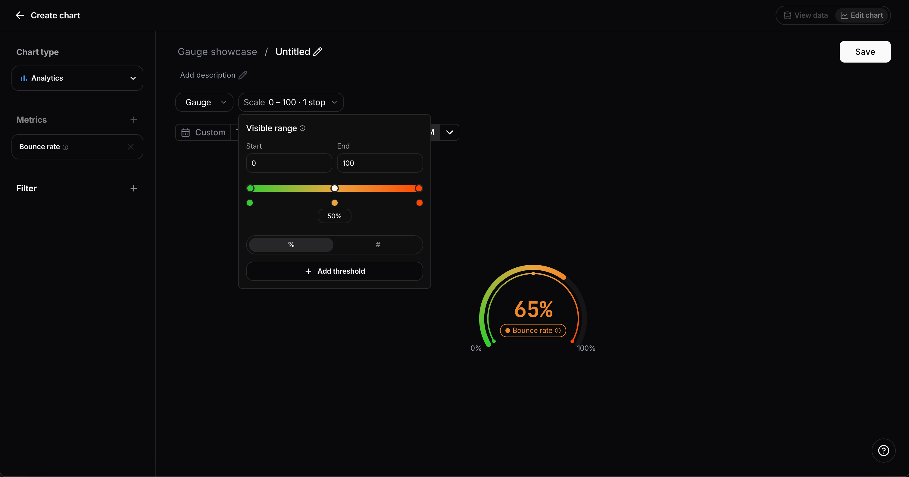 Gauge shows where a value sits on your defined scale. Use **Metric** when you need comparison against the previous period.
## MCP Server: reports and charts
The Nebuly MCP Server can now create and update reports and charts.
You can ask your assistant to:
* Create and update reports, including their name, description, and favorite status
* Retrieve the content of a report
* Add analytics and table charts to a report
Get started at [MCP Server](/guides/mcp-server).
## AI Fluency Index (AIFI)
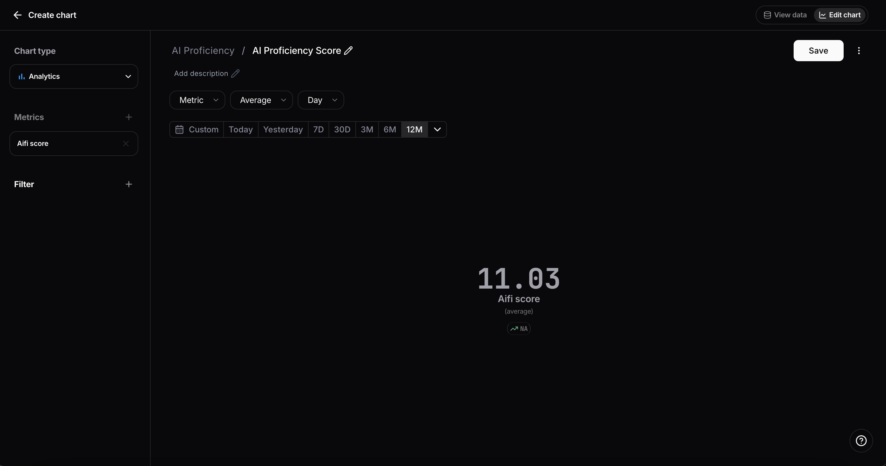
The AI Fluency Index (AIFI) is now available as a 0-100 score that helps you measure how effectively people interact with AI in real workflows.
AIFI is designed to make AI usage quality measurable and actionable so teams can:
* Track prompting quality improvements over time
* Identify users and groups that need enablement
* Measure the impact of coaching and process changes
* Report on proficiency, not just activity volume
Gauge shows where a value sits on your defined scale. Use **Metric** when you need comparison against the previous period.
## MCP Server: reports and charts
The Nebuly MCP Server can now create and update reports and charts.
You can ask your assistant to:
* Create and update reports, including their name, description, and favorite status
* Retrieve the content of a report
* Add analytics and table charts to a report
Get started at [MCP Server](/guides/mcp-server).
## AI Fluency Index (AIFI)
The AI Fluency Index (AIFI) is now available as a 0-100 score that helps you measure how effectively people interact with AI in real workflows.
AIFI is designed to make AI usage quality measurable and actionable so teams can:
* Track prompting quality improvements over time
* Identify users and groups that need enablement
* Measure the impact of coaching and process changes
* Report on proficiency, not just activity volume
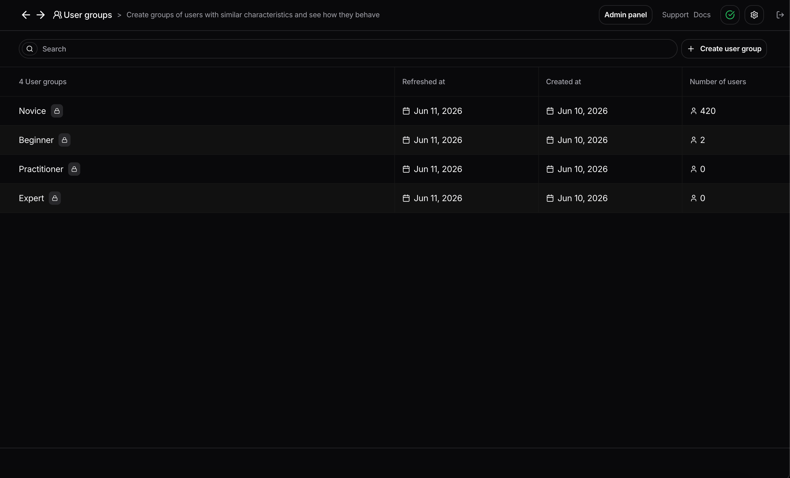
 ### System cohorts
We introduced platform-managed system cohorts for AI proficiency segmentation. These cohorts are created and maintained automatically per project, so they stay consistent and always up to date.
Proficiency levels:
* Expert
* Practitioner
* Beginner
* Novice
Cohort assignment is based on each user's AIFI score:
* 85 and above: Expert
* 65 to 84: Practitioner
* 40 to 64: Beginner
* Below 40: Novice
These cohorts refresh automatically every day and are intended for reporting, segmentation, and training insights. They are system-governed and behave differently from regular user-created cohorts.
### System cohorts
We introduced platform-managed system cohorts for AI proficiency segmentation. These cohorts are created and maintained automatically per project, so they stay consistent and always up to date.
Proficiency levels:
* Expert
* Practitioner
* Beginner
* Novice
Cohort assignment is based on each user's AIFI score:
* 85 and above: Expert
* 65 to 84: Practitioner
* 40 to 64: Beginner
* Below 40: Novice
These cohorts refresh automatically every day and are intended for reporting, segmentation, and training insights. They are system-governed and behave differently from regular user-created cohorts.
 ## Claude Compliance integration
You can now sync Claude conversation data from Anthropic's Claude Compliance API directly into Nebuly.
A self-hosted Python script pulls conversations from your Claude Enterprise organization and converts them into Nebuly Interactions, so Claude usage shows up alongside the rest of your analytics. The sync:
* Pulls conversation data via the Claude Compliance API
* Converts each user/assistant message pair into a Nebuly Interaction
* Tracks already-synced data locally to avoid duplicates, so it is incremental and safe to re-run
* Supports filtering by date range and a dry-run mode to preview before ingesting
See the [Claude Compliance integration guide](/integrations/claude-compliance/claude-compliance) to get started.
## Microsoft 365 Copilot integration
You can now sync Microsoft 365 Copilot Enterprise interactions from Microsoft Graph into Nebuly.
A self-hosted Python script reads licensed users and their Copilot interactions, converts prompt/response pairs into Nebuly Interactions, and tracks synced coverage locally so the sync is incremental and safe to re-run. The integration supports date-range filtering and dry-run previews before ingesting data.
See the [Microsoft 365 Copilot integration guide](/integrations/microsoft-copilot/microsoft-copilot) to get started.
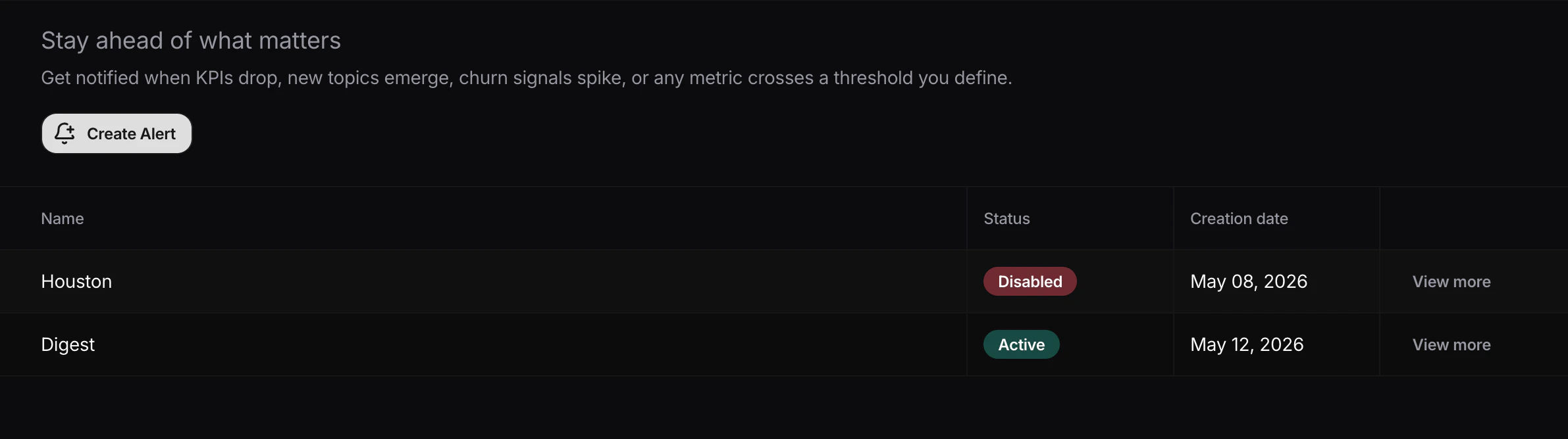
## Alerts
You can now configure alerts directly from **Settings > Alerts**. Here you can see all the organization alerts:
## Claude Compliance integration
You can now sync Claude conversation data from Anthropic's Claude Compliance API directly into Nebuly.
A self-hosted Python script pulls conversations from your Claude Enterprise organization and converts them into Nebuly Interactions, so Claude usage shows up alongside the rest of your analytics. The sync:
* Pulls conversation data via the Claude Compliance API
* Converts each user/assistant message pair into a Nebuly Interaction
* Tracks already-synced data locally to avoid duplicates, so it is incremental and safe to re-run
* Supports filtering by date range and a dry-run mode to preview before ingesting
See the [Claude Compliance integration guide](/integrations/claude-compliance/claude-compliance) to get started.
## Microsoft 365 Copilot integration
You can now sync Microsoft 365 Copilot Enterprise interactions from Microsoft Graph into Nebuly.
A self-hosted Python script reads licensed users and their Copilot interactions, converts prompt/response pairs into Nebuly Interactions, and tracks synced coverage locally so the sync is incremental and safe to re-run. The integration supports date-range filtering and dry-run previews before ingesting data.
See the [Microsoft 365 Copilot integration guide](/integrations/microsoft-copilot/microsoft-copilot) to get started.
## Alerts
You can now configure alerts directly from **Settings > Alerts**. Here you can see all the organization alerts:
 There are two kinds of alerts.
### Threshold alerts
Trigger a notification when a metric crosses a value you define. The current available metrics are **Error Rate**, **Business Risk** and **Topics**.
For each threshold alert you configure:
* Condition: greater than / less than
* Threshold: 1–100%
* Time window: last 24 hours, 7 days, 30 days
* Topics to monitor (for topic alerts)
### Recurring summaries
Receive a periodic digest of a project activity on a daily or weekly schedule, starting from a date and time you choose.
There are two kinds of alerts.
### Threshold alerts
Trigger a notification when a metric crosses a value you define. The current available metrics are **Error Rate**, **Business Risk** and **Topics**.
For each threshold alert you configure:
* Condition: greater than / less than
* Threshold: 1–100%
* Time window: last 24 hours, 7 days, 30 days
* Topics to monitor (for topic alerts)
### Recurring summaries
Receive a periodic digest of a project activity on a daily or weekly schedule, starting from a date and time you choose.
 Alerts are delivered via Slack or Microsoft Teams webhooks. You can find out how to create webhooks on the official guides of [slack](https://docs.slack.dev/messaging/sending-messages-using-incoming-webhooks/) and [teams](https://support.microsoft.com/en-us/office/send-messages-in-teams-using-incoming-webhooks-323660ec-12ca-40b1-a1d3-a3df47e808c4).
## RBAC improvements in Settings
We revamped the **Members** page in **Settings** to improve role and access management across large workspaces.
What's new:
* Pagination support in the members table
* Role-based filtering to quickly find users by permission level
* Ability to update user roles directly from settings
* Ability to update each user's project access from settings
* Ability to invite new users with a specific role from the invite flow
For self-hosted setups take a look at the [relative documentation](/self-hosting/authentication#roles-and-permissions) for more details.
## MCP Server (Beta)
The Nebuly MCP Server is now available in beta. It allows you to connect Claude and other MCP-compatible AI assistants directly to your Nebuly data, enabling natural language queries over your interactions, conversations, and analytics.
Get started at [MCP Server](/guides/mcp-server)
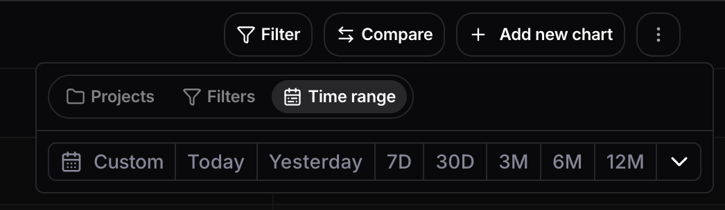
## Compare reports across time ranges
You can now use the comparison feature in reports to compare two distinct time ranges side by side. This makes it easier to measure changes across custom periods and spot differences in key metrics at a glance.
To get started, open a report and click **Compare** in the top-right corner. In the comparison panel, you can now choose **Time range** as the comparison type.
Alerts are delivered via Slack or Microsoft Teams webhooks. You can find out how to create webhooks on the official guides of [slack](https://docs.slack.dev/messaging/sending-messages-using-incoming-webhooks/) and [teams](https://support.microsoft.com/en-us/office/send-messages-in-teams-using-incoming-webhooks-323660ec-12ca-40b1-a1d3-a3df47e808c4).
## RBAC improvements in Settings
We revamped the **Members** page in **Settings** to improve role and access management across large workspaces.
What's new:
* Pagination support in the members table
* Role-based filtering to quickly find users by permission level
* Ability to update user roles directly from settings
* Ability to update each user's project access from settings
* Ability to invite new users with a specific role from the invite flow
For self-hosted setups take a look at the [relative documentation](/self-hosting/authentication#roles-and-permissions) for more details.
## MCP Server (Beta)
The Nebuly MCP Server is now available in beta. It allows you to connect Claude and other MCP-compatible AI assistants directly to your Nebuly data, enabling natural language queries over your interactions, conversations, and analytics.
Get started at [MCP Server](/guides/mcp-server)
## Compare reports across time ranges
You can now use the comparison feature in reports to compare two distinct time ranges side by side. This makes it easier to measure changes across custom periods and spot differences in key metrics at a glance.
To get started, open a report and click **Compare** in the top-right corner. In the comparison panel, you can now choose **Time range** as the comparison type.
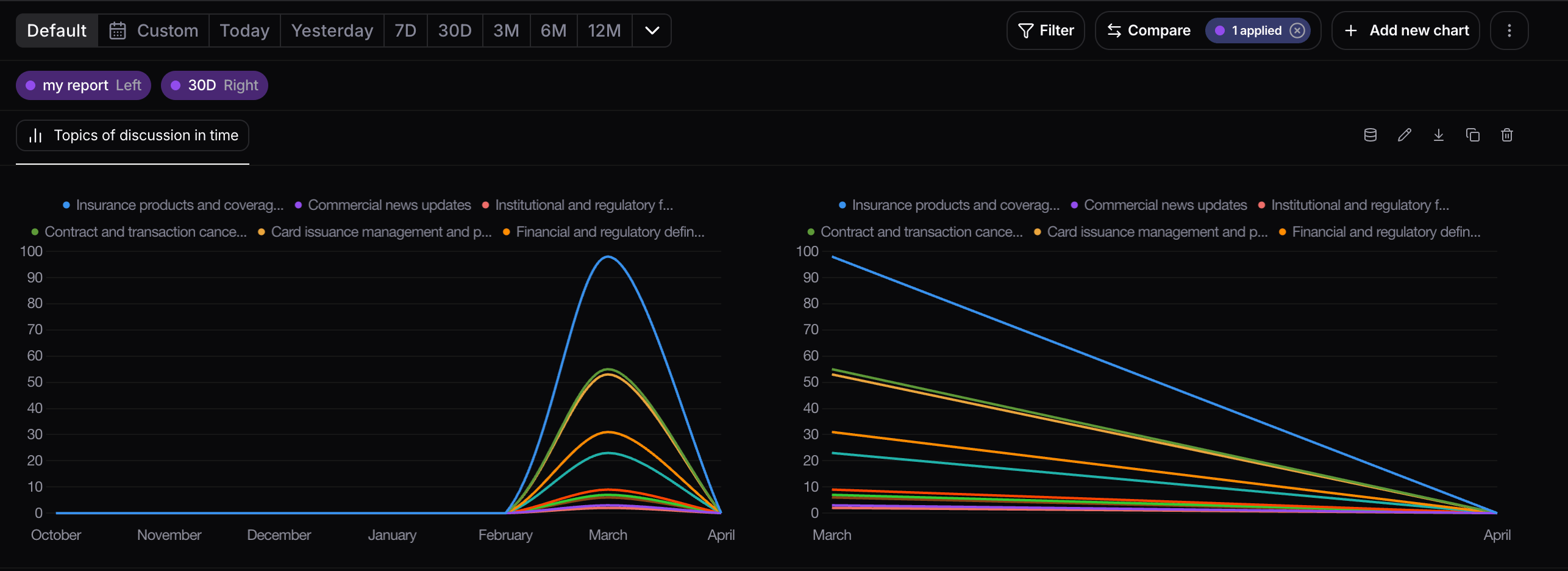
 When time-range comparison is enabled, each chart shows the original data on the left and the compared time range on the right, making it easier to inspect differences chart by chart.
 ## Manual labels for interactions and conversations
You can now manually label interactions and conversations directly in the UI. These labels can then be exported.
Labels are project-specific, and interaction labels are separate from conversation labels, so the two do not share the same label assignments.
There are two ways to add, remove, or create labels.
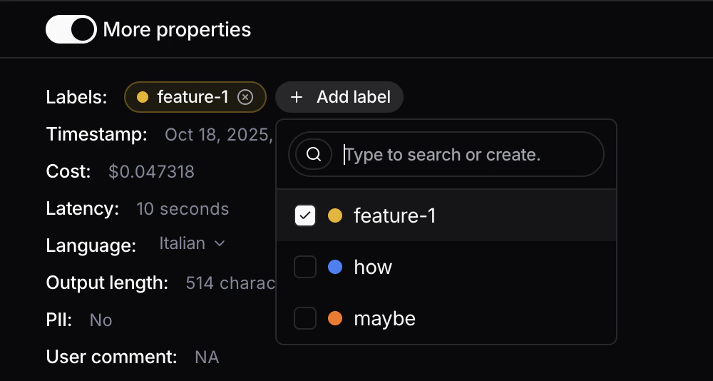
The first is from the details view of an interaction or conversation: scroll down to **More properties**, click **Add label**, then type to search for an existing label or create a new one.
## Manual labels for interactions and conversations
You can now manually label interactions and conversations directly in the UI. These labels can then be exported.
Labels are project-specific, and interaction labels are separate from conversation labels, so the two do not share the same label assignments.
There are two ways to add, remove, or create labels.
The first is from the details view of an interaction or conversation: scroll down to **More properties**, click **Add label**, then type to search for an existing label or create a new one.
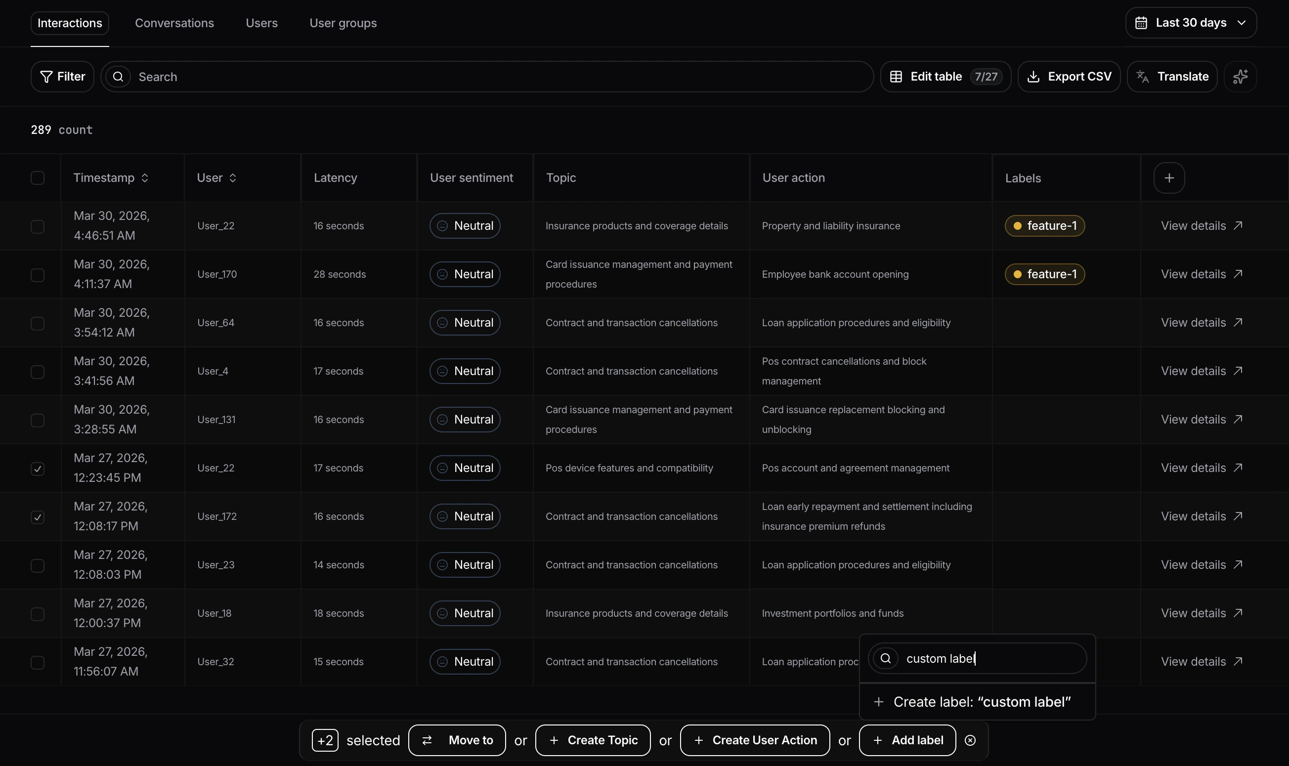
 The second is from the table view: select one or more interactions or conversations using the checkboxes, then click **Add label** and follow the same flow to add, remove, or create labels in bulk.
 ## Conversation health
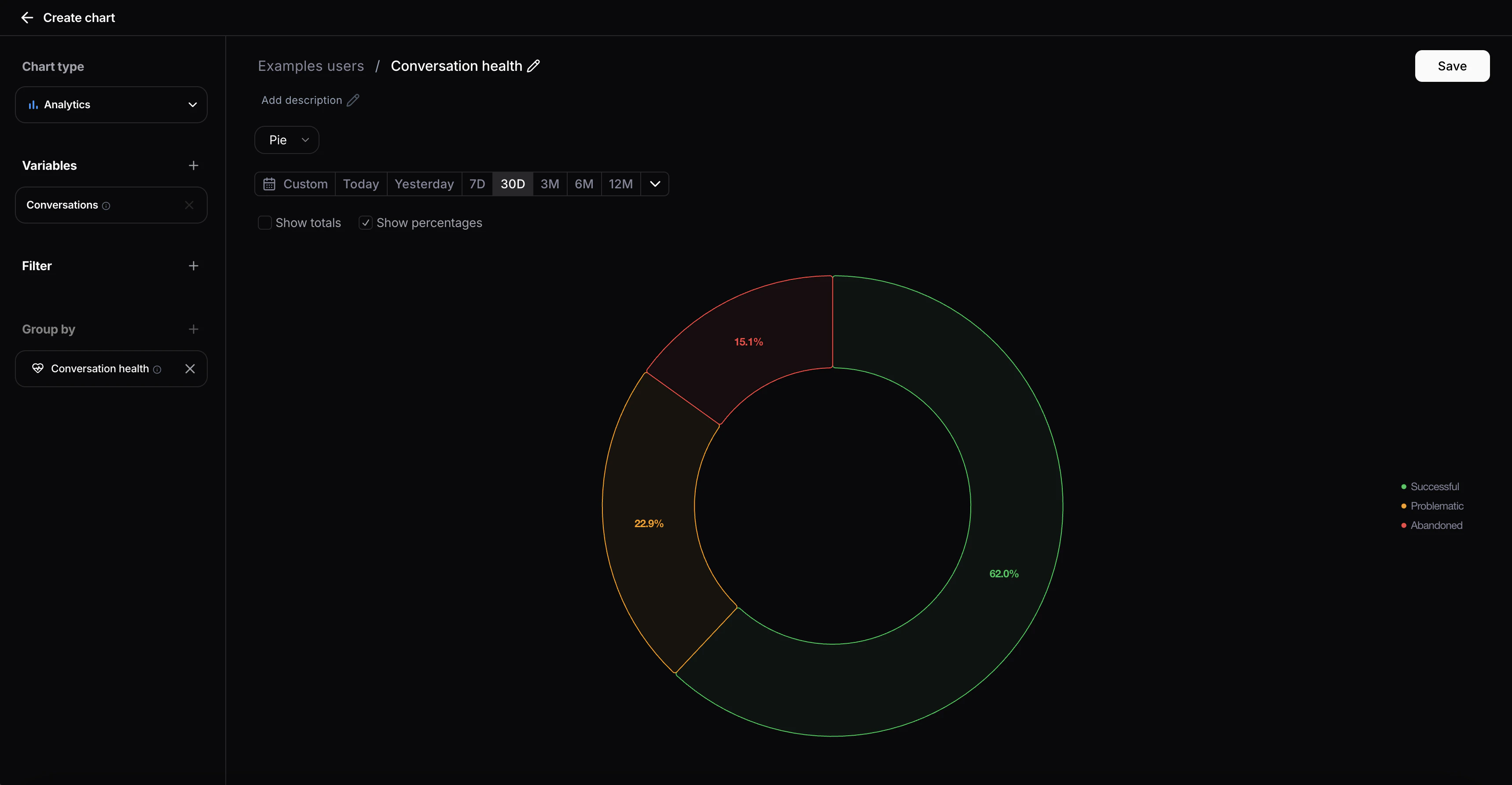
We introduced a new entity to track agent performance at the conversation level. Built on top of the existing error rate metric, Conversation Health classifies each conversation into one of three statuses:
* Successful — No errors detected during the conversation
* Problematic — One or more errors occurred within the conversation
* Abandoned — The user dropped off following an agent error
Conversation Health is now available as a filter across the entire platform and as a group-by dimension in all charts.
## Conversation health
We introduced a new entity to track agent performance at the conversation level. Built on top of the existing error rate metric, Conversation Health classifies each conversation into one of three statuses:
* Successful — No errors detected during the conversation
* Problematic — One or more errors occurred within the conversation
* Abandoned — The user dropped off following an agent error
Conversation Health is now available as a filter across the entire platform and as a group-by dimension in all charts.
 ## Interaction events on homepage charts
You can now view interaction events directly on homepage charts, just like in reports charts.
This includes events already available in your project, and events can be added or removed directly from the chart.
## Interaction events on homepage charts
You can now view interaction events directly on homepage charts, just like in reports charts.
This includes events already available in your project, and events can be added or removed directly from the chart.
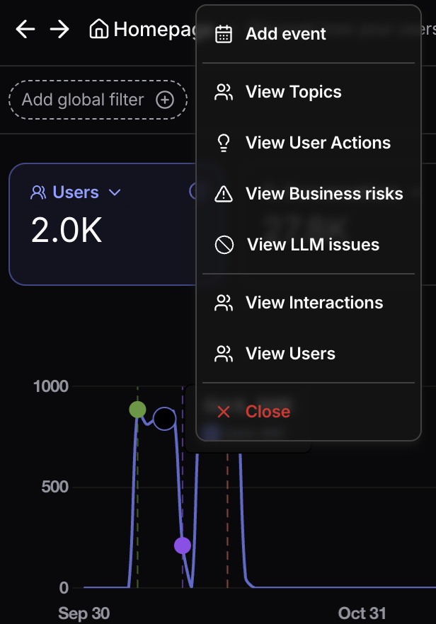
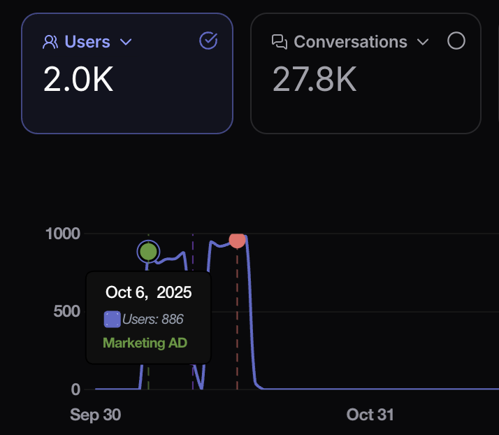 When you click a datapoint in the chart, a context menu opens with quick actions, including **Add event** or **Remove event**.
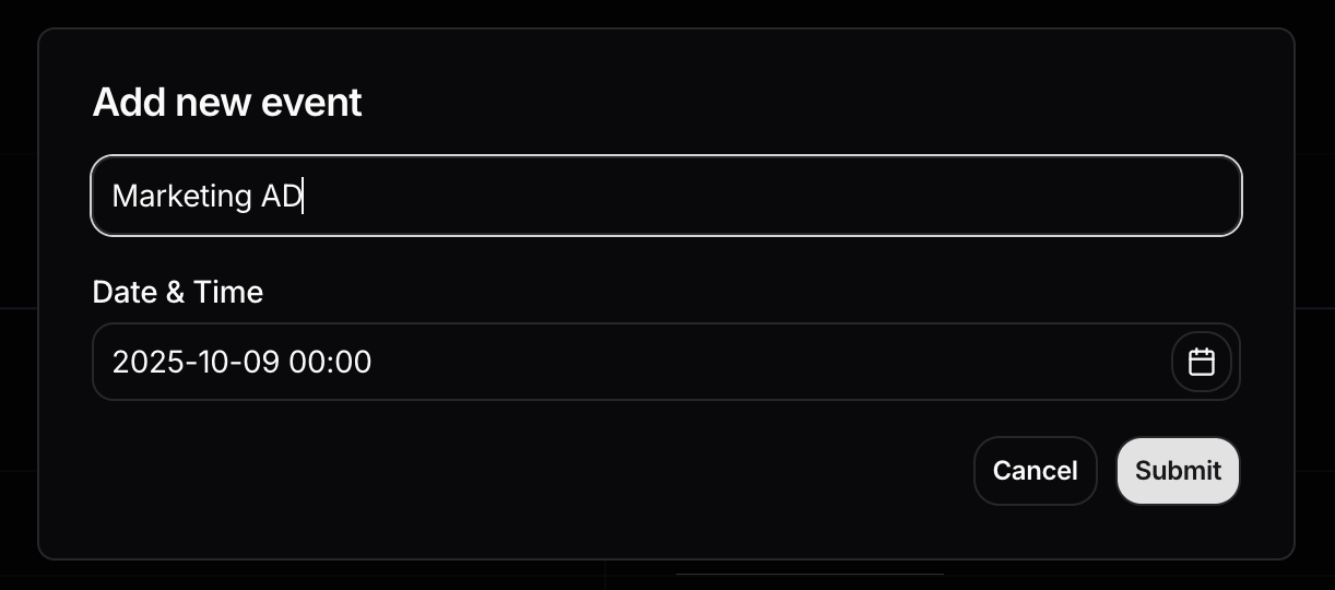
 Selecting **Add event** opens a modal form where you can enter the event name and date.
 ## Chart Targets
You can now overlay goal lines on line charts using the new **Target** section in the chart sidebar. Up to 5 targets can be added simultaneously, each displayed with a distinct color matching its line on the chart.
Two target types are supported:
* **Growth target** — projects a trend line starting from a chosen date, based on a growth rate (absolute or percentage) applied per a configurable time granularity (minute / hour / day / week / month / year).
* **Fixed target** — draws a constant horizontal reference line at a specified value across the entire chart.
## Chart Targets
You can now overlay goal lines on line charts using the new **Target** section in the chart sidebar. Up to 5 targets can be added simultaneously, each displayed with a distinct color matching its line on the chart.
Two target types are supported:
* **Growth target** — projects a trend line starting from a chosen date, based on a growth rate (absolute or percentage) applied per a configurable time granularity (minute / hour / day / week / month / year).
* **Fixed target** — draws a constant horizontal reference line at a specified value across the entire chart.
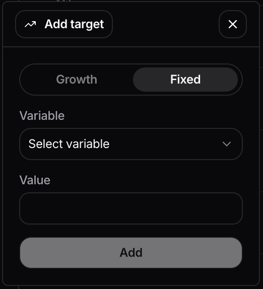
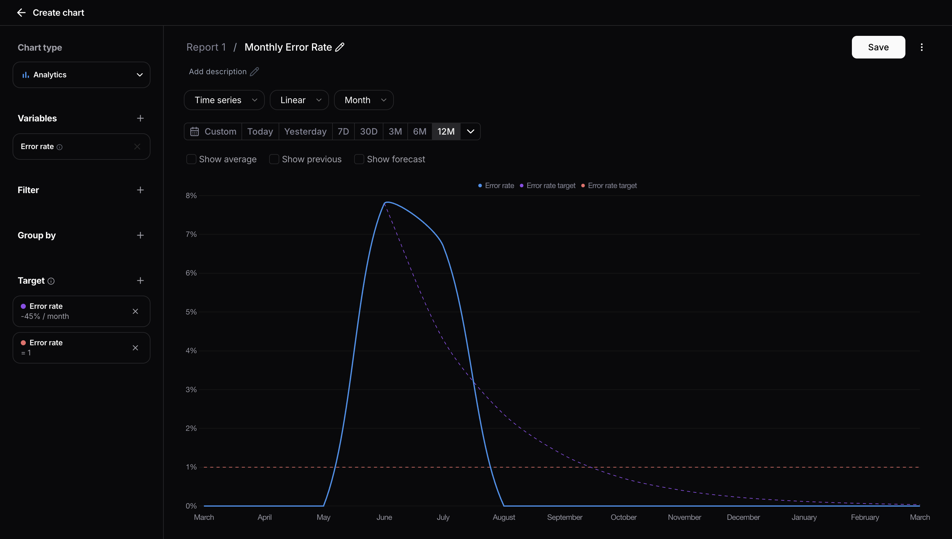 To add a target, open the sidebar and click the **Add target** button in the Target section. A popover will appear where you can configure the target type and its parameters.
For growth targets, choose a start date using the calendar picker, set the growth rate, the desired granularity, and select whether it is absolute or percentage-based.
To add a target, open the sidebar and click the **Add target** button in the Target section. A popover will appear where you can configure the target type and its parameters.
For growth targets, choose a start date using the calendar picker, set the growth rate, the desired granularity, and select whether it is absolute or percentage-based.
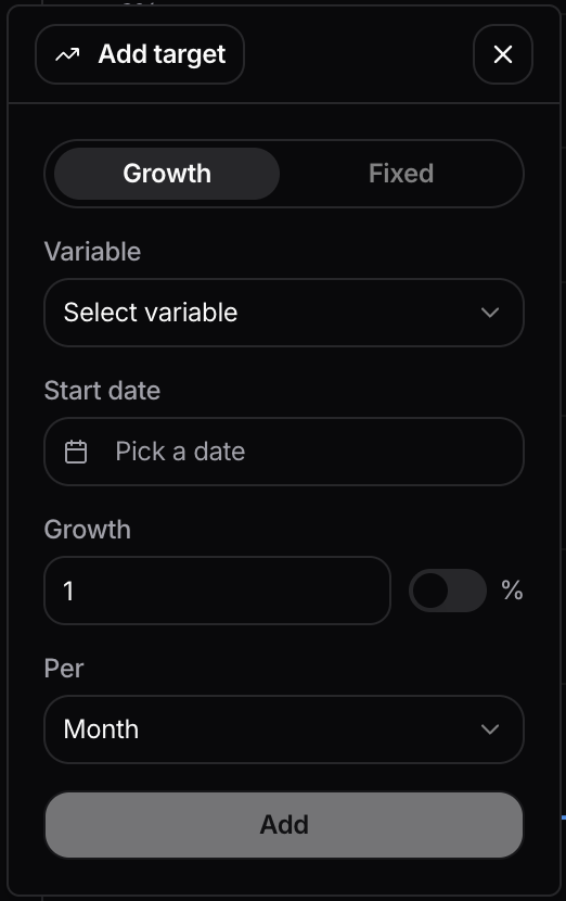 For fixed targets, simply enter the constant value to display as a horizontal reference line.
 ## Group by time in table charts
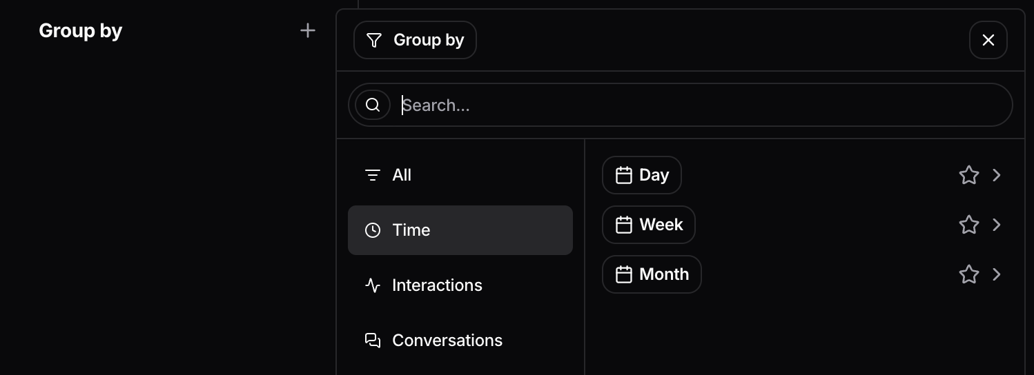
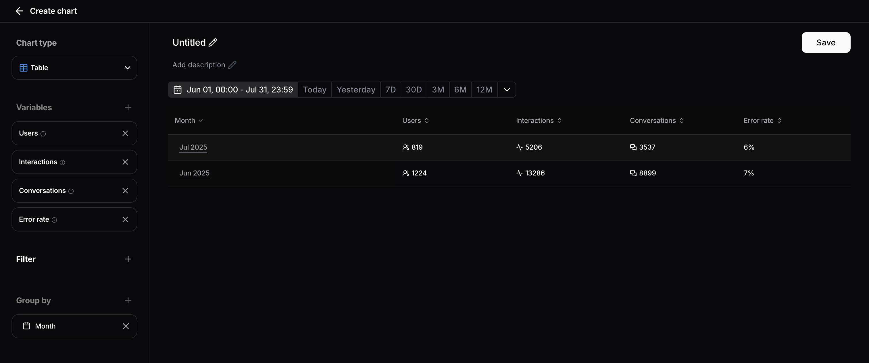
You can now aggregate **table data** by **time** granularity, enabling time-series data to be visualized in tabular format. This allows you to track how multiple variables change over time across different time intervals:
## Group by time in table charts
You can now aggregate **table data** by **time** granularity, enabling time-series data to be visualized in tabular format. This allows you to track how multiple variables change over time across different time intervals:
- Month-over-month
- Week-over-week
- Day-over-day
To get started, navigate to your table settings and select the desired time granularity from the aggregation options.
 ## Input and Output Token Variables
You can now track input and output token consumption directly in the report section and interaction table. Add the "Input Token" and "Output Token" variables to your charts to monitor LLM trace data.
Note: these values come from what's passed through the Interaction API, so if they aren't provided there, they'll appear as 0.
## Output Length Metric to Chart Variables
A new chart variable is now available to measure output length in characters, allowing users to track how verbose model responses are over time.
## New Failure Category: Thumbs Down
A new failure category has been added that automatically groups all interactions receiving a thumbs down into a dedicated category for easier analysis and reporting.
## Custom Variables for Analytics and Table Charts
Users can now define custom variables when creating or editing a chart. Custom variables support mathematical formulas, allowing customers to express calculations that were not possible with built-in variables. Formulas can reference both built-in and custom variables, and filters can be applied as usual, enabling businesses to track their metrics that matter most to their usage.
## AI Summary available in multiple Languages
AI summaries can be generated in different languages now.
In order to change the language you need to open the project settings and click on “Summary Language”.
## Input and Output Token Variables
You can now track input and output token consumption directly in the report section and interaction table. Add the "Input Token" and "Output Token" variables to your charts to monitor LLM trace data.
Note: these values come from what's passed through the Interaction API, so if they aren't provided there, they'll appear as 0.
## Output Length Metric to Chart Variables
A new chart variable is now available to measure output length in characters, allowing users to track how verbose model responses are over time.
## New Failure Category: Thumbs Down
A new failure category has been added that automatically groups all interactions receiving a thumbs down into a dedicated category for easier analysis and reporting.
## Custom Variables for Analytics and Table Charts
Users can now define custom variables when creating or editing a chart. Custom variables support mathematical formulas, allowing customers to express calculations that were not possible with built-in variables. Formulas can reference both built-in and custom variables, and filters can be applied as usual, enabling businesses to track their metrics that matter most to their usage.
## AI Summary available in multiple Languages
AI summaries can be generated in different languages now.
In order to change the language you need to open the project settings and click on “Summary Language”.
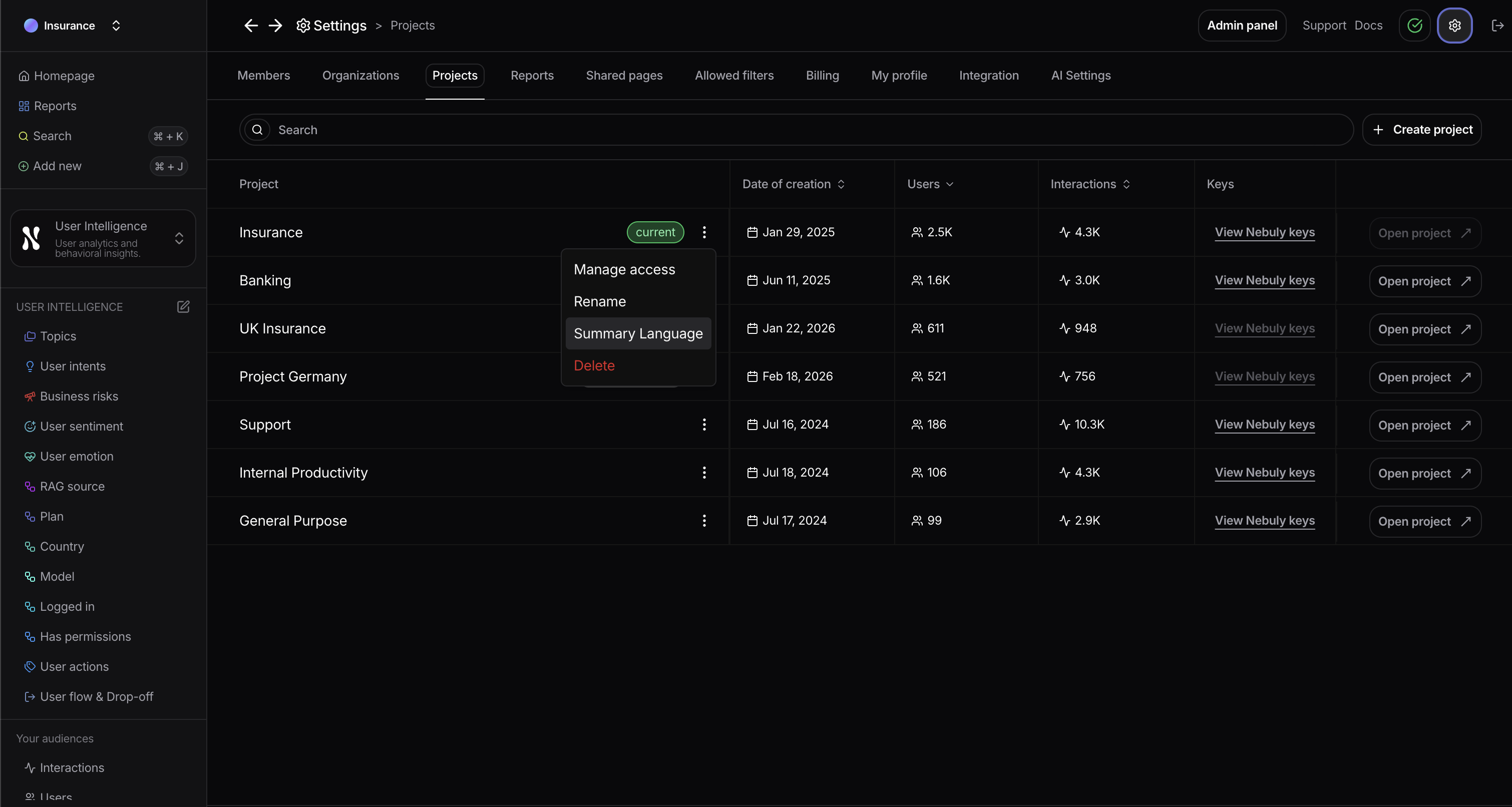 The button will open a dialog where users can chose the language to be used for all AI summaries in that project.
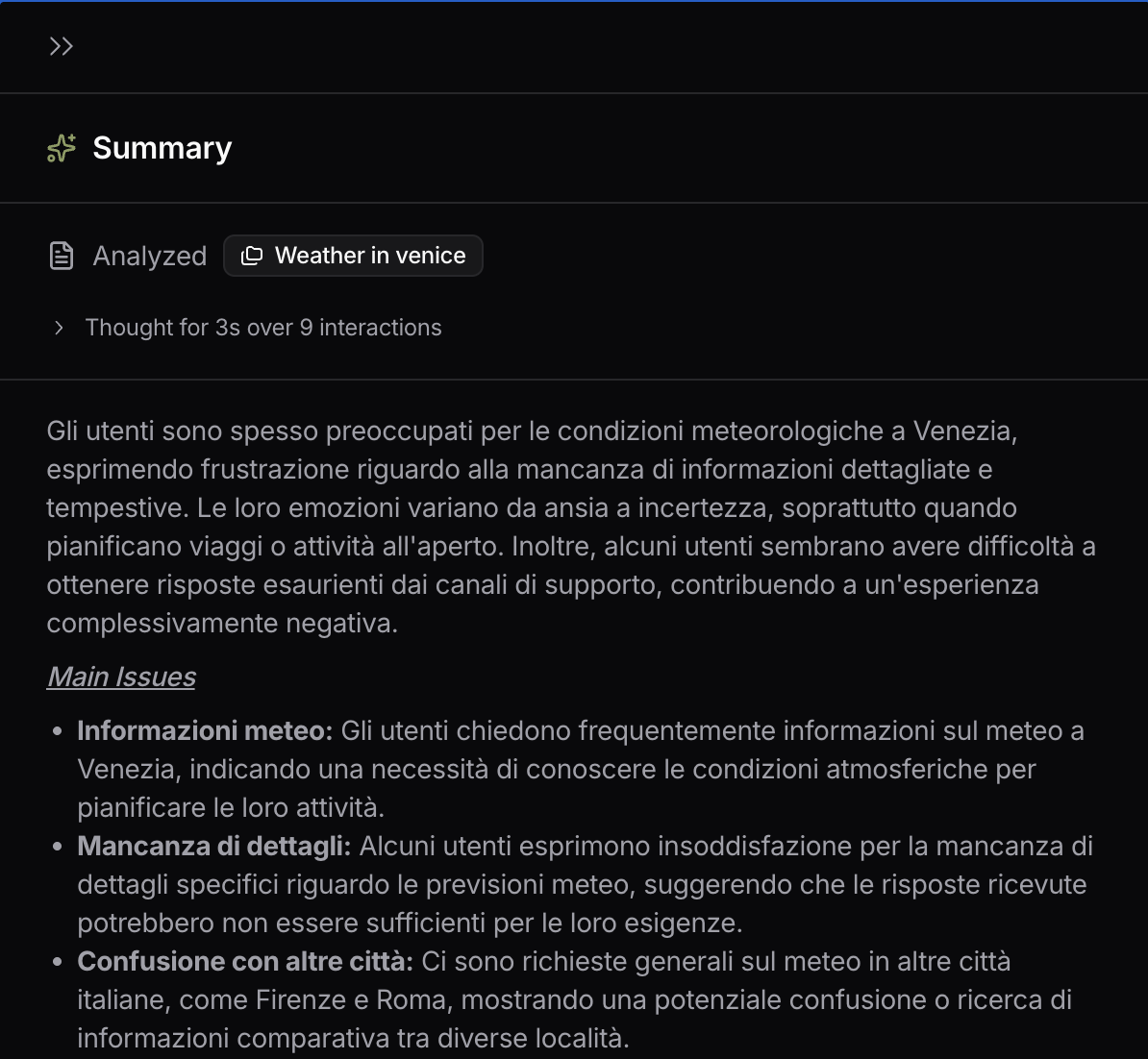
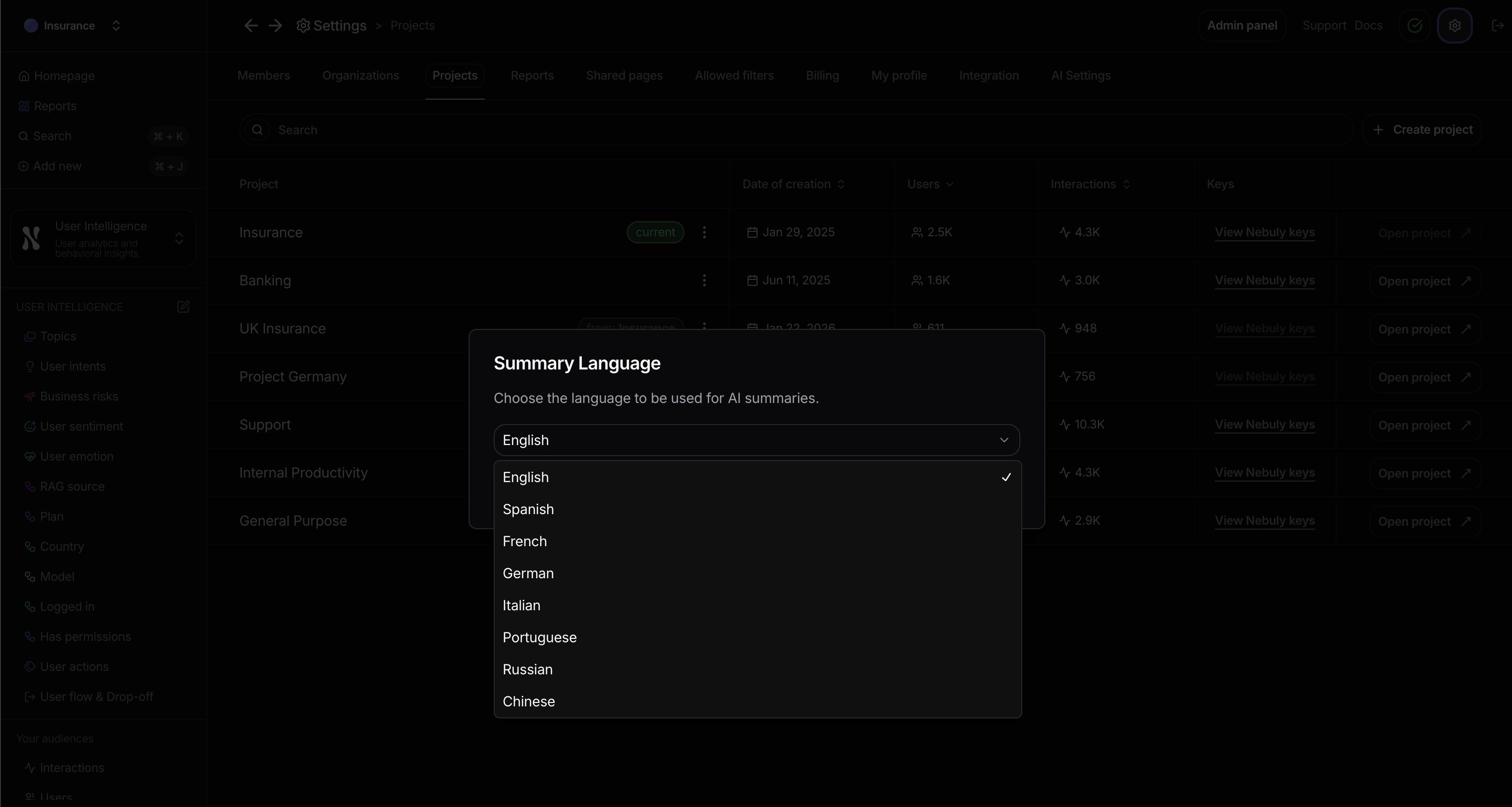 For example, after changing the language to Italian, the summary for a topic called “Weather in Venice” looks like this:
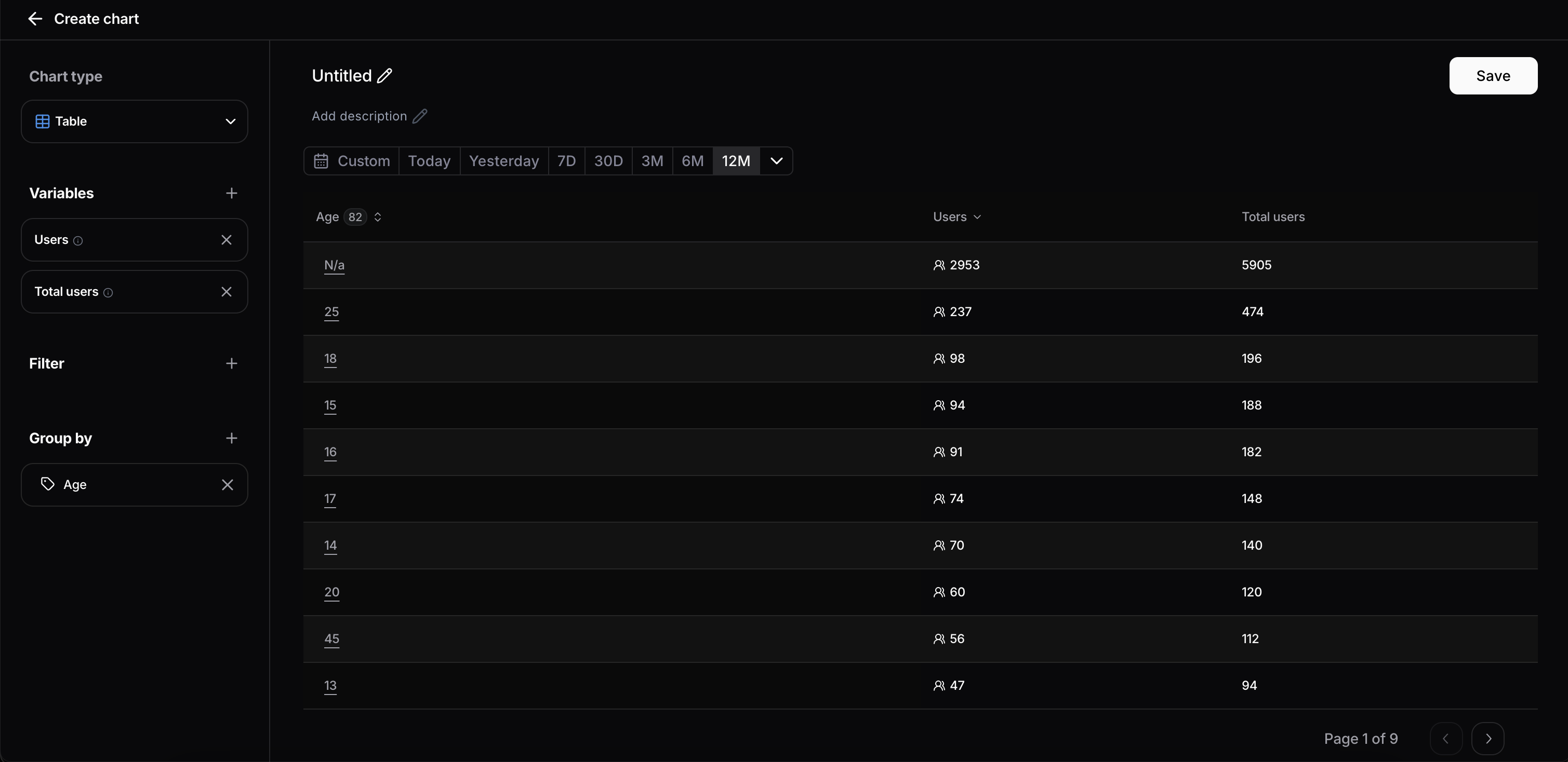
 ## Total Users variable
Added new variable Total Users which computes the total number of users without applying the time range / filters. The variable is usable inside custom variables, but only tags are available as breakdown. If this variable is used among another group ( ex. topic ) the visualized value will always be total users for that project.
## Total Users variable
Added new variable Total Users which computes the total number of users without applying the time range / filters. The variable is usable inside custom variables, but only tags are available as breakdown. If this variable is used among another group ( ex. topic ) the visualized value will always be total users for that project.
 ## Nebuly-Langfuse native integration
We've launched a native integration that lets teams ingest Langfuse observability data directly into Nebuly for user analytics.
What's new:
* Full integration option: Nebuly automatically pulls traces from your Langfuse account daily (interval configurable). API keys are securely stored in encrypted vaults.
* Local integration option: Use open-source Python scripts to extract and transform data in your own infrastructure. Full control over data residency and enrichment.
* Seamless data flow: No changes to your existing Langfuse instrumentation. Traces flow automatically to Nebuly for user intent, sentiment, and adoption analysis.
* Tag-based segmentation: Use Langfuse tags to add user context (segment, geography, cohort, role). Analyze adoption by any dimension that matters.
Get started at [Langfuse integration](/integrations/langfuse)
## Nebuly-Langfuse native integration
We've launched a native integration that lets teams ingest Langfuse observability data directly into Nebuly for user analytics.
What's new:
* Full integration option: Nebuly automatically pulls traces from your Langfuse account daily (interval configurable). API keys are securely stored in encrypted vaults.
* Local integration option: Use open-source Python scripts to extract and transform data in your own infrastructure. Full control over data residency and enrichment.
* Seamless data flow: No changes to your existing Langfuse instrumentation. Traces flow automatically to Nebuly for user intent, sentiment, and adoption analysis.
* Tag-based segmentation: Use Langfuse tags to add user context (segment, geography, cohort, role). Analyze adoption by any dimension that matters.
Get started at [Langfuse integration](/integrations/langfuse)