> ## Documentation Index
> Fetch the complete documentation index at: https://docs.nebuly.com/llms.txt
> Use this file to discover all available pages before exploring further.
# Analytics and table charts
You can configure your analytics and table charts by selecting the **metrics** you want to measure, applying **filters** to narrow the dataset, and choosing one or more **group by** dimensions to break down the results. As you update the configuration, the chart preview refreshes automatically so you can immediately see the impact of your changes.
## Main Settings
### Metrics
Every chart starts with one or more **metrics**. A metric defines the value you want to measure, such as the number of conversations, AI cost, error rate, activation rate, or hours saved. Read more about key metrics [here](/guides/key-metrics).
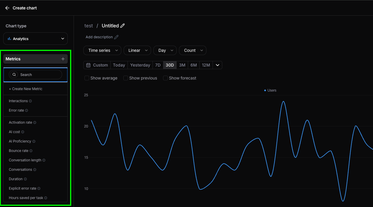
Click the **+** button in the **Metrics** section to add a metric to your chart. You can search for an existing metric or create a new custom metric by selecting **Create New Metric**. For more info about how to create new metrics, read [here](/custom-metrics).
A single chart can contain multiple metrics, allowing you to compare related values in the same visualization. For example, you might display **Conversations** and **Users** together to understand how user growth relates to overall activity.
Use the search bar to quickly find metrics in large workspaces, or browse the list of available metrics.
 ### Filters
Filters let you narrow the dataset used to calculate your chart. Instead of measuring all available data, you can restrict the analysis to a specific subset, such as a user sentiment, topic, or any other supported dimension.
For example, you can create a chart that only includes conversations where the **average user sentiment is Negative** and the conversation contains **more than 5 turns**. This allows you to focus your analysis on a specific subset of interactions that match your criteria.
To learn more about filters, see [here](/guides/platform/filters).
### Filters
Filters let you narrow the dataset used to calculate your chart. Instead of measuring all available data, you can restrict the analysis to a specific subset, such as a user sentiment, topic, or any other supported dimension.
For example, you can create a chart that only includes conversations where the **average user sentiment is Negative** and the conversation contains **more than 5 turns**. This allows you to focus your analysis on a specific subset of interactions that match your criteria.
To learn more about filters, see [here](/guides/platform/filters).
 ### Group By
Use **Group by** to break down a metric across one or more dimensions. Instead of showing a single total, the chart separates the results into categories so you can compare how the metric varies across your data.
For example, you can group **Users** by **Average user sentiment** to see how many users had predominantly **Neutral** conversations versus **Negative** ones.
The order of the selected dimensions determines how the data is organized. The first dimension creates the primary groups, while additional dimensions create nested breakdowns within them.
For filters and group-by dimensions, every attribute on an interaction or conversation is available, including all the [tags](/guides/tags) you sent at ingestion.
### Group By
Use **Group by** to break down a metric across one or more dimensions. Instead of showing a single total, the chart separates the results into categories so you can compare how the metric varies across your data.
For example, you can group **Users** by **Average user sentiment** to see how many users had predominantly **Neutral** conversations versus **Negative** ones.
The order of the selected dimensions determines how the data is organized. The first dimension creates the primary groups, while additional dimensions create nested breakdowns within them.
For filters and group-by dimensions, every attribute on an interaction or conversation is available, including all the [tags](/guides/tags) you sent at ingestion.
 ### Time range
Every chart has its own **time period**, which defines the window of data included in the analysis. Changing the time period updates all metrics, filters, and groupings to use only data within the selected range.
You can choose from predefined ranges such as **Today**, **Last 7 days**, **Last 30 days**, **Last 12 months**, or define a **custom** date range.
To learn more about how time ranges work, see [here](/guides/platform/filters).
### Time range
Every chart has its own **time period**, which defines the window of data included in the analysis. Changing the time period updates all metrics, filters, and groupings to use only data within the selected range.
You can choose from predefined ranges such as **Today**, **Last 7 days**, **Last 30 days**, **Last 12 months**, or define a **custom** date range.
To learn more about how time ranges work, see [here](/guides/platform/filters).
 ## Analytics Charts Settings
The following settings are available when configuring an Analytics chart. Depending on the selected visualization, some settings may appear or not.
### Visualization
The **Visualization** determines how the results of your chart are displayed. Nebuly supports multiple visualization types, each optimized for a different kind of analysis.
Choose the visualization that best fits your data:
* **Time series** – Visualize trends over time.
* **Stacked time series** – Compare how multiple categories contribute to a total over time.
* **Horizontal bar chart** – Compare values across categories.
* **Metric** – Display a single KPI as a standalone value.
* **Gauge** – Display a KPI against a target or threshold.
* **Time series distribution** – Analyze how values are distributed over time.
* **Scatter plot** – Explore relationships between two variables.
* **Pie** – Show the proportion of each category within a whole.
### Aggregation
The **Aggregation** controls how values are calculated over time.
* **Linear** displays the value for each time interval independently. For example, if you're grouping by day, each point shows the metric for that specific day.
* **Cumulative** displays a running total, where each point includes the values from all previous time intervals.
Use **Linear** to analyze day-to-day, weekly, or monthly changes, and **Cumulative** to track overall growth or progress over time.
### Time granularity
For time-series charts, you can control the **granularity** of the buckets independently from the time range you're looking at. Granularity options include **hour**, **day**, **week**, **month**, and **quarter**.
### Number of bars (horizontal bar charts)
Horizontal bar charts with a **Group by** include a **Number of bars** field in the configuration panel. It caps how many bars are rendered, which is especially useful for export, since a chart with dozens of bars can become unreadable as a PNG.
The field appears once a **Group by** is selected. Pick a preset (**No limit**, **5**, **10**, or **15**) or type a custom number. When you export the chart as PNG or CSV, only the configured number of bars is included.
### Value type
The **Value type** controls how metric values are displayed.
* **Count** displays the raw value of the selected metric.
* **Percentage** displays each value as a percentage of the total, making it easier to compare the relative contribution of each category.
For example, when grouping **Conversations** by **User sentiment**, **Count** shows the total number of conversations in each sentiment, while **Percentage** shows what share of all conversations each sentiment represents.
## Analytics Charts Settings
The following settings are available when configuring an Analytics chart. Depending on the selected visualization, some settings may appear or not.
### Visualization
The **Visualization** determines how the results of your chart are displayed. Nebuly supports multiple visualization types, each optimized for a different kind of analysis.
Choose the visualization that best fits your data:
* **Time series** – Visualize trends over time.
* **Stacked time series** – Compare how multiple categories contribute to a total over time.
* **Horizontal bar chart** – Compare values across categories.
* **Metric** – Display a single KPI as a standalone value.
* **Gauge** – Display a KPI against a target or threshold.
* **Time series distribution** – Analyze how values are distributed over time.
* **Scatter plot** – Explore relationships between two variables.
* **Pie** – Show the proportion of each category within a whole.
### Aggregation
The **Aggregation** controls how values are calculated over time.
* **Linear** displays the value for each time interval independently. For example, if you're grouping by day, each point shows the metric for that specific day.
* **Cumulative** displays a running total, where each point includes the values from all previous time intervals.
Use **Linear** to analyze day-to-day, weekly, or monthly changes, and **Cumulative** to track overall growth or progress over time.
### Time granularity
For time-series charts, you can control the **granularity** of the buckets independently from the time range you're looking at. Granularity options include **hour**, **day**, **week**, **month**, and **quarter**.
### Number of bars (horizontal bar charts)
Horizontal bar charts with a **Group by** include a **Number of bars** field in the configuration panel. It caps how many bars are rendered, which is especially useful for export, since a chart with dozens of bars can become unreadable as a PNG.
The field appears once a **Group by** is selected. Pick a preset (**No limit**, **5**, **10**, or **15**) or type a custom number. When you export the chart as PNG or CSV, only the configured number of bars is included.
### Value type
The **Value type** controls how metric values are displayed.
* **Count** displays the raw value of the selected metric.
* **Percentage** displays each value as a percentage of the total, making it easier to compare the relative contribution of each category.
For example, when grouping **Conversations** by **User sentiment**, **Count** shows the total number of conversations in each sentiment, while **Percentage** shows what share of all conversations each sentiment represents.
 ### Display options
Analytics charts include optional display settings that add additional context to your visualizations.
* **Show average** displays the average value of the selected metric across the time period as a reference line.
* **Show previous** overlays data from the previous equivalent time period, making it easy to compare current performance against historical values.
* **Show forecast** extends the chart with a projected trend based on historical data, helping you estimate future performance.
### Targets
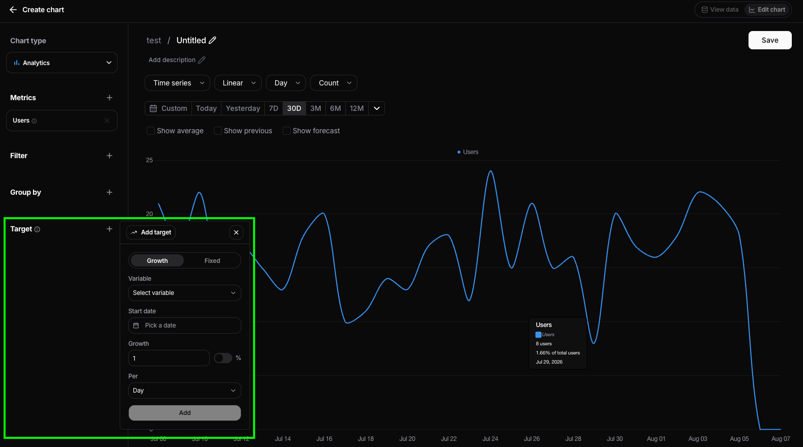
Targets let you define a goal for a metric and visualize progress toward it directly in your chart. This makes it easy to compare actual performance against expected outcomes over time.
Nebuly supports two types of targets:
* **Growth target** – Defines a target that increases over time by a fixed amount or percentage. For example, increase **Users** by **15 per day** or **5% per month**.
* **Fixed target** – Defines a constant value that the metric should reach or maintain throughout the selected time period.
Each target is associated with a metric and can be configured with a start date, growth rate (if applicable), and time interval. Once added, the target is displayed alongside the chart, making it easy to monitor progress and identify whether performance is above or below expectations.
### Display options
Analytics charts include optional display settings that add additional context to your visualizations.
* **Show average** displays the average value of the selected metric across the time period as a reference line.
* **Show previous** overlays data from the previous equivalent time period, making it easy to compare current performance against historical values.
* **Show forecast** extends the chart with a projected trend based on historical data, helping you estimate future performance.
### Targets
Targets let you define a goal for a metric and visualize progress toward it directly in your chart. This makes it easy to compare actual performance against expected outcomes over time.
Nebuly supports two types of targets:
* **Growth target** – Defines a target that increases over time by a fixed amount or percentage. For example, increase **Users** by **15 per day** or **5% per month**.
* **Fixed target** – Defines a constant value that the metric should reach or maintain throughout the selected time period.
Each target is associated with a metric and can be configured with a start date, growth rate (if applicable), and time interval. Once added, the target is displayed alongside the chart, making it easy to monitor progress and identify whether performance is above or below expectations.