> ## Documentation Index
> Fetch the complete documentation index at: https://docs.nebuly.com/llms.txt
> Use this file to discover all available pages before exploring further.
# Reports
> Nebuly's flexible analytics workspace: build custom views, configure charts, forecast metrics, and share results.
**Reports** are Nebuly's flexible analytics workspace. They are the place where you build custom views, combine metrics that are unique to Nebuly (time saved, prompts-to-value, prompt quality, implicit feedback, business risks, error rate) with custom attributes about conversations, interactions, and users, and turn those views into recurring monitoring or one-off investigations.
To find where reports live in the interface (the Reports tab, the three sidebar sections, and the Reports Library), see [Navigating Nebuly](/guides/navigating-nebuly).
## How reports are organized
Every report belongs to one of three classes, shown as sections under the **Reports** tab in the sidebar:
* **Workspace**: reports shared across the platform with everyone on your team. Use this for the views your team monitors together, so everyone works from the same source of truth.
* **Private**: reports visible only to you. Use this for personal investigations or works in progress you're not ready to share.
* **Favorites**: your starred shortcuts. Favorites aren't a separate copy: starring any Workspace or Private report pins it here for quick access. The list is individual to each user, so your favorites don't affect anyone else's.
You set a report's visibility (Private or Workspace) when you create it, and you can star a report at any time to add it to Favorites. For where these sections appear in the interface, see [Navigating Nebuly](/guides/navigating-nebuly).
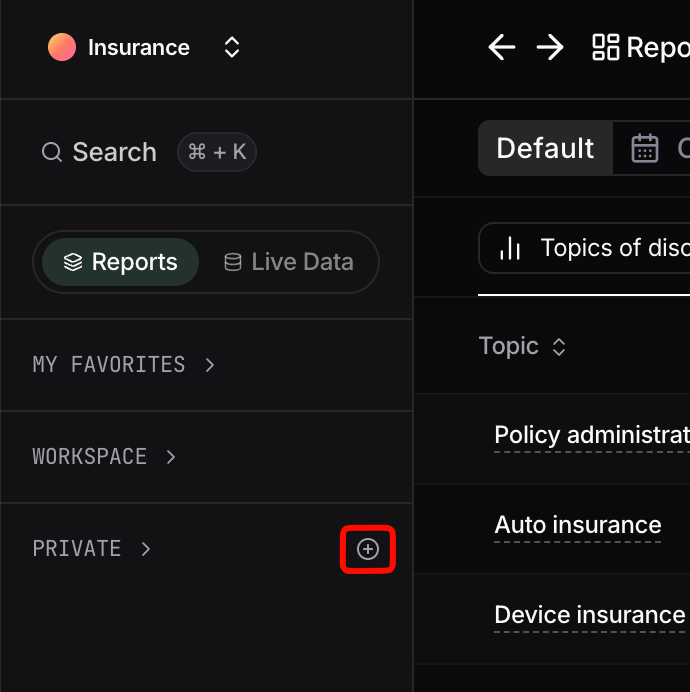
## Create a report
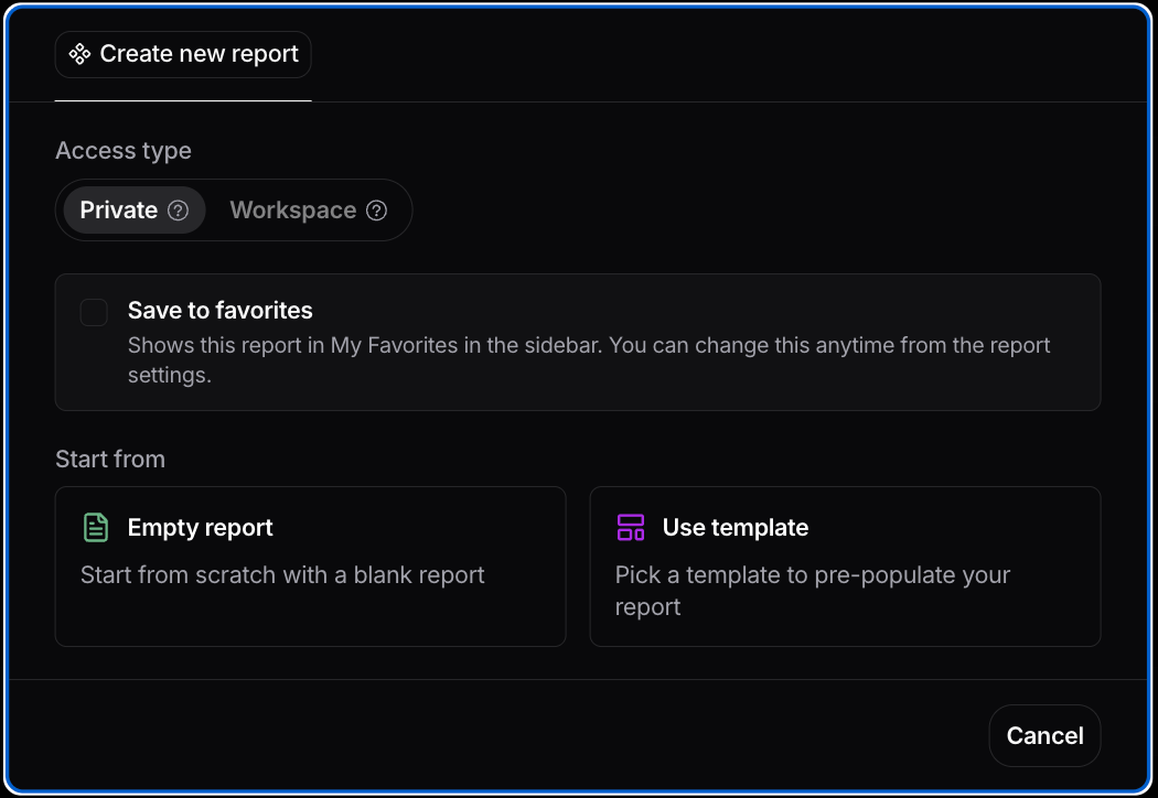
Hover over the name of a section in the sidebar and click the **+** button, or click **Add new**, to open the report creation wizard. The wizard walks you through a few steps:
1. **Set visibility**: choose **Private** (only you) or **Workspace** (everyone on the platform).
2. **Save to favorites**: optionally check this to pin the report under your Favorites section immediately.
3. **Choose a starting point**: start from an empty report, or pick a template (both Nebuly-provided templates and templates created by admins in your organization).
4. **Name and describe**: finalize the report's name and add an optional description.
When creating a report, you can start from scratch or pick from a wide range of templates, both those provided by Nebuly and those created by admins in your organization.
 New reports are added to your sidebar automatically. When a section has more than 10 reports, a **More** button appears at the bottom of the list, where you can show or hide reports in the sidebar and reorder them.
## Configuring a report
### Adding charts to a report
From inside a report, open the chart-creation panel and choose a chart type. The main families are **Analytics**, **Table**, and **Retention**.
New reports are added to your sidebar automatically. When a section has more than 10 reports, a **More** button appears at the bottom of the list, where you can show or hide reports in the sidebar and reorder them.
## Configuring a report
### Adding charts to a report
From inside a report, open the chart-creation panel and choose a chart type. The main families are **Analytics**, **Table**, and **Retention**.
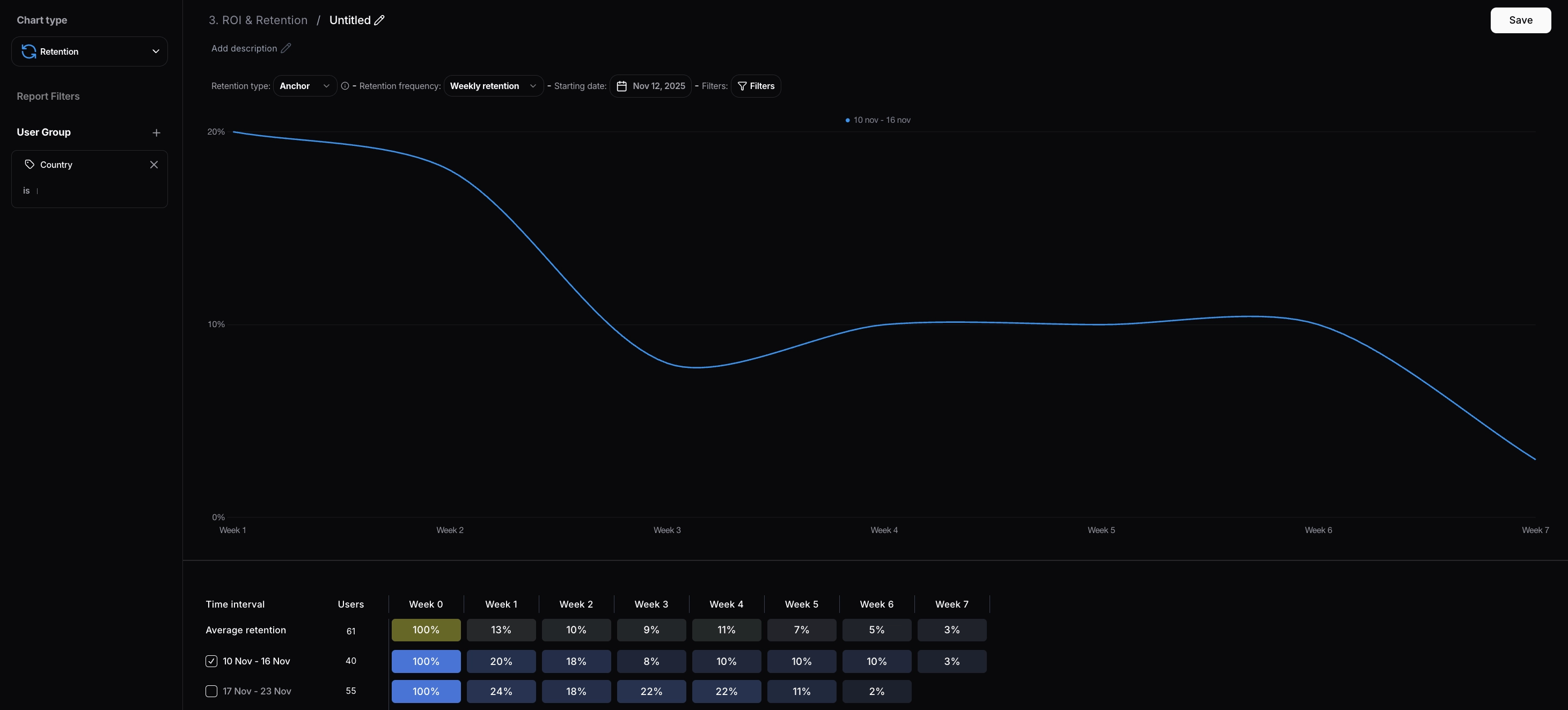
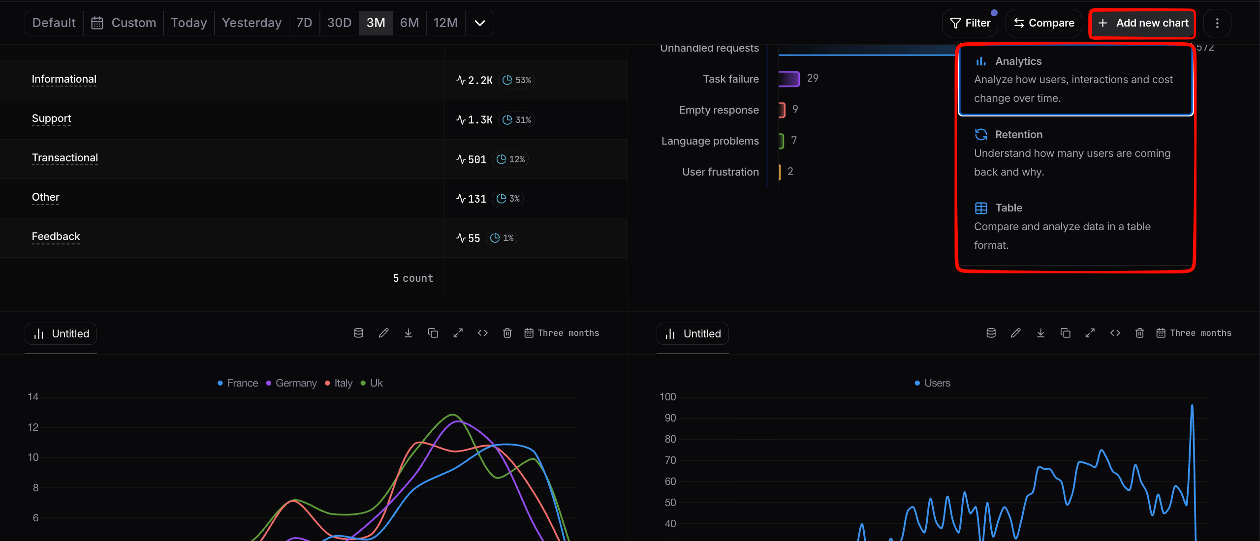 #### Retention
Use the **Retention** chart type to understand whether specific user types come back to the product over time. This is the right choice for cohort analysis. For example, "what percentage of users who had their first conversation in week N are still active in week N+1, N+2, …?"
#### Retention
Use the **Retention** chart type to understand whether specific user types come back to the product over time. This is the right choice for cohort analysis. For example, "what percentage of users who had their first conversation in week N are still active in week N+1, N+2, …?"
 #### Analytics and Table
For all other use cases, use **Analytics** or **Table**:
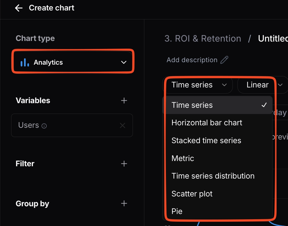
* **Analytics** supports a range of visualizations with X- and Y-axis configuration, including time series, stacked time series, horizontal bar, metric (single number), scatter plot, pie, and **Gauge** (a single KPI on a color-coded semicircular scale with a configurable range and threshold bands).
* **Table** supports multi-grouping tabular views. Use it when you want to *rank or compare* across two or more dimensions (e.g. topics × user sentiment).
#### Analytics and Table
For all other use cases, use **Analytics** or **Table**:
* **Analytics** supports a range of visualizations with X- and Y-axis configuration, including time series, stacked time series, horizontal bar, metric (single number), scatter plot, pie, and **Gauge** (a single KPI on a color-coded semicircular scale with a configurable range and threshold bands).
* **Table** supports multi-grouping tabular views. Use it when you want to *rank or compare* across two or more dimensions (e.g. topics × user sentiment).
 ### Configuring a chart: Variables, Filters, Group by
Every chart in Nebuly is built from three concepts:
* **Variables**: the metric you want to measure. *Example: counting conversations.*
* **Filter**: narrows the dataset the metric is computed on. *Example: counting conversations, only Germany, only conversations containing the word "bike".*
* **Group by**: splits the metric along a dimension. *Example: counting conversations, only Germany, containing "bike", split by user sentiment.*
In other words: **Variables** answer *what*, **Filter** answers *which subset*, **Group by** answers *broken down how*.
For more on building your own metrics, see the *Custom Variables* section below. For details on filter syntax and saved filter sets, see [Filtering](/guides/filtering).
### Configuring a chart: Variables, Filters, Group by
Every chart in Nebuly is built from three concepts:
* **Variables**: the metric you want to measure. *Example: counting conversations.*
* **Filter**: narrows the dataset the metric is computed on. *Example: counting conversations, only Germany, only conversations containing the word "bike".*
* **Group by**: splits the metric along a dimension. *Example: counting conversations, only Germany, containing "bike", split by user sentiment.*
In other words: **Variables** answer *what*, **Filter** answers *which subset*, **Group by** answers *broken down how*.
For more on building your own metrics, see the *Custom Variables* section below. For details on filter syntax and saved filter sets, see [Filtering](/guides/filtering).
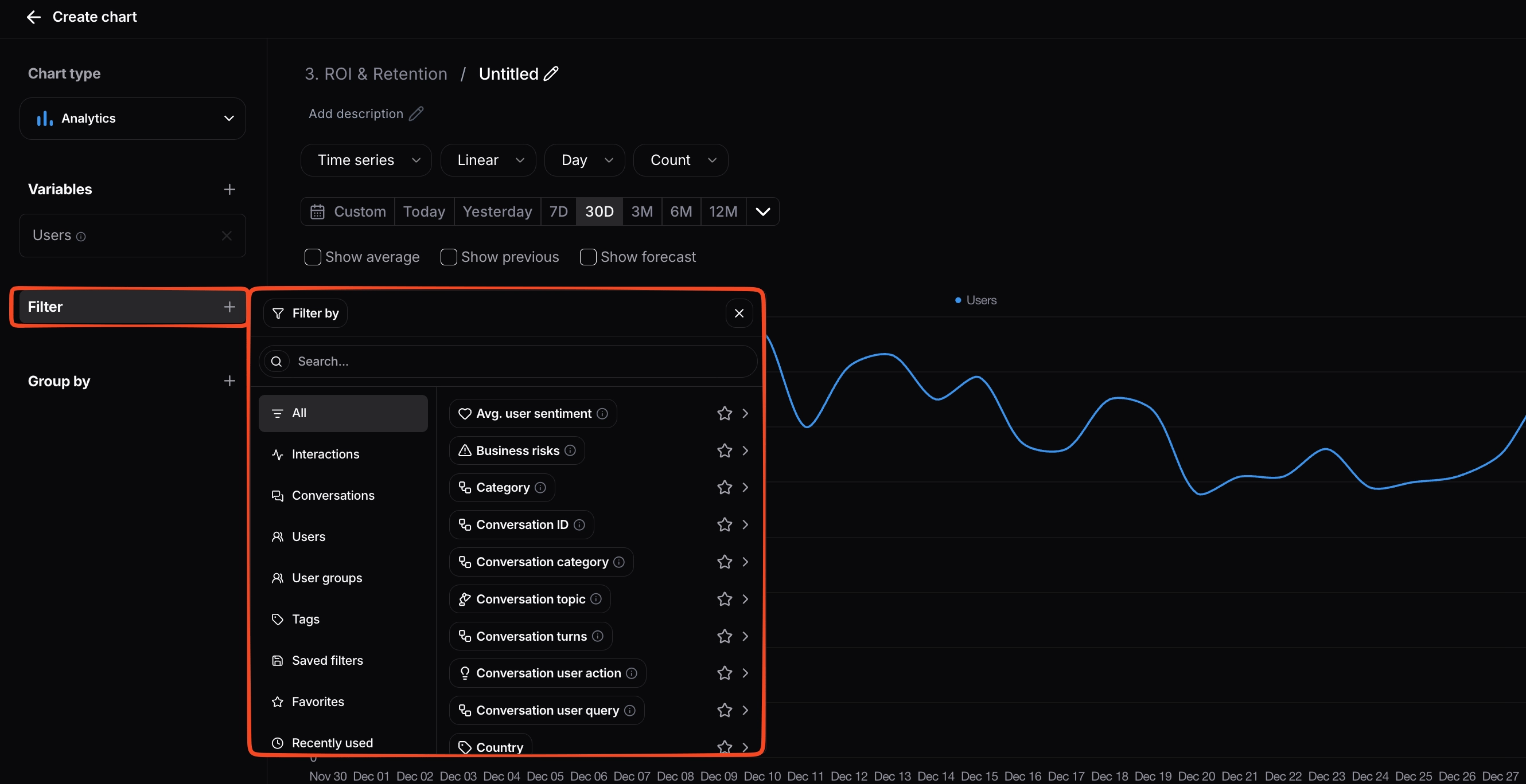 For filters and group-by dimensions, every attribute on an interaction or conversation is available, including all the [tags](/guides/enrichment-and-tagging) you sent at ingestion.
### Time granularity
For time-series charts, you can control the **granularity** of the buckets independently from the time range you're looking at. Granularity options include **hour**, **day**, **week**, **month**, and **quarter**.
A chart that already exists can be re-bucketed without rebuilding it: open the chart's configuration and pick a different granularity from the time controls.
### Number of bars (horizontal bar charts)
Horizontal bar charts with a **Group by** include a **Number of bars** field in the configuration panel. It caps how many bars are rendered, which is especially useful for export, since a chart with dozens of bars can become unreadable as a PNG.
The field appears once a **Group by** is selected. Pick a preset (**No limit**, **5**, **10**, or **15**) or type a custom number. When you export the chart as PNG or CSV, only the configured number of bars is included.
## Custom Variables
Built-in variables cover most needs, but when creating or editing an Analytics or Table chart you can also define **custom variables**. Custom variables support **mathematical formulas**, so you can express calculations that aren't possible with built-in variables alone. Formulas can reference both built-in and custom variables, and filters can be applied as usual, letting your team track the metrics that matter most to how you measure the AI product.
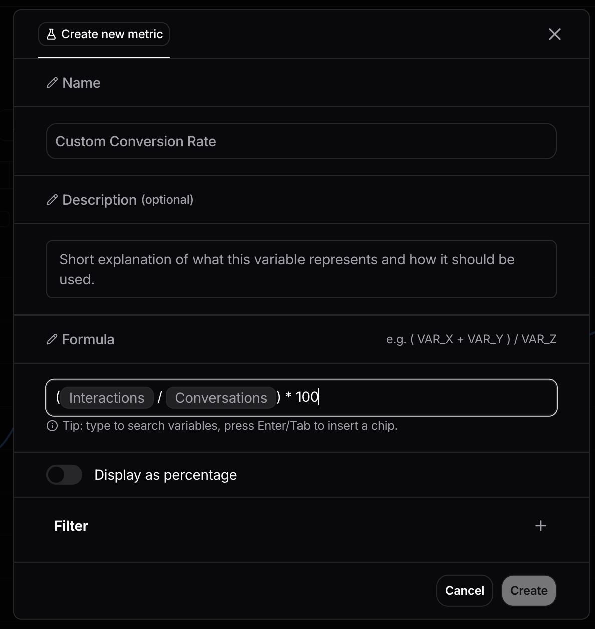
### Creating a new variable
To create a custom variable, open the chart builder for an Analytics or Table chart. In the **Metrics** panel on the left, click **+ Create New Metric**.
For filters and group-by dimensions, every attribute on an interaction or conversation is available, including all the [tags](/guides/enrichment-and-tagging) you sent at ingestion.
### Time granularity
For time-series charts, you can control the **granularity** of the buckets independently from the time range you're looking at. Granularity options include **hour**, **day**, **week**, **month**, and **quarter**.
A chart that already exists can be re-bucketed without rebuilding it: open the chart's configuration and pick a different granularity from the time controls.
### Number of bars (horizontal bar charts)
Horizontal bar charts with a **Group by** include a **Number of bars** field in the configuration panel. It caps how many bars are rendered, which is especially useful for export, since a chart with dozens of bars can become unreadable as a PNG.
The field appears once a **Group by** is selected. Pick a preset (**No limit**, **5**, **10**, or **15**) or type a custom number. When you export the chart as PNG or CSV, only the configured number of bars is included.
## Custom Variables
Built-in variables cover most needs, but when creating or editing an Analytics or Table chart you can also define **custom variables**. Custom variables support **mathematical formulas**, so you can express calculations that aren't possible with built-in variables alone. Formulas can reference both built-in and custom variables, and filters can be applied as usual, letting your team track the metrics that matter most to how you measure the AI product.
### Creating a new variable
To create a custom variable, open the chart builder for an Analytics or Table chart. In the **Metrics** panel on the left, click **+ Create New Metric**.
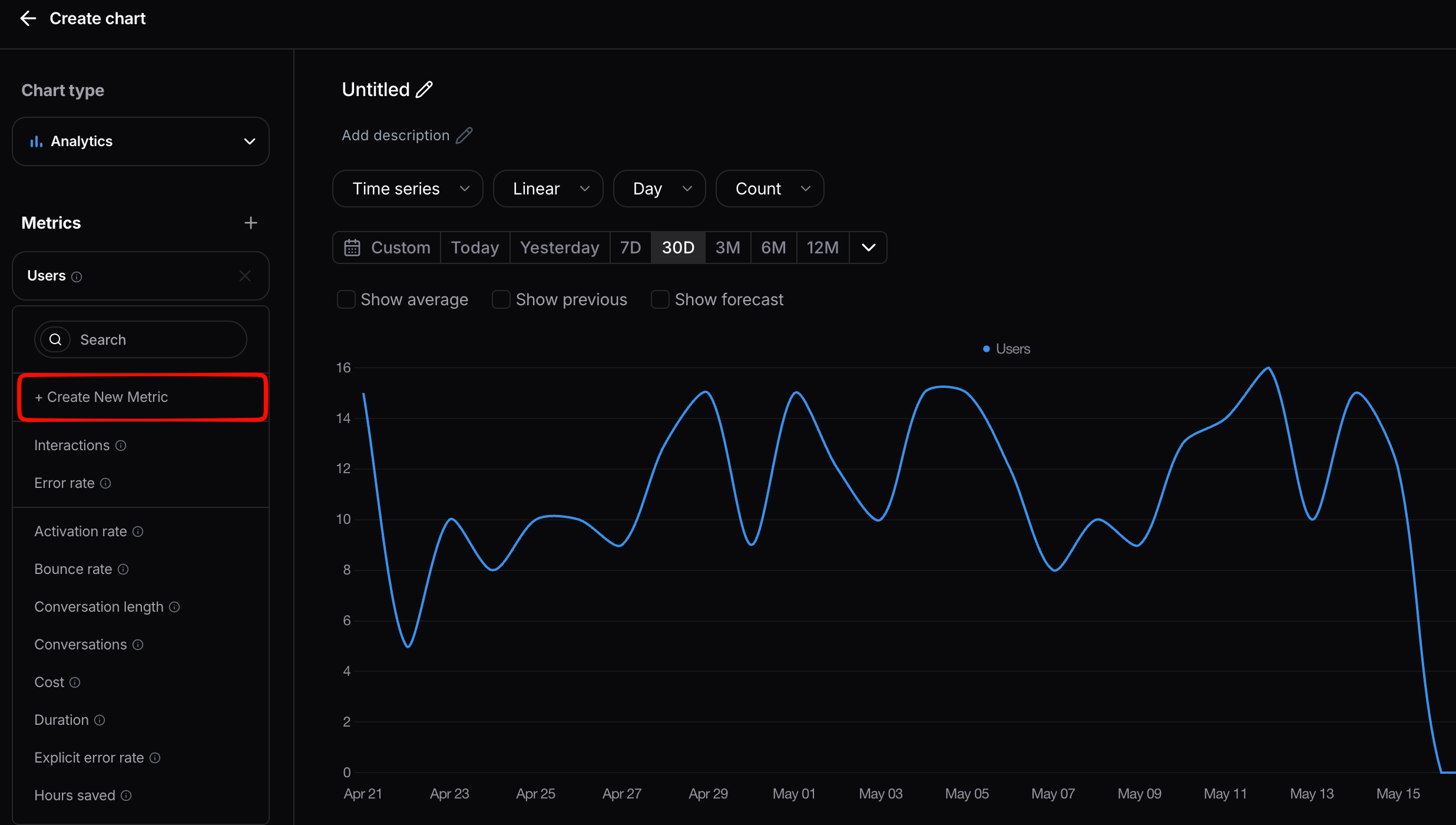 In the dialog that opens, give the variable a **Name** and, optionally, a **Description**. Then build the **Formula**: type to search for variables and press Enter or Tab to insert each one as a chip, adding operators and numbers as needed (for example, `( Interactions / Conversations ) * 100`). Turn on **Display as percentage** if the result should be shown as a percentage, optionally add a **Filter** to scope the variable, then click **Create**.
The new variable is added to the chart and can be referenced inside other custom variables.
## Forecasting metrics
For any time-series line chart in Reports, you can extend the chart with a **forecast** of where the metric is heading through the end of the current period. This is especially useful for monitoring goals ("are we on track to hit our monthly target?") and for executive reports where the audience cares about the trajectory, not just the historical line.
### Turning on forecasting
In a chart's configuration, enable **Show forecast** (alongside other options like *Show average* and *Show previous period*). The forecast appears as an additional line (or, on stacked time-series charts, an additional set of bars) in a different color from the historical data, so it's visually clear what's actual and what's projected.
## Compare
Comparison overlays a second view next to your report's current data, so you can measure differences at a glance. Each chart shows the **original dataset on the left** and the **comparison on the right**.
Open a report and click **Compare** in the top-right corner, then choose what to compare the report against:
* **A filter or segment.** Compare the report's data against any subset defined by a filter, for example a single topic, country, user group, or any tag you sent at ingestion. This lets you hold the report fixed and see how any segment differs from the rest of the data.
* **A time range.** Compare the current period against another period to spot changes over time.
* **Another project.** Pull a second project alongside the current one to compare metrics across deployments, for example an internal copilot versus a customer-facing assistant. See [Projects and Organizations](/guides/projects-and-organizations).
Each chart in the report then renders both sides side by side, so you can inspect differences chart by chart.
## Chart quick actions
Hover over any chart card to reveal quick actions without opening a menu: **edit**, **data mode** (jump into the underlying data), **export**, **duplicate**, **delete**, and **resize** (expand or compress the chart).
## Reordering charts
Charts can be reordered within a report by dragging them into a new position.
In the dialog that opens, give the variable a **Name** and, optionally, a **Description**. Then build the **Formula**: type to search for variables and press Enter or Tab to insert each one as a chip, adding operators and numbers as needed (for example, `( Interactions / Conversations ) * 100`). Turn on **Display as percentage** if the result should be shown as a percentage, optionally add a **Filter** to scope the variable, then click **Create**.
The new variable is added to the chart and can be referenced inside other custom variables.
## Forecasting metrics
For any time-series line chart in Reports, you can extend the chart with a **forecast** of where the metric is heading through the end of the current period. This is especially useful for monitoring goals ("are we on track to hit our monthly target?") and for executive reports where the audience cares about the trajectory, not just the historical line.
### Turning on forecasting
In a chart's configuration, enable **Show forecast** (alongside other options like *Show average* and *Show previous period*). The forecast appears as an additional line (or, on stacked time-series charts, an additional set of bars) in a different color from the historical data, so it's visually clear what's actual and what's projected.
## Compare
Comparison overlays a second view next to your report's current data, so you can measure differences at a glance. Each chart shows the **original dataset on the left** and the **comparison on the right**.
Open a report and click **Compare** in the top-right corner, then choose what to compare the report against:
* **A filter or segment.** Compare the report's data against any subset defined by a filter, for example a single topic, country, user group, or any tag you sent at ingestion. This lets you hold the report fixed and see how any segment differs from the rest of the data.
* **A time range.** Compare the current period against another period to spot changes over time.
* **Another project.** Pull a second project alongside the current one to compare metrics across deployments, for example an internal copilot versus a customer-facing assistant. See [Projects and Organizations](/guides/projects-and-organizations).
Each chart in the report then renders both sides side by side, so you can inspect differences chart by chart.
## Chart quick actions
Hover over any chart card to reveal quick actions without opening a menu: **edit**, **data mode** (jump into the underlying data), **export**, **duplicate**, **delete**, and **resize** (expand or compress the chart).
## Reordering charts
Charts can be reordered within a report by dragging them into a new position.
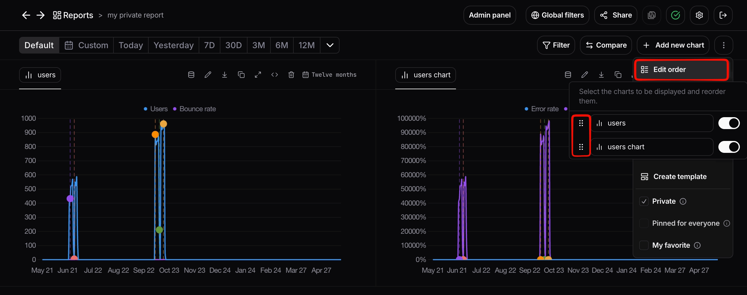 ## Report actions
The three-dot menu in the top-right of a report gives you:
* **Duplicate**: create a copy of the report.
* **Create template**: save the report as a reusable template that other team members can start from.
* **Add description**: add a description to the report.
* **Edit order**: rearrange the charts within the report.
## Drill into a data point
Every data point on a chart is a live entry point into the records behind it. **Right-click any point** on a chart (a peak in conversation health, a spike in error rate, a bar in a breakdown) and a context menu opens with options to drill straight into the underlying data:
* **View Interactions**: open the exact interactions that make up that data point.
* **View Users**: open the users implicated in that data point.
* **Explore more**: open the point in [Explore Mode](#explore-mode) for deeper slicing and follow-up filtering.
* **Add event**: annotate that moment on the timeline (see [Events](/guides/events)).
## Report actions
The three-dot menu in the top-right of a report gives you:
* **Duplicate**: create a copy of the report.
* **Create template**: save the report as a reusable template that other team members can start from.
* **Add description**: add a description to the report.
* **Edit order**: rearrange the charts within the report.
## Drill into a data point
Every data point on a chart is a live entry point into the records behind it. **Right-click any point** on a chart (a peak in conversation health, a spike in error rate, a bar in a breakdown) and a context menu opens with options to drill straight into the underlying data:
* **View Interactions**: open the exact interactions that make up that data point.
* **View Users**: open the users implicated in that data point.
* **Explore more**: open the point in [Explore Mode](#explore-mode) for deeper slicing and follow-up filtering.
* **Add event**: annotate that moment on the timeline (see [Events](/guides/events)).
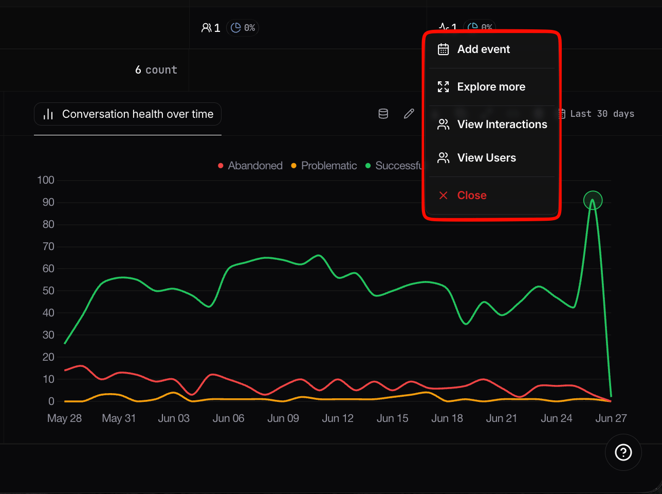 This turns any chart from a static summary into an investigation tool. When you spot something unusual, you are one click away from the specific conversations, users, and interactions responsible, with the chart's current filters and time range carried over.
## Explore Mode
Explore Mode is the fast path from a report chart to the raw evidence behind it. Use it to:
* Drill down from aggregated chart values into lower-level breakdowns.
* Jump from a row straight to the related **users**, **interactions**, and **conversations**.
* Keep slicing with filters to answer follow-up questions without rebuilding the chart.
Open it from a chart's quick actions (the data mode icon) or directly from a report's table rows. It keeps your current report, chart, and active filters in context, so analysis continues from where you started. From there, the row shortcuts described in [Navigating Nebuly](/guides/navigating-nebuly) let you jump into the exact entity list you need.
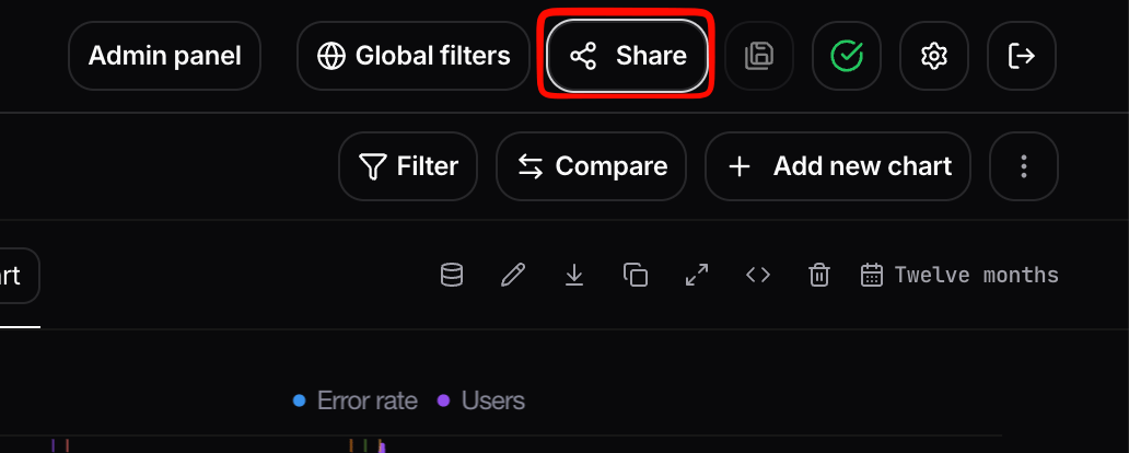
## External sharing via shareable links
You can generate a shareable link to a report by navigating to the top right of the screen to the **Share** button. The link gives the recipient access to the report without requiring them to log in to Nebuly.
This turns any chart from a static summary into an investigation tool. When you spot something unusual, you are one click away from the specific conversations, users, and interactions responsible, with the chart's current filters and time range carried over.
## Explore Mode
Explore Mode is the fast path from a report chart to the raw evidence behind it. Use it to:
* Drill down from aggregated chart values into lower-level breakdowns.
* Jump from a row straight to the related **users**, **interactions**, and **conversations**.
* Keep slicing with filters to answer follow-up questions without rebuilding the chart.
Open it from a chart's quick actions (the data mode icon) or directly from a report's table rows. It keeps your current report, chart, and active filters in context, so analysis continues from where you started. From there, the row shortcuts described in [Navigating Nebuly](/guides/navigating-nebuly) let you jump into the exact entity list you need.
## External sharing via shareable links
You can generate a shareable link to a report by navigating to the top right of the screen to the **Share** button. The link gives the recipient access to the report without requiring them to log in to Nebuly.
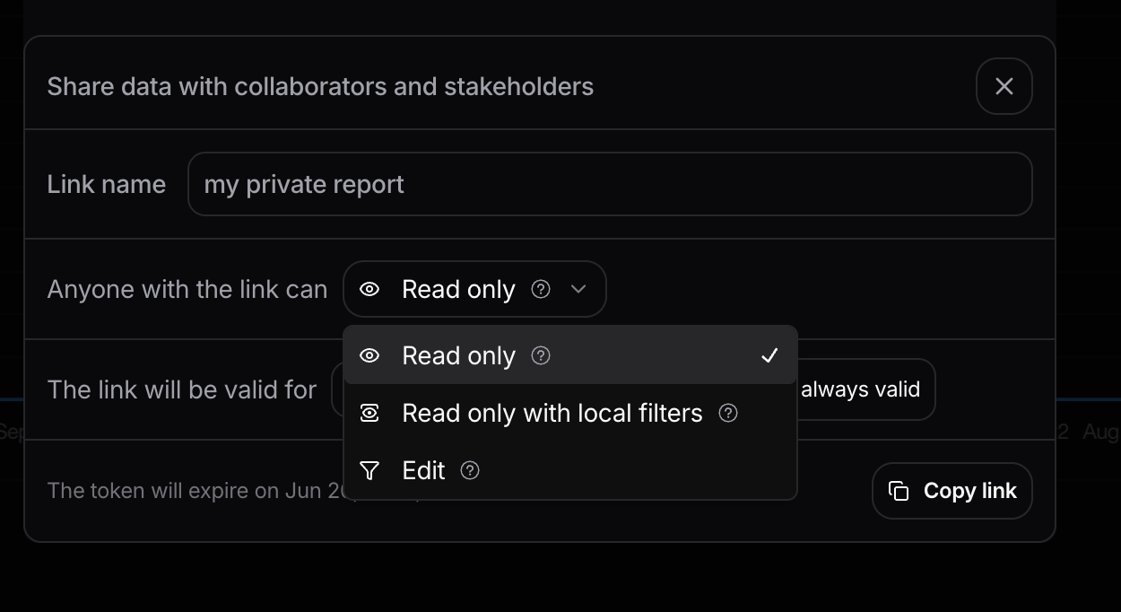
 When sharing a report externally you can configure:
* **Permissions:**
* **Read-only:** the recipient can view the data but cannot make any changes.
* **Edit permissions:** the recipient can customize individual charts within the report. Report-level filters remain locked so they can only see data they are permitted to see.
* **Time-limited access:** set an expiration on the link.
* **Project-based filters:** the link enforces the report's filters, ensuring sensitive data outside the report's scope is never exposed.
When sharing a report externally you can configure:
* **Permissions:**
* **Read-only:** the recipient can view the data but cannot make any changes.
* **Edit permissions:** the recipient can customize individual charts within the report. Report-level filters remain locked so they can only see data they are permitted to see.
* **Time-limited access:** set an expiration on the link.
* **Project-based filters:** the link enforces the report's filters, ensuring sensitive data outside the report's scope is never exposed.
 This is the recommended path when you need to communicate AI initiative results to a wider audience without granting them seats in Nebuly. To share a single interaction or conversation instead of a full report, see [Sharing pages in Nebuly](/guides/sharing-pages).
## Programmatic access
Reports and charts are also available outside the UI through the **Nebuly MCP Server**, which lets AI assistants query your Nebuly data and create or update reports and charts. You can ask an assistant to list reports, build a new report, or add charts to an existing one, without leaving your assistant.
For setup and the full list of supported tools, see the [Nebuly MCP Server docs](/guides/mcp-server).
## Tips and best practices
* **Start from a template.** Even if you'll heavily customize, starting from a default template gets you to "useful" much faster than a blank report.
* **Name reports for the question they answer.** "Weekly error-rate watch: Customer Support" beats "Errors v2".
* **Use [Events](/guides/events) on time-series charts** to mark releases, prompt updates, or campaigns. It makes spikes much easier to explain weeks later.
* **Add descriptions for context.** You can add a description to both a report and an individual chart, so teammates understand what a view shows and why it matters without having to ask.
* **Save high-value filter combinations.** Once you know a filter combo you'll keep coming back to, save it from the filter panel. It'll be available across views. See [Filtering](/guides/filtering).
* **Star a report to add it to Favorites** in the sidebar, so your most-used reports are always one click away.
This is the recommended path when you need to communicate AI initiative results to a wider audience without granting them seats in Nebuly. To share a single interaction or conversation instead of a full report, see [Sharing pages in Nebuly](/guides/sharing-pages).
## Programmatic access
Reports and charts are also available outside the UI through the **Nebuly MCP Server**, which lets AI assistants query your Nebuly data and create or update reports and charts. You can ask an assistant to list reports, build a new report, or add charts to an existing one, without leaving your assistant.
For setup and the full list of supported tools, see the [Nebuly MCP Server docs](/guides/mcp-server).
## Tips and best practices
* **Start from a template.** Even if you'll heavily customize, starting from a default template gets you to "useful" much faster than a blank report.
* **Name reports for the question they answer.** "Weekly error-rate watch: Customer Support" beats "Errors v2".
* **Use [Events](/guides/events) on time-series charts** to mark releases, prompt updates, or campaigns. It makes spikes much easier to explain weeks later.
* **Add descriptions for context.** You can add a description to both a report and an individual chart, so teammates understand what a view shows and why it matters without having to ask.
* **Save high-value filter combinations.** Once you know a filter combo you'll keep coming back to, save it from the filter panel. It'll be available across views. See [Filtering](/guides/filtering).
* **Star a report to add it to Favorites** in the sidebar, so your most-used reports are always one click away.