Time to value chart is the best way to easily understand how long it takes your users to get the answers they were looking for.
Here are examples of the types of questions you can address using Time to value:
- What percent of all users dropped off after asking one question?
- How many interactions did it take to satisfied users to get the answer they were looking for?
- What percentage of all users did action B after doing action A?
Quick start
Creating aTime to value chart involves the same fundamental steps as constructing any other type of chart. Generating a chart using Time to value is a quick and straightforward process, requiring only a few clicks, with results delivered almost instantaneously.
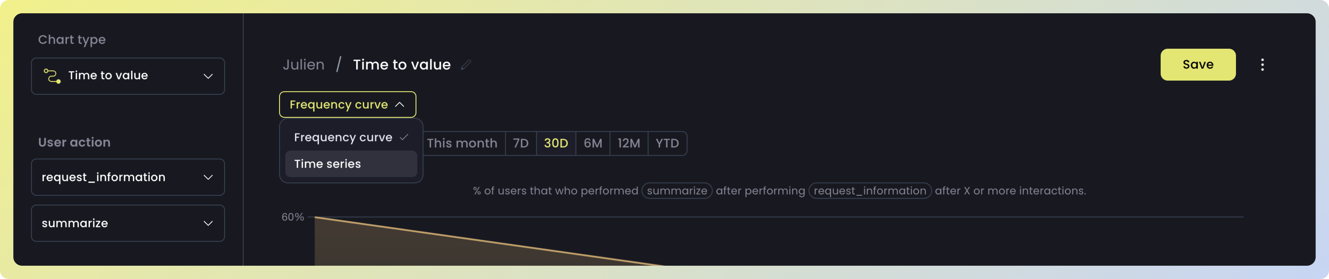
Step 1: Choose actions
Select the two actions you’re interested in. The chart will display both the percentage of users and the number of interactions it took for users to move from the first action to the next.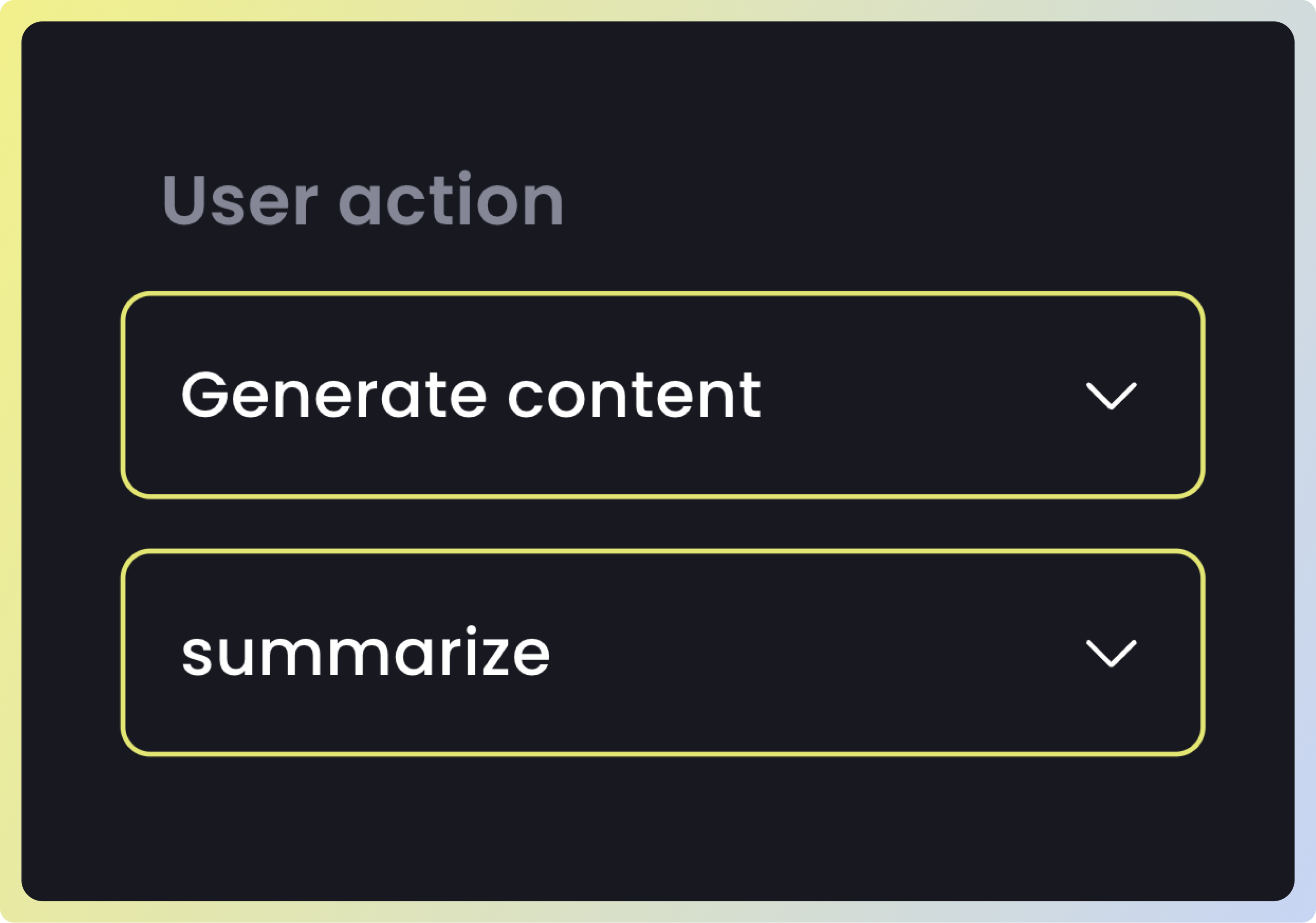
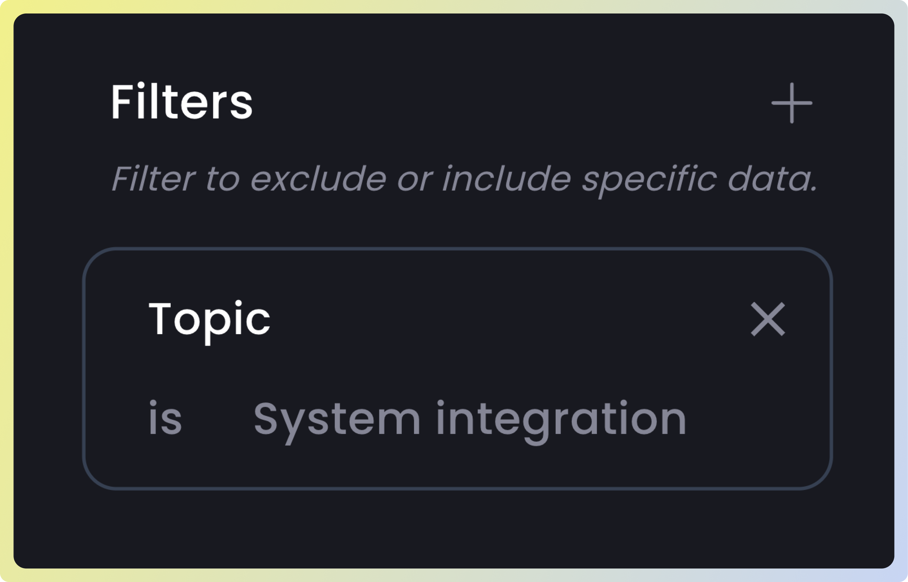
Step 2: Choose Filters
TheFilter applies to both the actions you’ve chosen, enabling you to remove or exclude any undesired data from the results. Supported filters are:
| Filter | Description |
|---|---|
| Topic | The main theme the user is talking about during the interaction |
| Data source | The external reference or knowledge sources the LLM might use to fetch or validate information |
| Language | The specific language (like English or Spanish) in which the model generates its response |
| User | The specific user ID |
Step 3: Choose Visualization
Select from two visualization types:-
Frequency Curve: Displays the percentage of users and how many interactions they took to transition from the first action to the second. -
Time Series: Indicates, for a specified number of interactions, how the percentage of users evolved over time. This can help answer questions such as: “How has the percentage of users who dropped off after 3 interactions changed over time?”