- Explore tasks, questions and actions users are doing
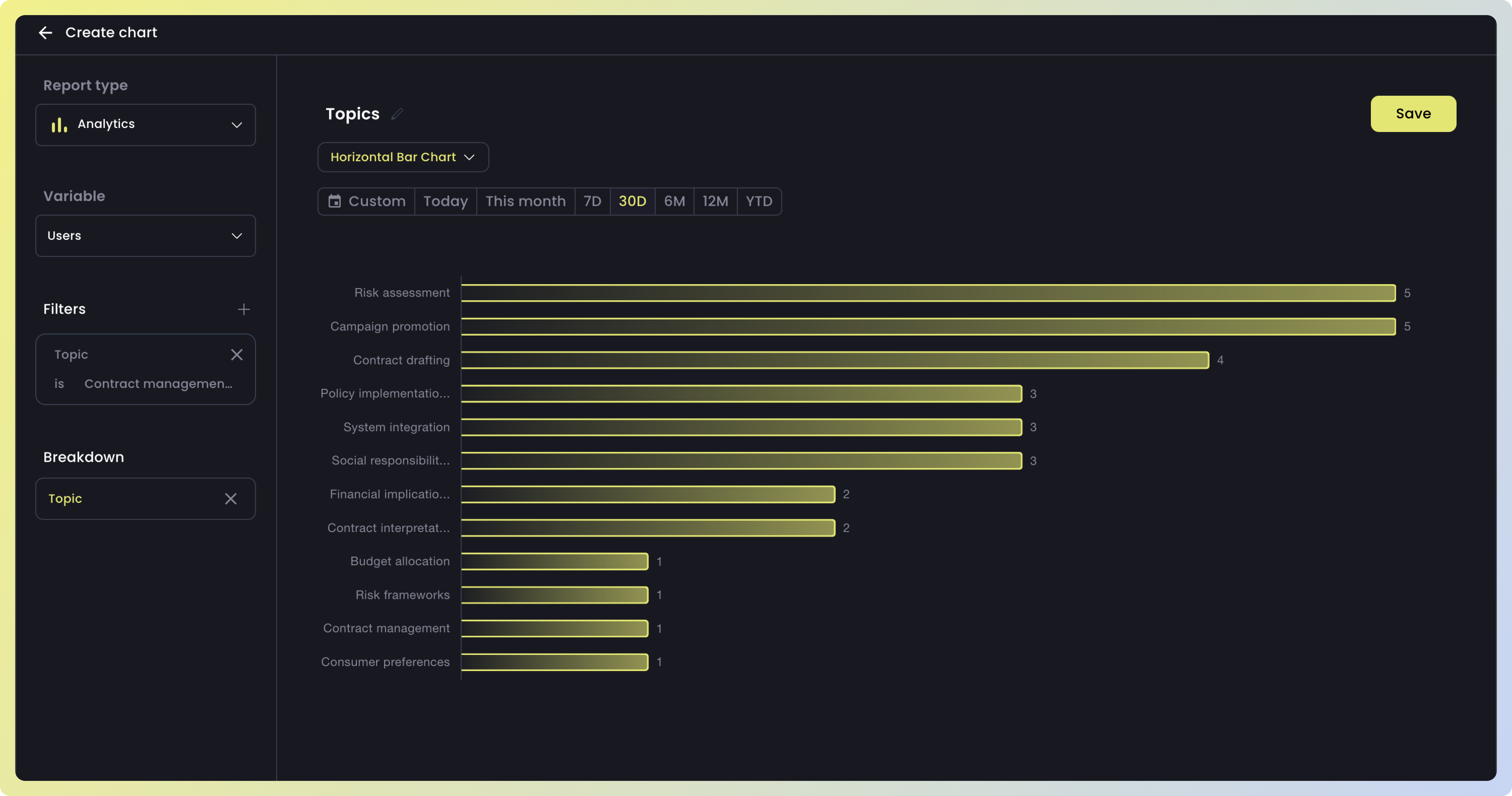
- Understand the most discussed topics by your users
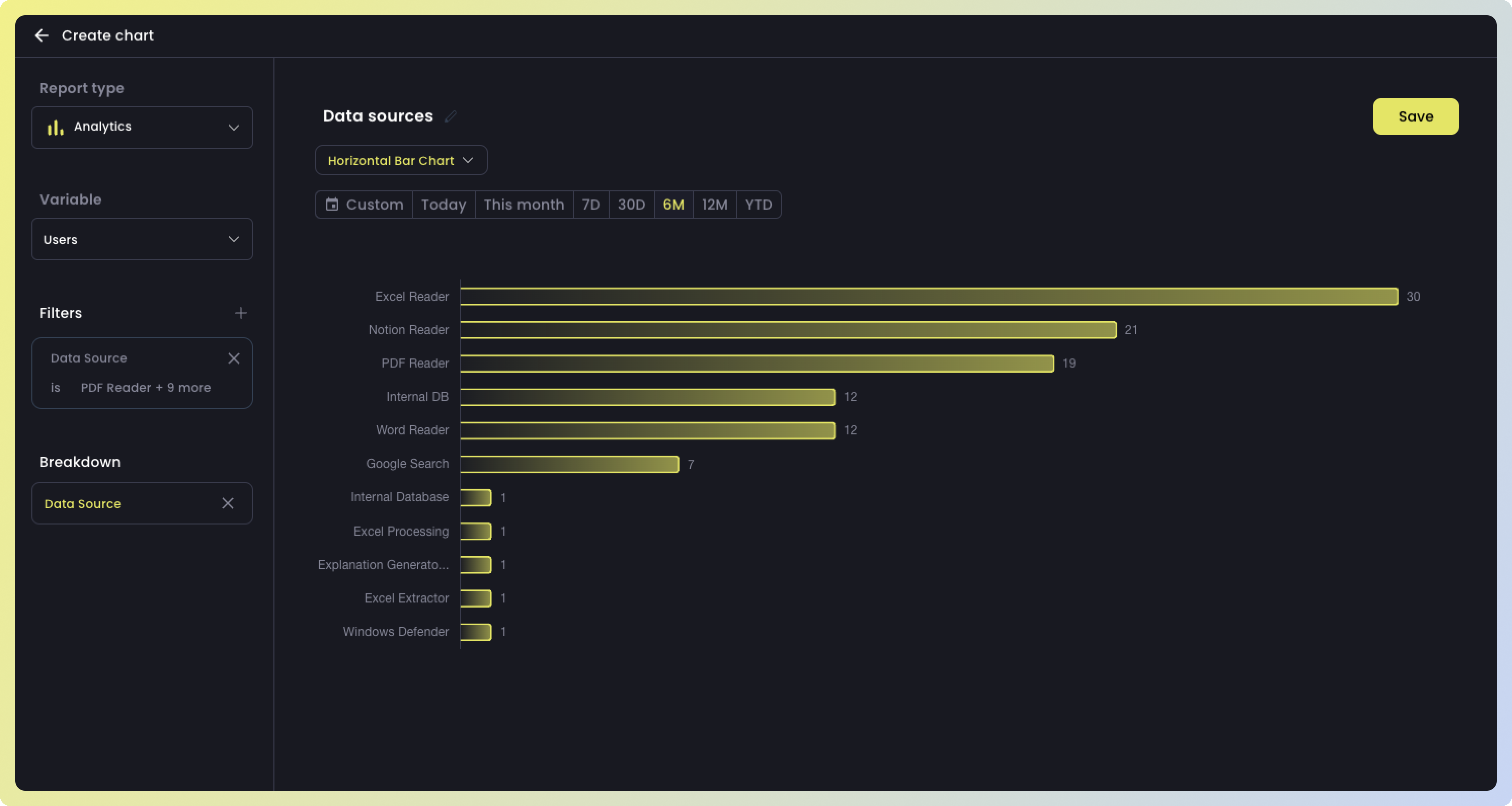
- Understand RAG data sources commonly utilized by your users
Tasks, questions and actions
The best way to easily understand what your users are doing with your LLMs is using the User Flow chart. This chart identifies the most frequent tasks/questions done by your users. You can use User Flows to understand how your users sequentially ask questions to your LLM-product and analyze drop-offs or unsuccessful behavior.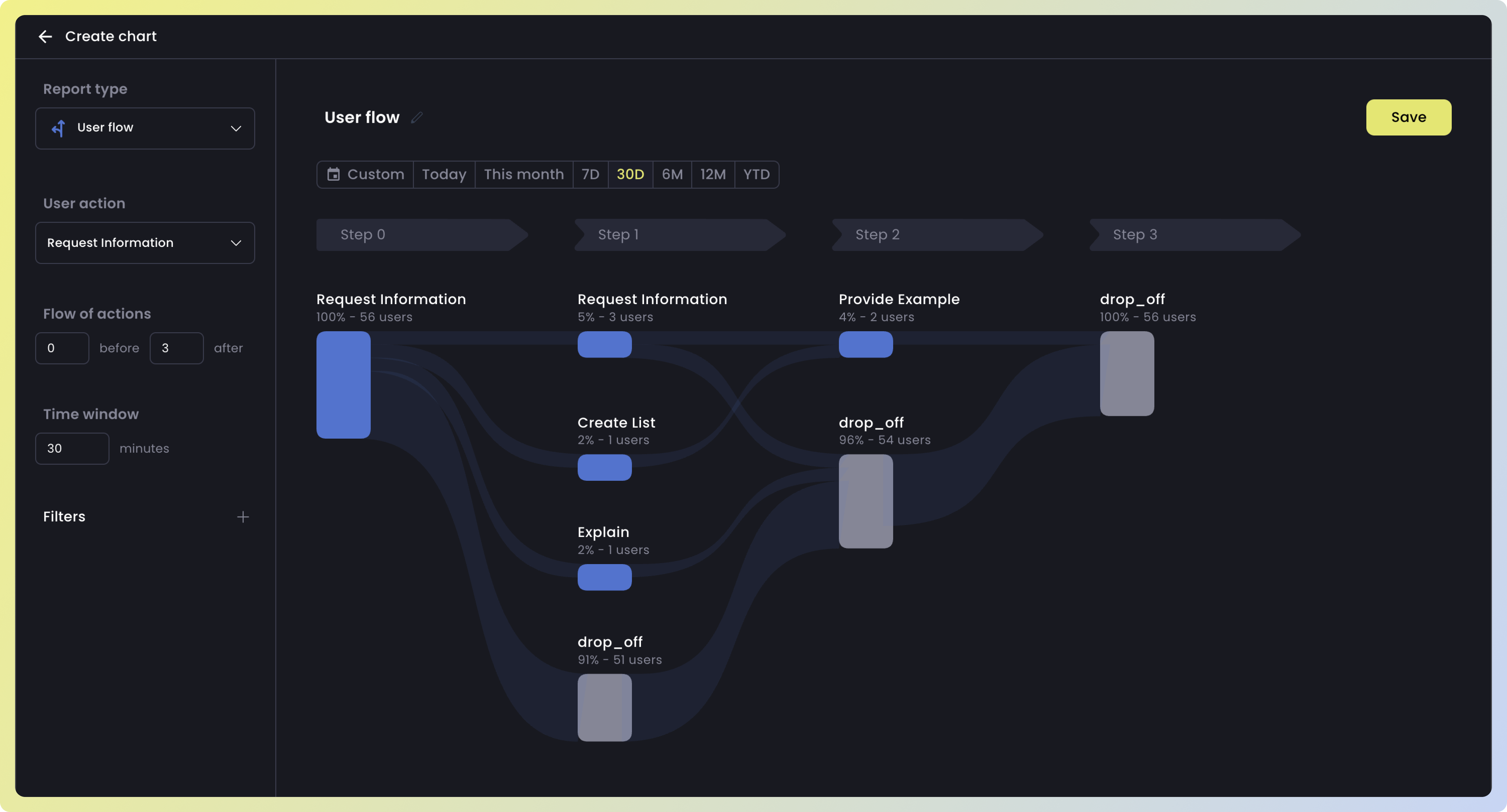
Most discussed topics
Topics reveal the subjects users frequently discuss in your LLM product. By identifying these popular topics, you can enhance your LLM product by enriching content in areas most discussed by users. For clear visualization, use the Analytics chart, filtering users or interactions bytopics.
Most used RAG data sources
Data sources show the most accessed RAG sources by your users. To view this clearly, utilize the Analytics chart and filter bydata source for users or interactions. To track trends over time, utilize the line chart or vertical bar chart.