- How many new users come back after one week?
- Which groups have the highest long-term engagement?
- Has user retention improved over time?
Retention settings
User groups
Optionally, select one or more User Groups to calculate retention only for a specific audience. If no user group is selected, retention is calculated across all users.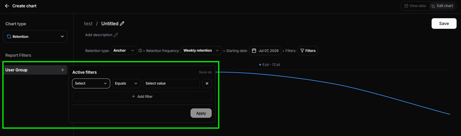
Retention type
The Retention type determines how Nebuly calculates whether a user is retained.- Anchor tracks users from their first interaction. Once a user enters a cohort, Nebuly measures whether they return in each subsequent period (Week 1, Week 2, Month 1, etc.). This is the classic cohort retention analysis and is ideal for measuring long-term engagement.
- Rolling measures retention using a rolling time window. Instead of anchoring users to their first interaction, Nebuly continuously evaluates whether users remain active from one period to the next. This is useful for understanding ongoing user engagement without focusing on acquisition cohorts.
Retention frequency
Choose how cohorts are divided over time. Available frequencies include daily, weekly, monthly For example, weekly retention creates one cohort per week and measures retention week by week.Starting date
The Starting date defines the earliest cohort included in the analysis. Only users whose first interaction occurs on or after this date are considered.Filters
Apply report filters to calculate retention on a subset of users or interactions. For example, you can measure retention only for:- Users from Germany
- Conversations tagged as Support
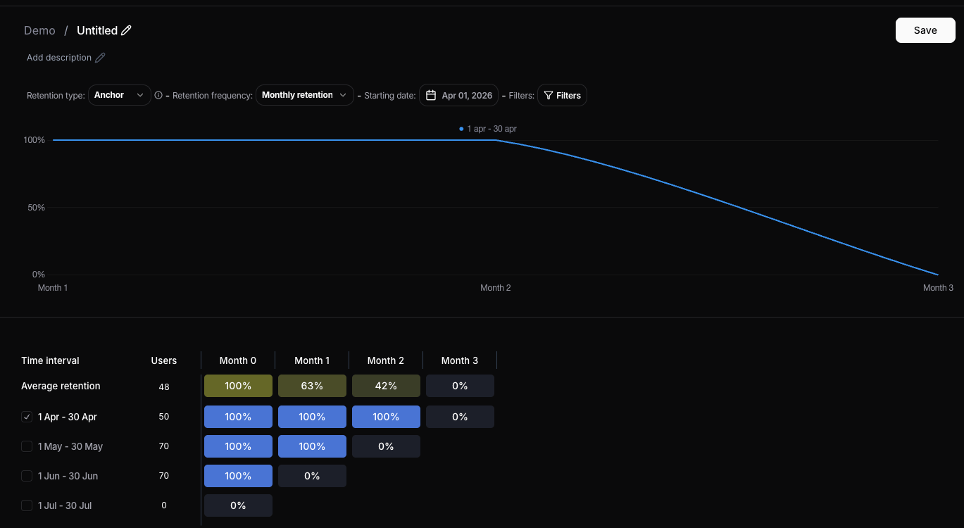
Understanding the retention chart
The retention chart consists of two complementary views:- Retention curve (top) – Displays the retention trend for the selected cohort(s). Each point represents the percentage of users who returned during that retention period, making it easy to visualize how engagement changes over time.
- Retention table (bottom) – Displays the exact retention values for each cohort and period.
- Month 0 (or Week 0 / Day 0) is always 100%, as it represents the users when they first entered the cohort.
- Month 1, Month 2, and subsequent columns show the percentage of users from the original cohort who returned during those periods.