

- Reviews each interaction. Nebuly looks at what the user asked for and what the model returned.
- Estimates its complexity. Each interaction gets a complexity score based on how hard the request was, for example how much reasoning, context, or specialized knowledge it needed.
- Forecasts the best-fit model. Using that score, Nebuly predicts the cheapest model tier that would have produced the same output quality.
- Calculates the savings. Nebuly reprices each interaction at that model’s catalog price, compares it with what you actually paid, and adds up the difference by task over a full year.
Model tiers
Every model is placed in one of four tiers, from cheapest to most expensive:| Tier | Typical use |
|---|---|
| Light | Simple, short tasks such as rewording, formatting, or quick lookups |
| Medium | Everyday work that needs some reasoning or context |
| Frontier | Complex analysis, multi-step reasoning, or long context |
| Flagship | The most demanding tasks that need the most capable model available |
Model savings
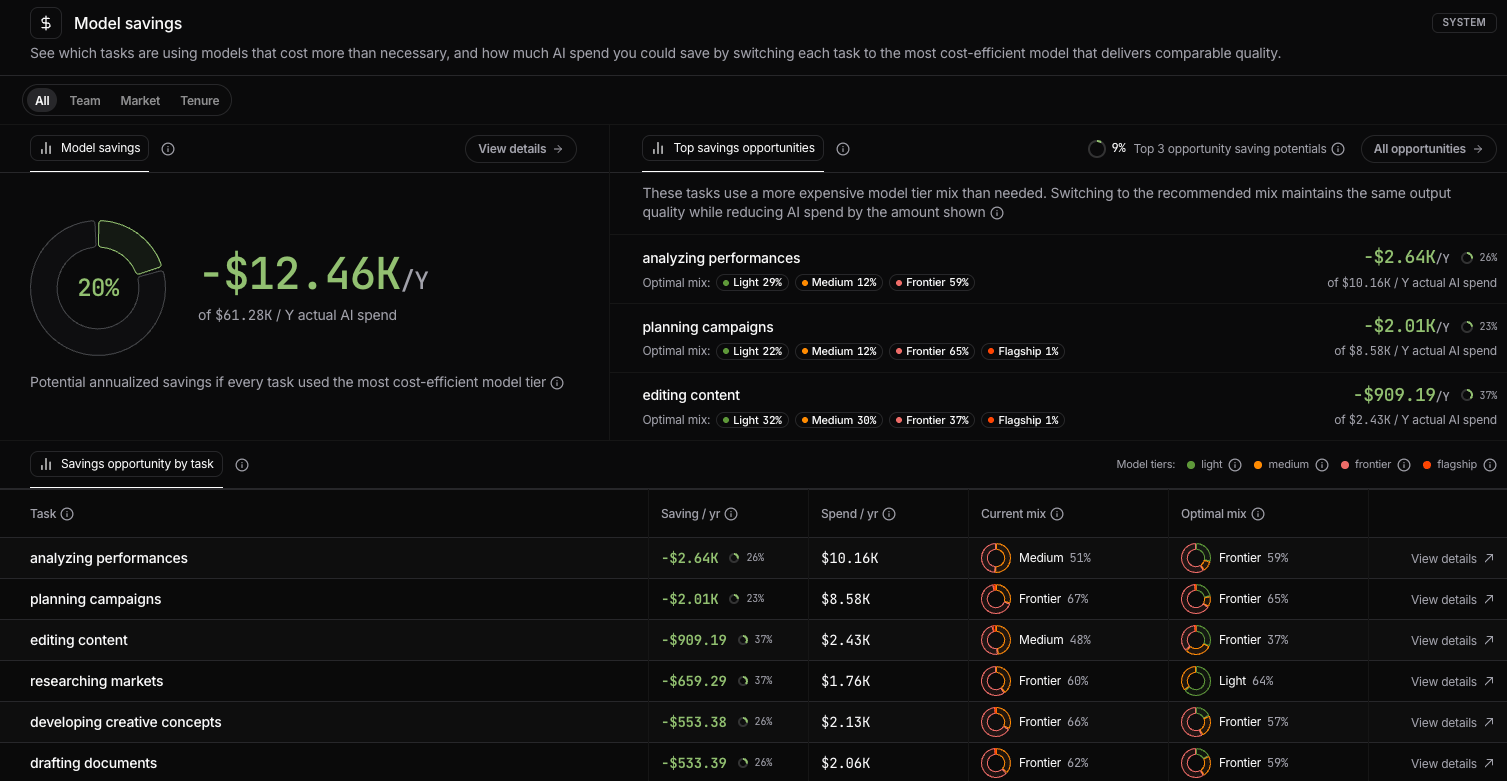
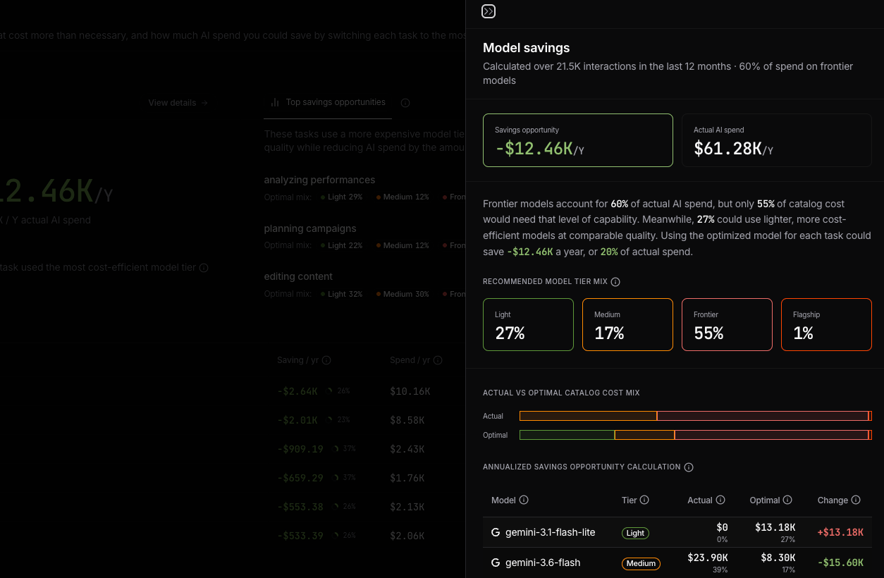
Shows your total potential annualized savings and what share of your annualized AI spend that represents. All figures on this page are annualized: Nebuly takes the interactions in the last 30 days window and projects them to a full year. This gives you one consistent yearly figure to compare with your AI budget, whichever team or task you look at. Click View details to open the full breakdown:- Savings opportunity and Actual AI spend, both annualized
- A plain-language summary of where spend goes today and how much of it could move to lighter models
- Recommended model tier mix: the share of spend each tier should have
- Actual vs optimal catalog cost mix: two bars comparing today’s tier split with the recommended one
- Annualized savings opportunity calculation: a model-by-model table showing annualized actual spend, annualized optimal spend, and the change for each model
Top savings opportunities
Lists the 3 tasks where switching models saves the most. Each shows the recommended mix, the annual savings, and the share of that task’s spend you’d save. The figure at the top is how much of your total AI spend those three tasks alone could save. Click All opportunities to see the full ranked list, with the total savings from the top 10.Savings opportunity by task
Lists every task with:| Column | What it shows |
|---|---|
| Saving / yr | Annual savings from switching to the optimal mix, with the percentage of the task’s spend |
| Spend / yr | Current annual spend on the task |
| Current mix | Today’s tier split. The label shows the largest tier. Hover to see the full split |
| Optimal mix | The recommended tier split. The label shows the largest tier |
Filtering the view
Use All, Team, Market, or Tenure at the top to see savings for the whole organization or for a specific group.Build your own reports
Model optimization metrics are also available in Nebuly’s reporting engine. You can combine model usage, estimated savings, task type, and user attributes with your existing filters and groupings to analyze where more efficient model choices could reduce cost. For example, you can build reports to understand:- Which tasks have the largest optimization potential
- Which teams or business units could save the most
- How model usage differs across teams
- Where expensive models are being used for simpler tasks