Chart Types
Analytics
The Analytics chart is the most flexible visualization in Nebuly. Analytics supports line charts, stacked line charts, bar charts, horizontal bars, pie charts, scatter plots, gauges, and single-value metrics, making it suitable for trend analysis, KPI monitoring, comparisons, and distributions. Read more about analytics chart here.Table
The Table chart displays report data in a tabular format and supports multiple grouping levels. It is best suited for ranking, comparing, and drilling down into data across multiple dimensions—for example, comparing topics by user sentiment or AI tasks by time saved. Read more about table chart here.Retention
Use the Retention chart to measure how well users return to your AI application over time. Users are grouped into groups based on their first interaction, and Nebuly calculates the percentage of each cohort that remains active in subsequent time periods. This chart is ideal for cohort analysis and understanding long-term engagement. Read more about retention chart here.Chart backbone
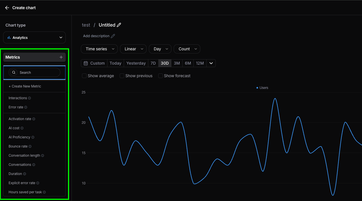
Every chart in Nebuly is built from three core concepts:- Metrics – The metric you want to measure. Example: Count of conversations.
- Filter – Narrows the dataset the metric is computed on. Example: Conversations from Germany that contain the word “bike”.
- Group by – Breaks the metric down by a dimension. Example: Group conversations by user sentiment.
Create a new chart
To create a new chart, open any custom report (system reports cannot be edited) and click Add new chart. The first step is to select the chart type—Analytics, Retention, or Table. Don’t worry if you’re unsure: you can change the chart type later without losing your configuration. Next, give your chart a title and description. Use a descriptive title and explain what the chart measures so that other users can quickly understand its purpose. After that, you’re ready to configure the chart by selecting its metrics, filters, grouping, and visualization settings. Read here how to setup your analytic/table charts, and here how to setup your retention charts.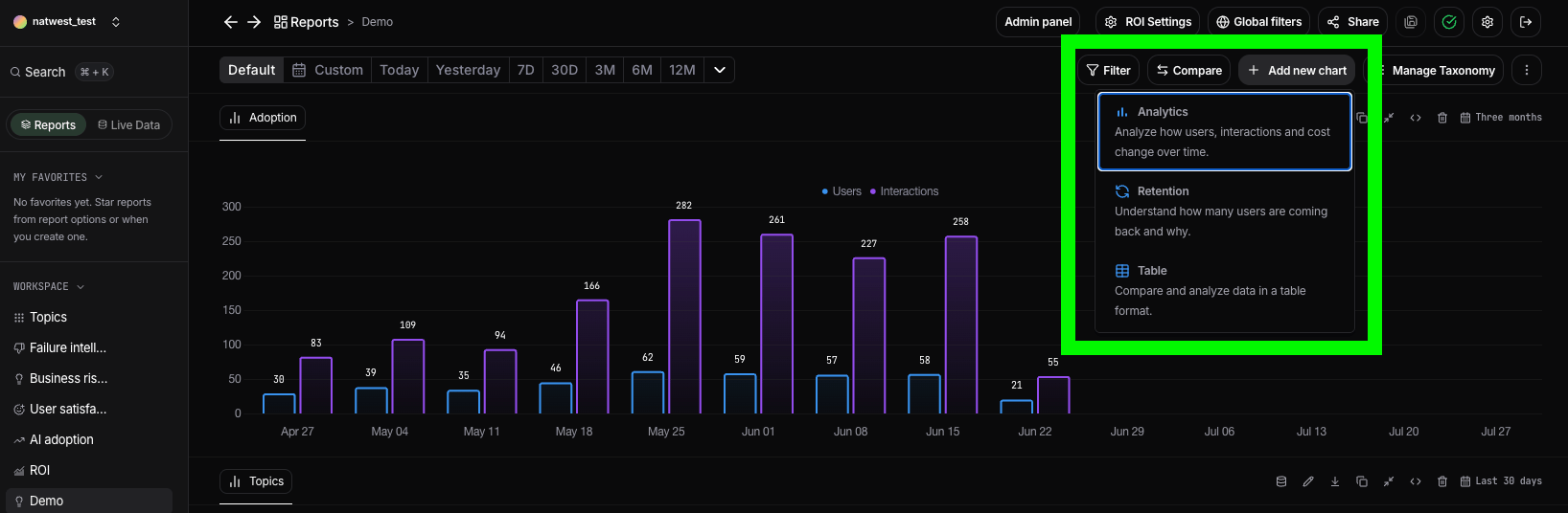
Manage a chart
Once a chart has been added to a report, you can manage it from the top-right menu on the chart card. The available actions include:- Explore – Open the chart in Explore mode to drill down into the underlying data and inspect the raw interactions behind the visualization. Learn more in Explore mode.
- Edit – Modify the chart configuration, including metrics, filters, grouping, and visualization settings.
- Download – Export the chart data as a CSV file for further analysis.
- Embed – Generate an embed code to display the chart in external applications or dashboards.
- Resize – Expand or reduce the chart size to optimize your report layout.
- Duplicate – Create a copy of the chart, including all of its configuration, making it easy to build variations without starting from scratch.
- Delete – Remove the chart from the report. This action only deletes the chart and does not affect the underlying data or report.