Create a new chart
Click the Add new button in the left sidebar and select Chart to open the chart builder.
Select a metric
Select the metric you want to analyze. You can find the full list of available metrics in the Key Metrics guide.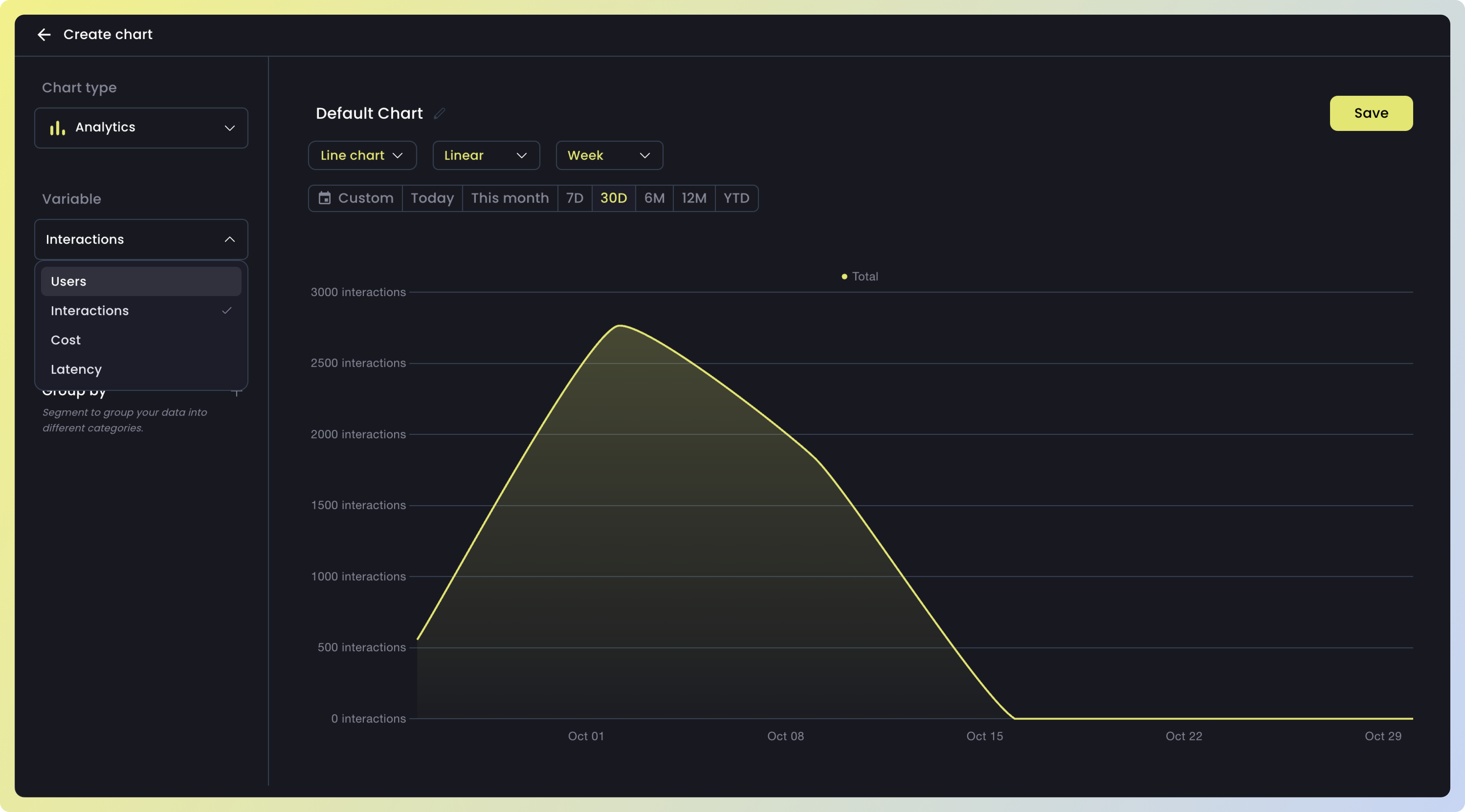
Apply filters
Use filters to narrow down your data and exclude what’s not relevant. You can apply one or more filters at the same time. Nebuly supports 100+ filters — here are some examples.
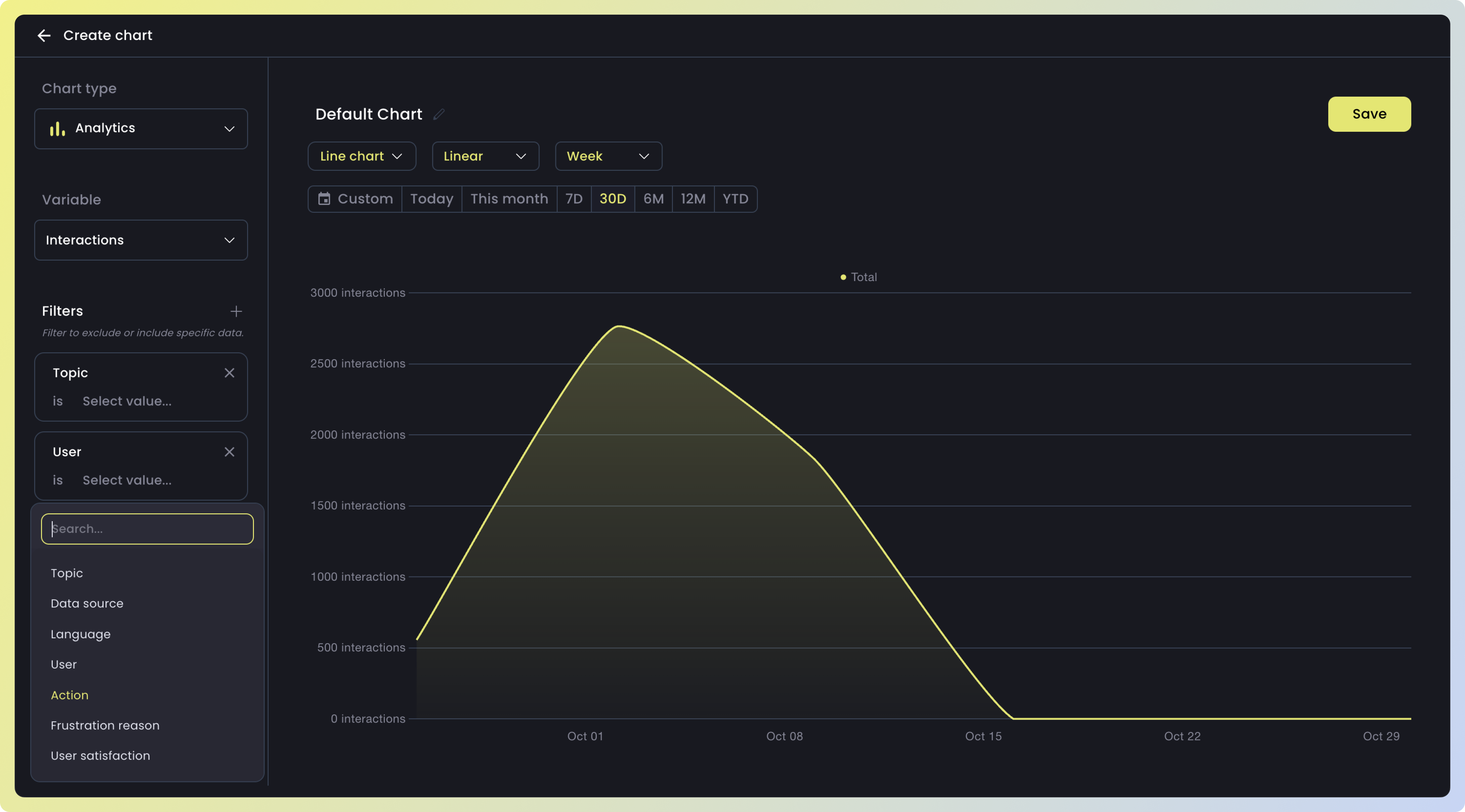
| Filter | Description |
|---|---|
| Topic | The main theme the user is talking about during the interaction |
| Data source | The external reference or knowledge sources the LLM might use to fetch or validate information |
| Language | The specific language in which the model generates its response |
| User | The specific user ID |
| Action | The task or question the user performs during an interaction |
| Frustration reason | Specific reasons a user might be frustrated, such as verbosity, insufficient knowledge, lack of clarity, or the answer not being deep enough |
Group your data
Use
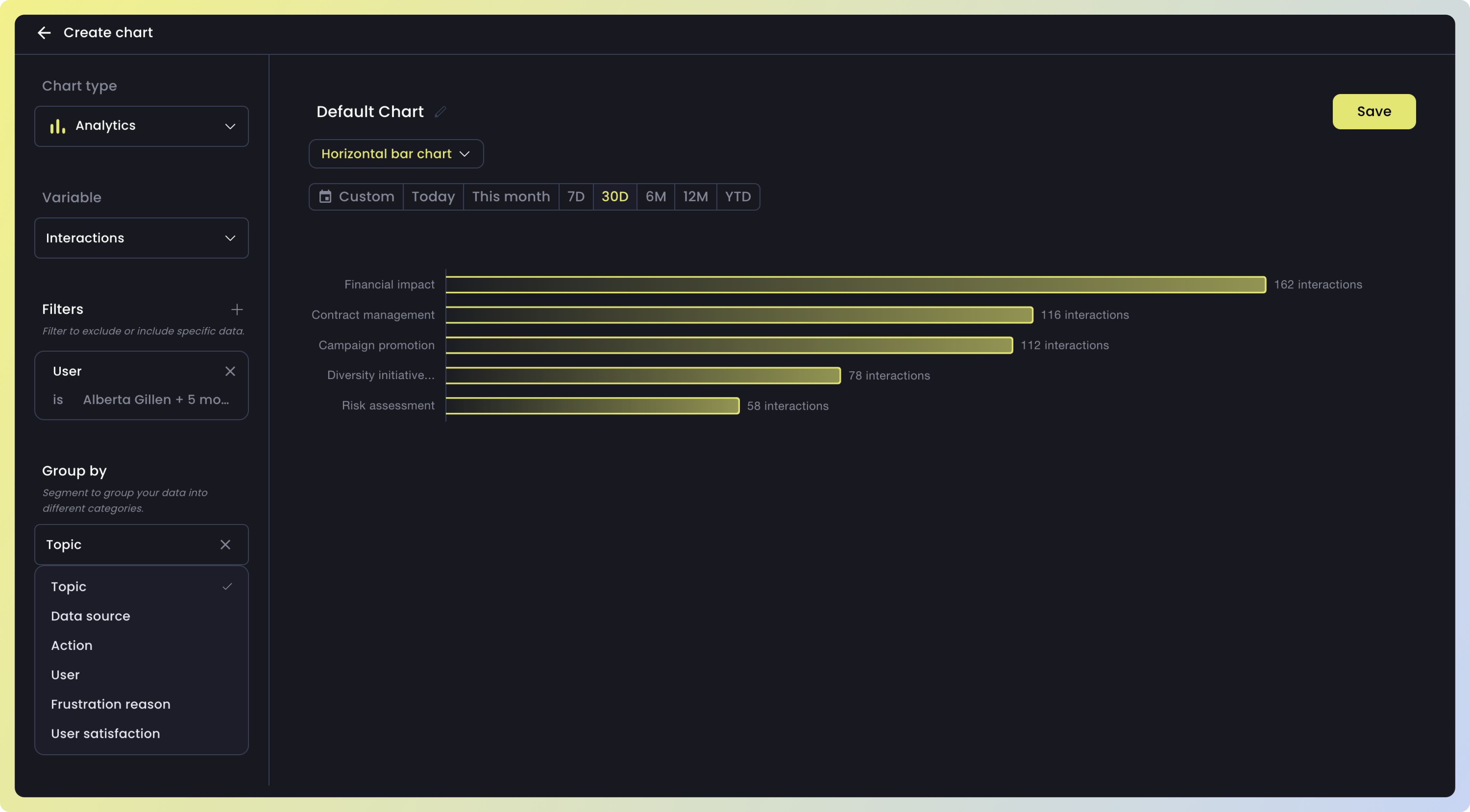
Group by to segment your data and compare different slices side by side. Like filters, Nebuly supports 100+ dimensions — here are some examples.| Group | Description |
|---|---|
| Topic | The main theme the user is talking about during the interaction |
| Data source | The external reference or knowledge sources the LLM might use to fetch or validate information |
| Language | The specific language in which the model generates its response |
| User | The specific user ID |
| Action | The task or question the user performs during an interaction |
| Frustration reason | Specific reasons a user might be frustrated, such as verbosity, insufficient knowledge, lack of clarity, or the answer not being deep enough |
Choose a visualization
Select the chart type that best represents your data. While a 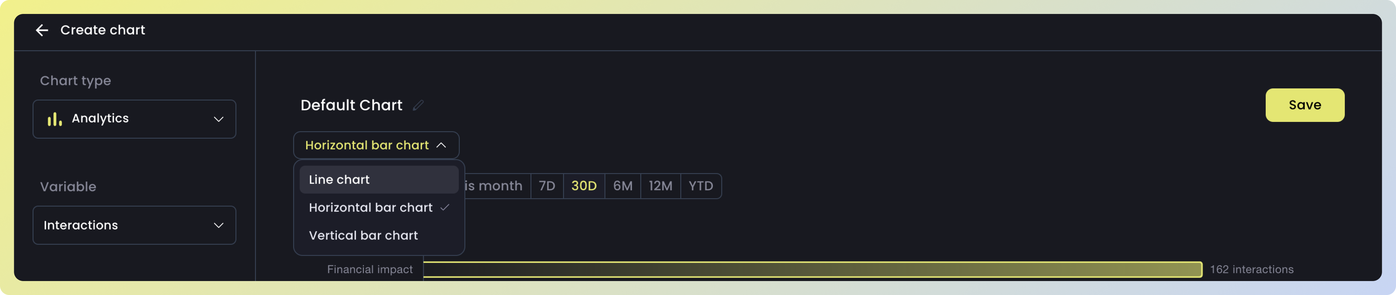
Line chart is great for spotting trends over time, other types like Horizontal bar chart are more useful for comparing aggregated values across categories.