Top bar

The Nebuly top bar, visible everywhere in the platform
- Global filters that apply across the whole platform. They stay active as you move between pages, so the data you see everywhere reflects the same selection until you change it. For the fields you can filter by and how to save filter sets, see Filtering.
- Share button, which generates anonymous sharing links. For details, see Sharing pages in Nebuly.
- Access to the Settings.
Sidebar
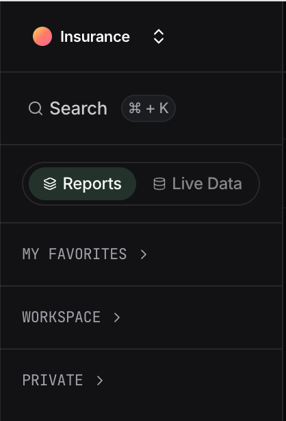
The sidebar controls what you see in the main view. It is split into two tabs: Reports and Live Data.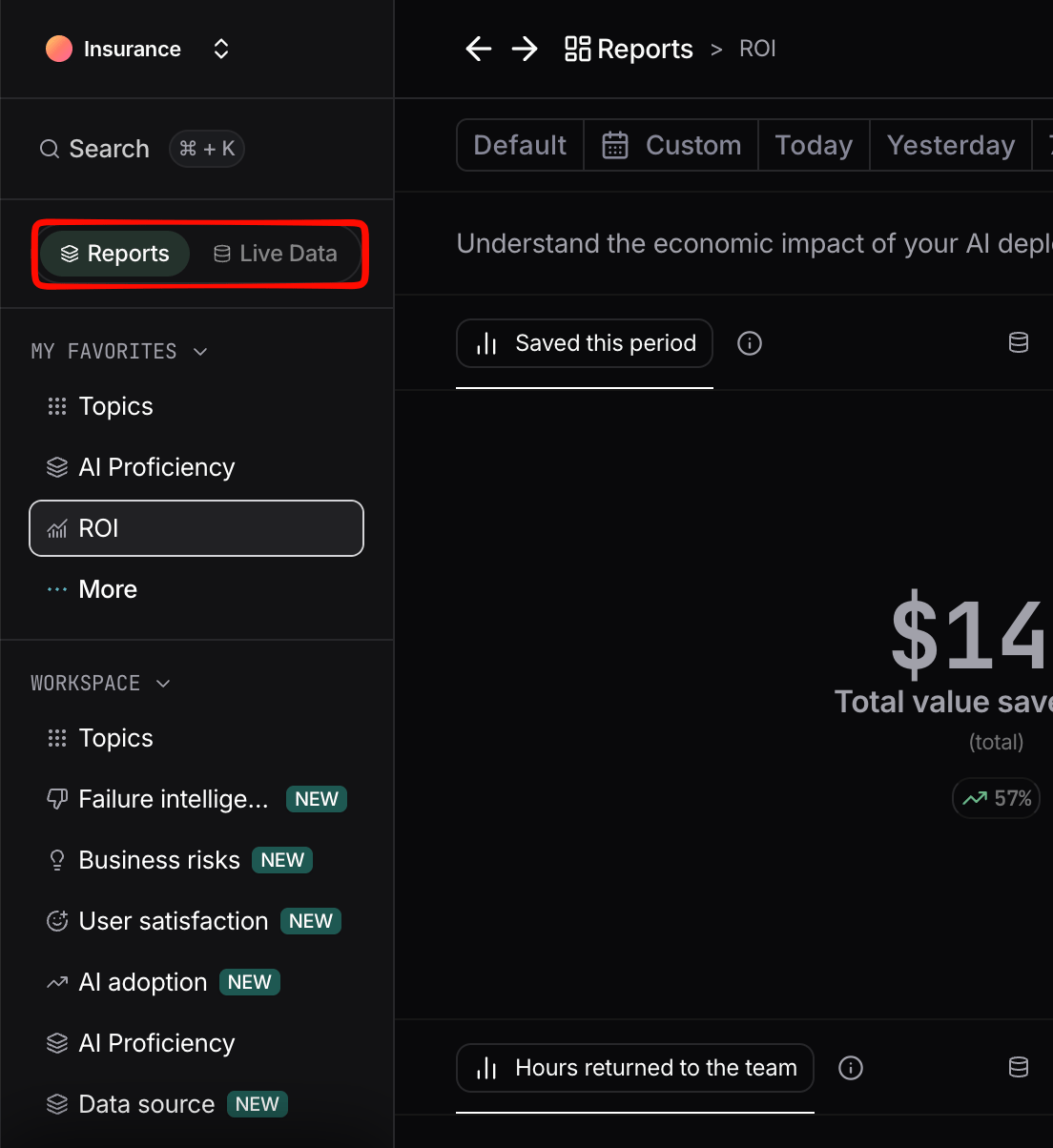
The Nebuly sidebar, with the Reports and Live Data tabs
Reports
Under the Reports tab, reports are organized into three sections:- Favorites: reports you have starred for quick access.
- Workspace: reports shared across the platform with all users.
- Private: reports you own, only visible to you.
The three report sections in the Reports tab
Live Data
The Live Data tab brings interactions, conversations, users, and user groups together in one place, so you can move between aggregated insights and the underlying activity without switching pages. For definitions of each data type, see Nebuly Data Types.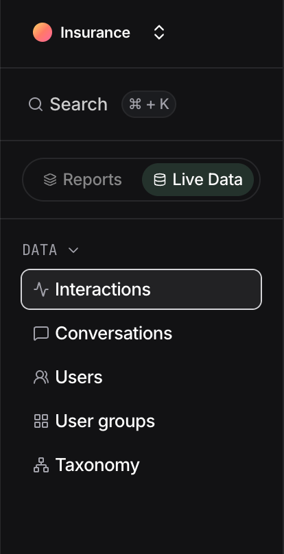
The Live Data tab
Table views
Live Data is shown as tables. You can add or remove columns depending on the data type you are viewing. Exporting is supported in CSV format. Row shortcuts let you jump straight from a row to the related users, interactions, or conversations, so you can drill from a summary into the detail behind it. To inspect a single interaction, click View details in the last column of a row. Once the details panel is open, click any other message in the same conversation and its details load in place, so you can move through a conversation without leaving the panel.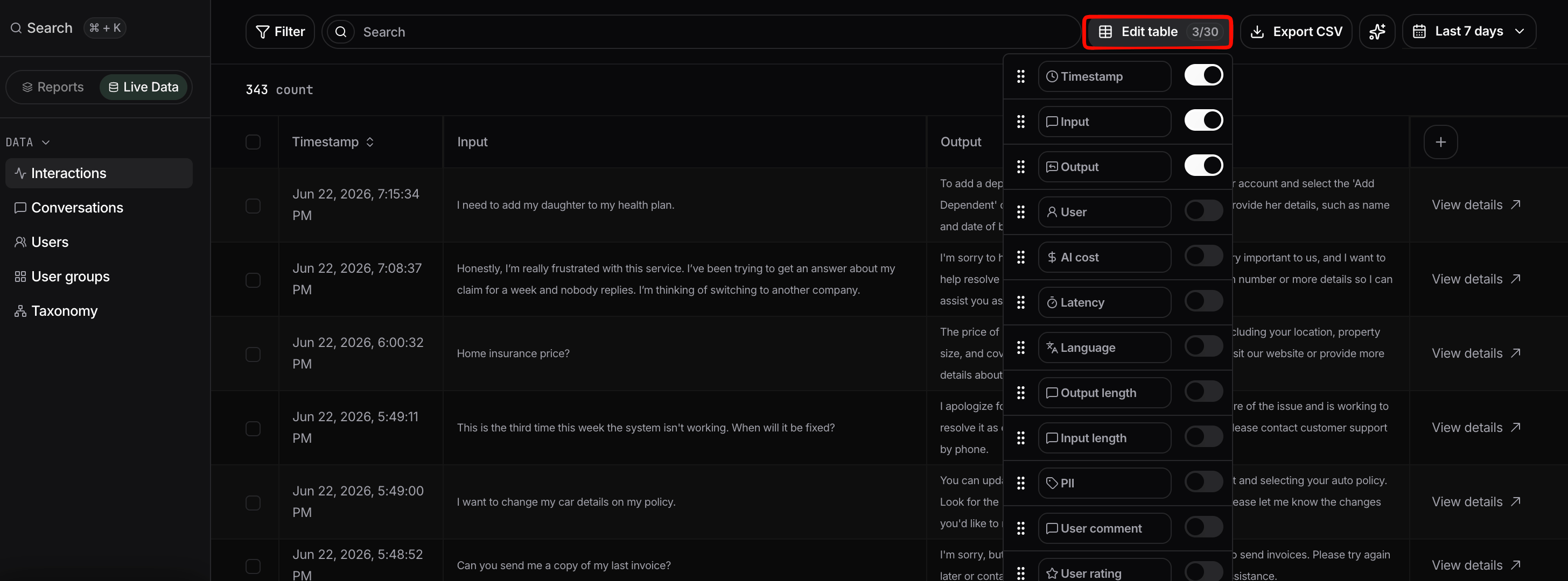
The interaction details panel
Interaction view
Every interaction in a Live Data table can be opened on its own to investigate it in full. Click View details in the last column of a row to open the interaction view.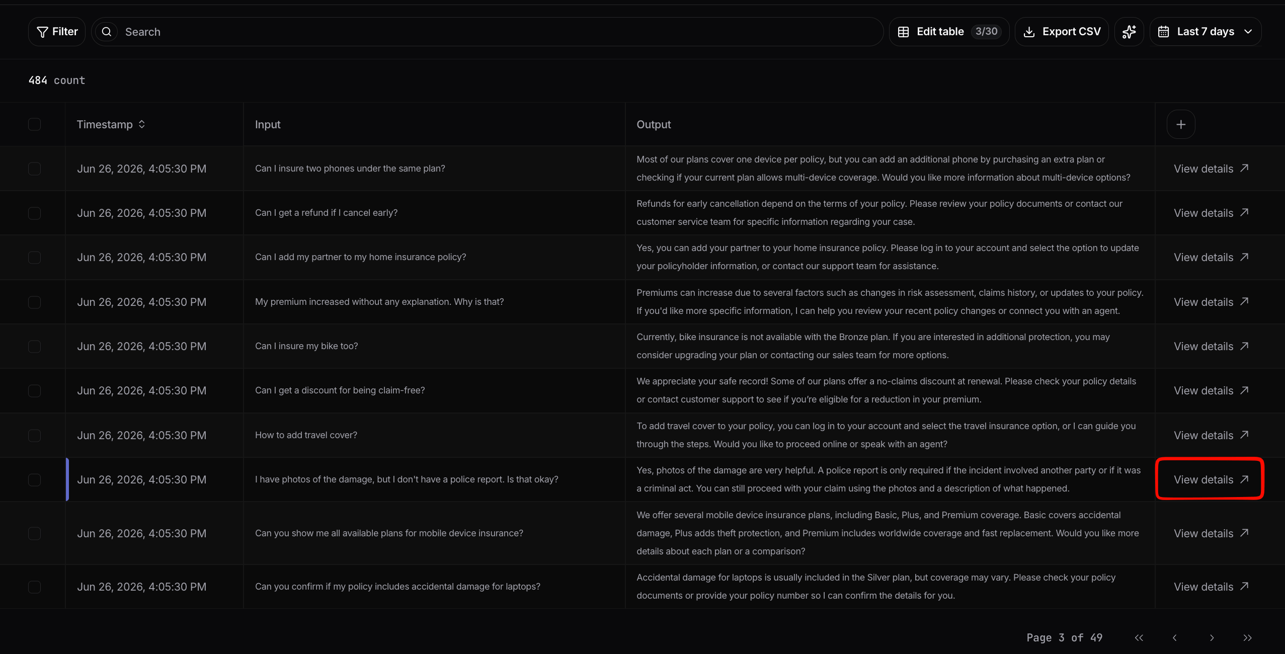
Open an interaction from the table with View details
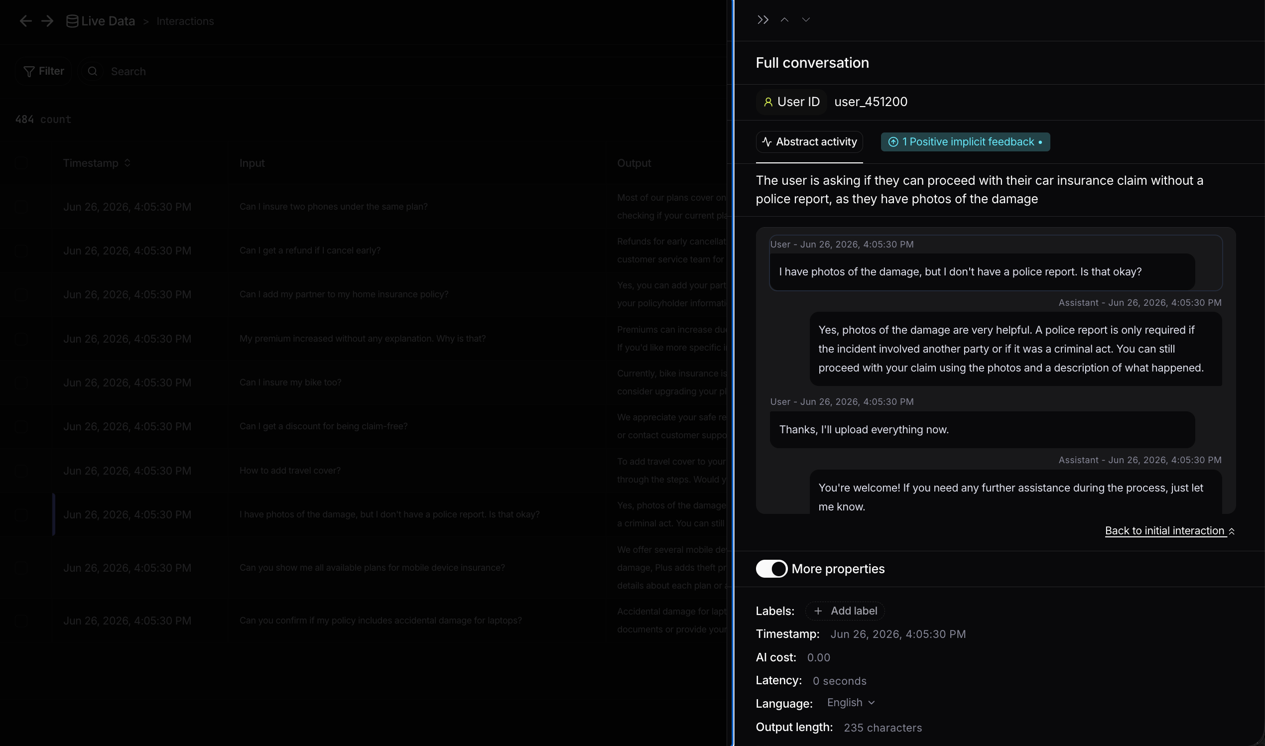
The full conversation and key properties in the interaction view
- Quality and feedback signals: user feedback, user sentiment, user emotions, and PII detection.
- Intent and context: the detected topic, intent, user action, and business risk.
- Failure intelligence: add or review the type of problem for the interaction (see Failure Intelligence).
- Technical metrics: AI cost, latency, language, input and output length, and input and output tokens.
- Tags: business context such as plan, model, and country (see Enrichment and tagging), plus the interaction ID.
- RAG sources: the sources retrieved to generate the answer, shown as the query sent and the result returned for each source.
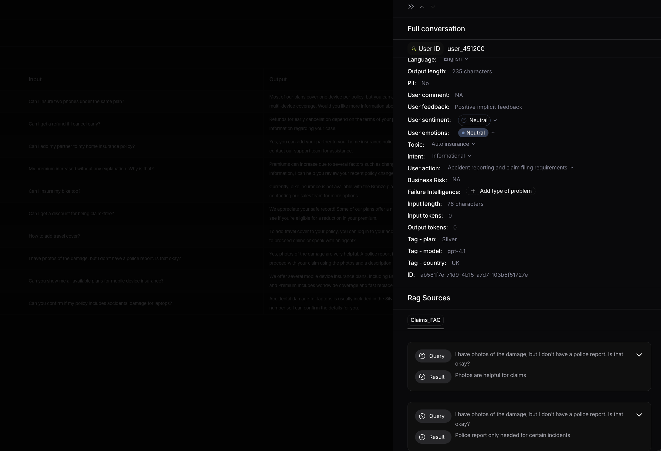
Expanded properties and RAG sources in the interaction view
Summarize
The Summarize button generates an AI summary of all the interactions shown in the current view. Instead of reading each interaction one by one, you get an overview of what users are doing and the common problems behind the interactions on screen, which is a fast way to understand a topic, a filtered slice, or any group you are investigating. It works on any table or list view. The button needs at least 5 interactions in the view to generate a summary, so narrow your filters until you have enough data.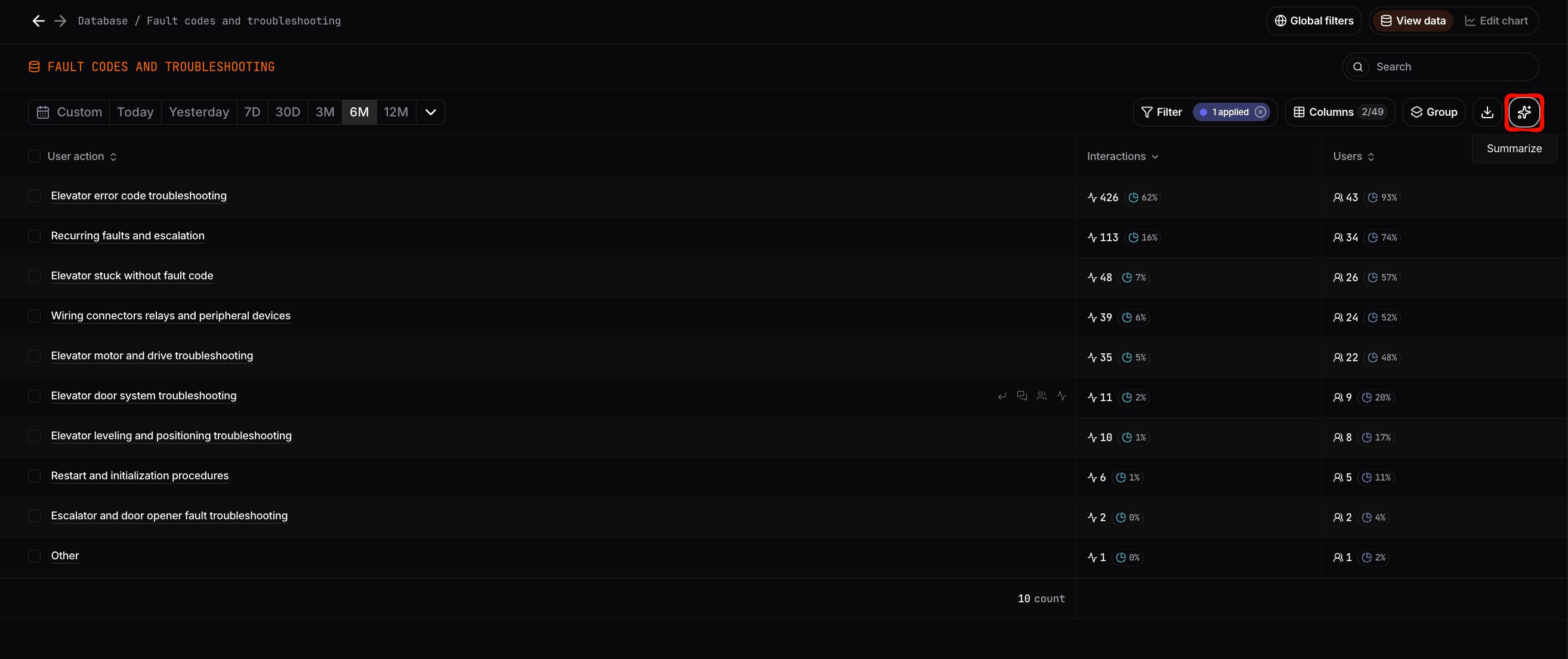
The Summarize button in a table view
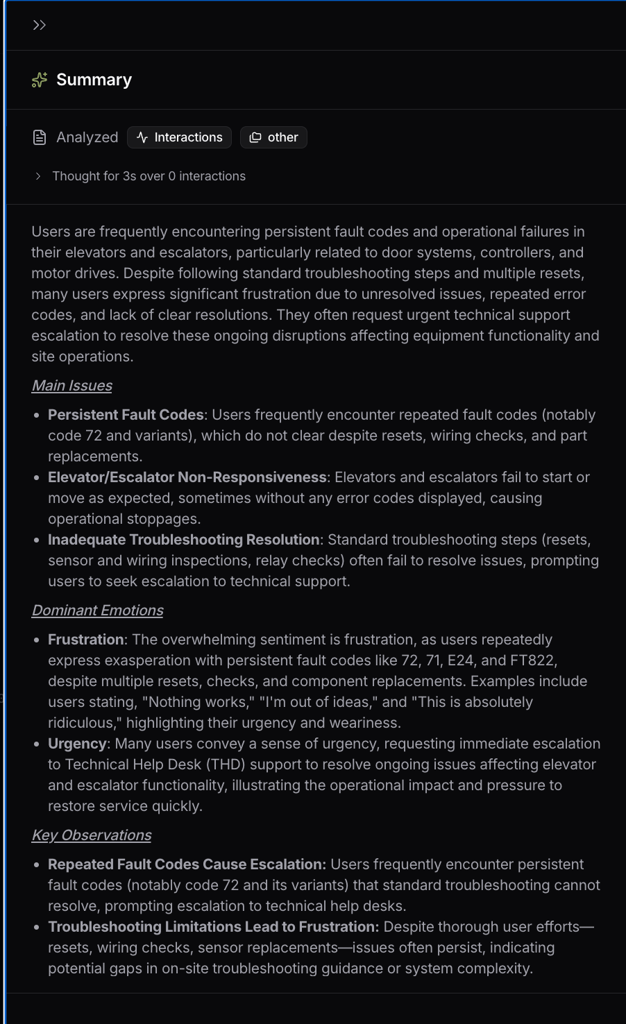
A generated summary
Filtering
Filters let you narrow the data to exactly what you want to see. There are two levels:- Global filters in the top bar, which apply across the whole platform and persist as you navigate.
- Local filters inside a chart or table, which apply only to that view.