Adding charts to a report
From inside a report, open the chart-creation panel and choose a chart type. The main families are Analytics, Table, and Retention. Read more here about charts.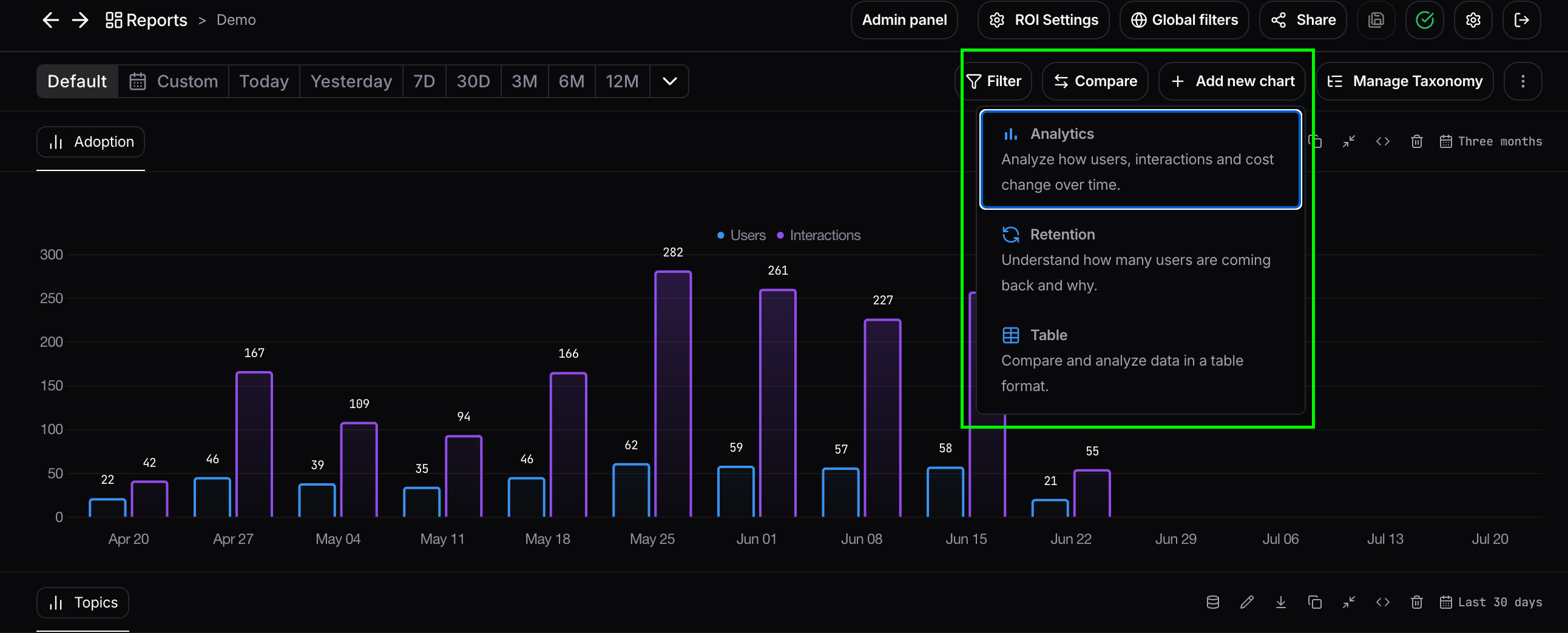
Time range
The time range determines which data is displayed throughout the report. Changing the time range updates every chart in the report, allowing you to analyze the same metrics over different periods. Read more about time range here. Individual charts can also override the report’s time range. In that case, the chart uses its own configured range instead of the report’s default.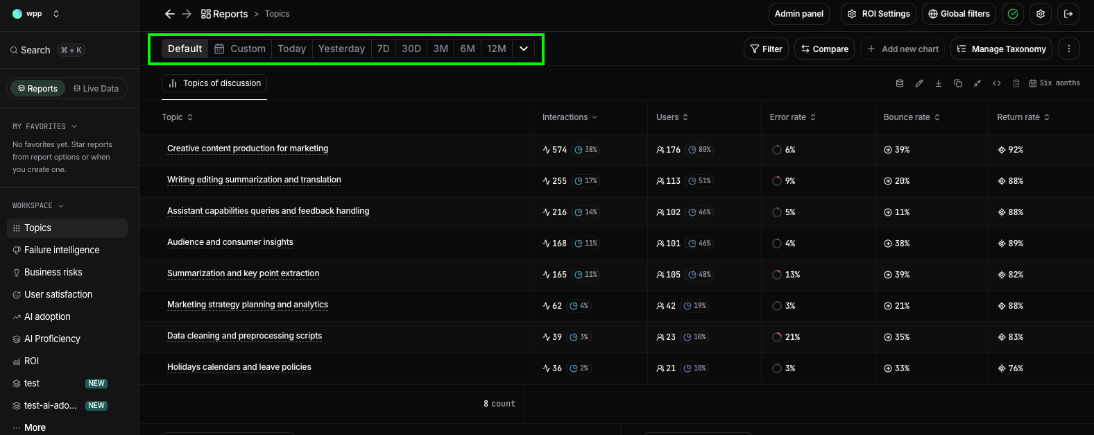
Compare
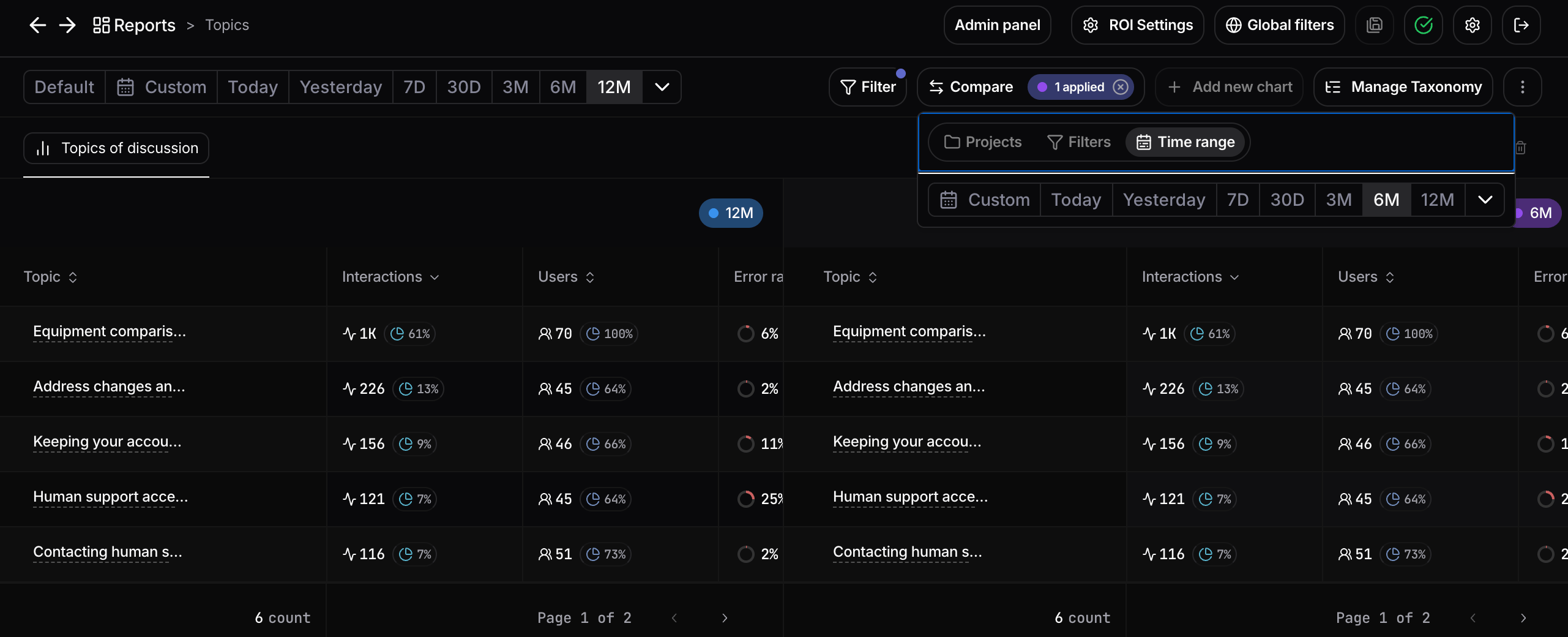
Comparison overlays a second view next to your report’s current data, so you can measure differences at a glance. Each chart shows the original dataset on the left and the comparison on the right. Open a report and click Compare in the top-right corner, then choose what to compare the report against:- A filter or segment. Compare the report’s data against any subset defined by a filter, for example a single topic, country, user group, or any tag you sent at ingestion. This lets you hold the report fixed and see how any segment differs from the rest of the data. Read more about filters here.
- A time range. Compare the current period against another period to spot changes over time. Read more about time range here.
- Another project. Pull a second project alongside the current one to compare metrics across deployments, for example an internal copilot versus a customer-facing assistant. See organizations and projects.
Filters
Filters let you narrow the data shown throughout a report so you can focus your analysis on specific users, conversations, topics, or any other dimension available in Nebuly. If you have administrator or edit permissions, you can also configure the default filters that other users see when they open the report. At any time, you can reset the filters to return to the original configuration defined by the report creator. For more information about filters, read here.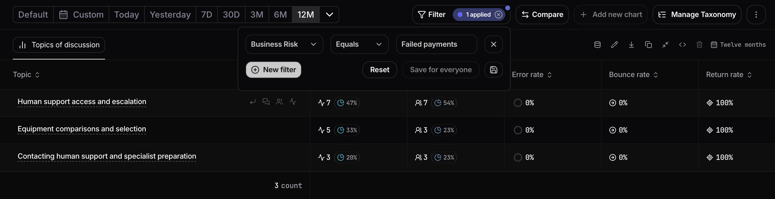
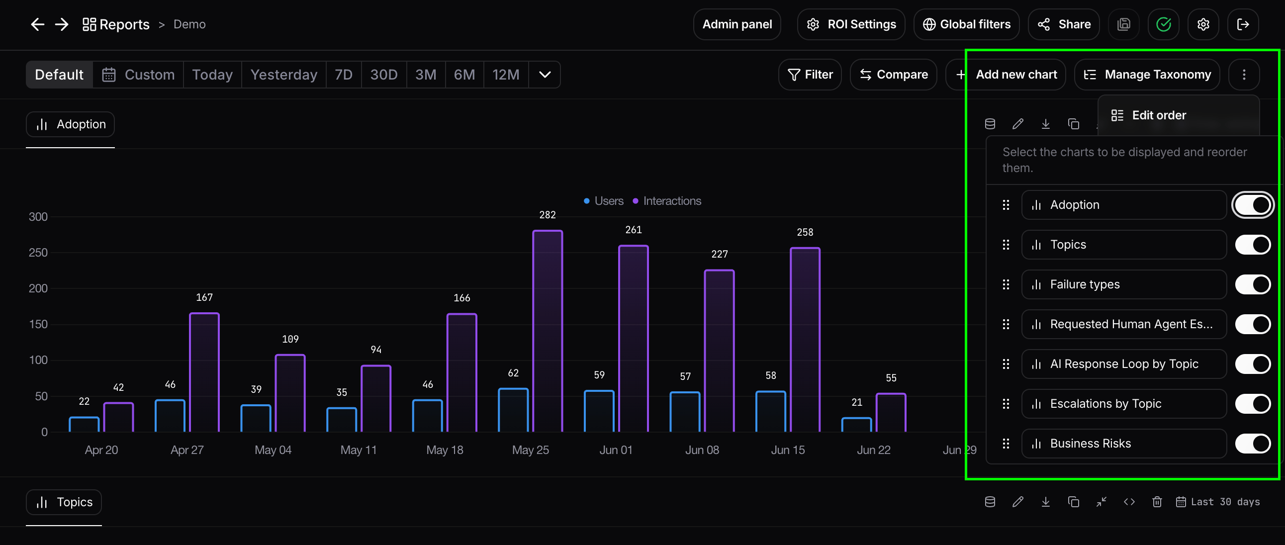
Edit order
The Edit order option lets you control which charts are displayed in a report and the order in which they appear. Open the report menu (⋮) and select Edit order. A panel opens listing every chart in the report. From there, you can:- Reorder charts by dragging them into the desired position.
- Show or hide charts using the toggle next to each chart. Hidden charts remain part of the report but are not displayed until they are enabled again.